Adding the other Visualizations
All the remaining visualizations in the dashboards will use the same sample spreadsheet
Note
If you want to change your data source, you will need to select the overflow button next to the data source name or create a new data source instead. You can also duplicate visualizations to speed up the creation process.
This section will cover the following visualizations:
|
|
|
|
|
|
|
|
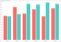
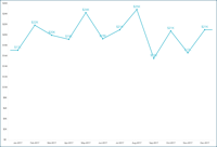
Win/Lost by Month
The Win/Lost by Month visualization displays the amount of won and lost opportunities for a six-month period in a column chart. In order to create it:
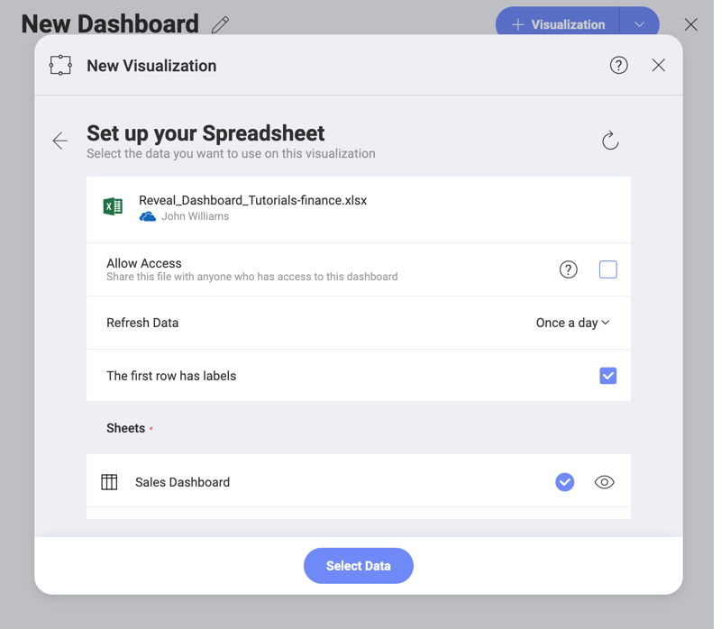
Select the + button in the right corner of your dashboard. In the New Visualization dialog, select the Analytics_Dashboard_Tutorials spreadsheet in the Data in Dashboard section. Make sure the Sales Dashboard option is selected, and then press Load Data.
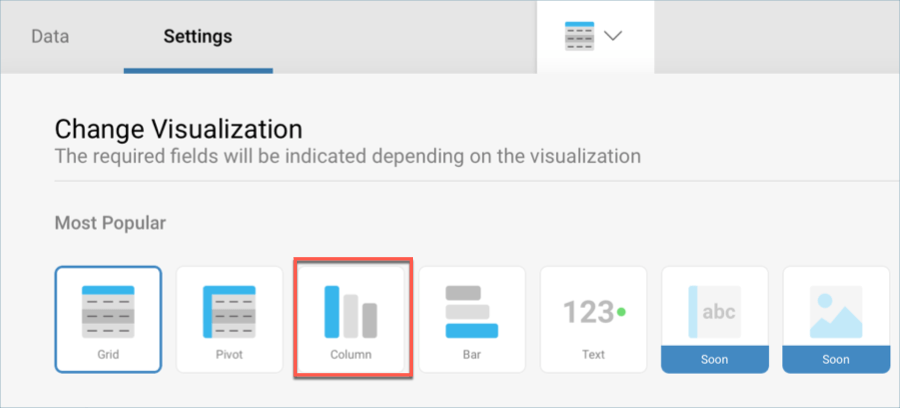
Open the visualizations picker by selecting the grid icon in the top bar, and select the "Column" chart.
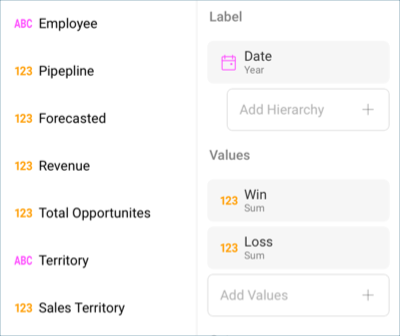
In the Data Editor, drag and drop the Date field into Label, and the Win and Loss fields into Values.
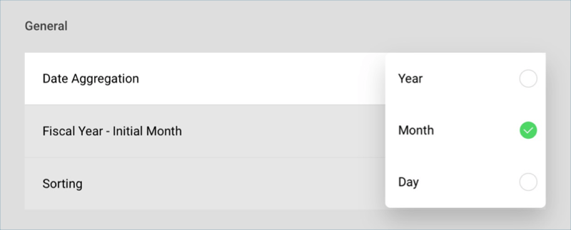
The data displayed in this visualization displays data by month. In order to match this format, select Date in the Label placeholder, and change the Date Aggregation to Month.
Then, select Update Field.
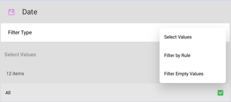
In order for the visualization to display a six-month period, you will need to add a filter. To do this, drop Date into Data Filters and select it to access the Visualization Filter menu. Within it, select Filter by Rule under Filter Type.
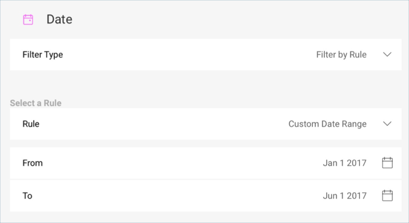
Then, select Custom Date Range under Rule, and enter the following custom range:
After this, select Update Field.
Change the title of your visualization to "Win/Lost by Month" by selecting the pencil icon next to "Sales Dashboard".
Once you are done, go back to the Dashboard Editor by selecting the tick icon in the top right-hand corner.
Forecasted
The Forecasted visualization displays the forecast for a six month period in a bar chart. In order to create it:
Select the + button in the right corner of your dashboard. In the New Visualization dialog, select the Analytics_Dashboard_Tutorials spreadsheet in the Data in Dashboard section. Make sure the Sales Dashboard option is selected, and then press Load Data.
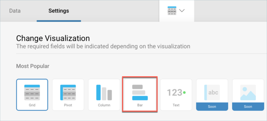
Open the visualizations picker by selecting the grid icon in the top bar, and select the "Bar" chart.
In the Data Editor, drag and drop the Date field into Label, and the Forecasted field into Values.
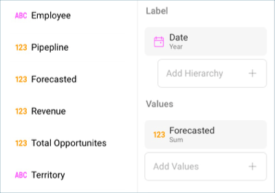
The data displayed in this visualization displays data by month. In order to match this format, select Date in the Label placeholder, and change the Date Aggregation to Month. Also, change the Sorting to Descending.
Then, select Update Field.
Because the Forecasted field has sales information, it should be formatted as currency. Select the Forecasted field in Values, and apply the following changes:
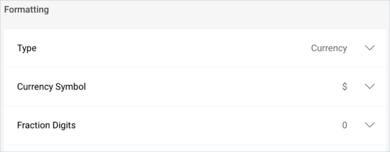
a. Change the Type to Currency.
b. Change the Fraction Digits to 0. Then, select Update Field.
In order for the visualization to display a six-month period, you will need to add a filter. To do this, drop Date into Data Filters and select it to access the Visualization Filter menu. Within it, select Filter by Rule under Filter Type.
Then, select Custom Date Range under Rule, and enter the following custom range:
Then, select Update Field.
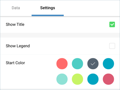
To match the sample visualization's color, go to the Settings section and change the color to the third one.
Change the title of your visualization to "Forecasted" by selecting the pencil icon next to "Sales Dashboard".
Once you are done, go back to the Dashboard Editor by selecting the tick icon in the top right-hand corner.
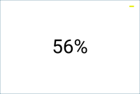
Lost Opportunities
The Lost Opportunities visualization simply displays the percentage of opportunities which were missed in a Text Gauge. In order to create it:
Select the + button in the right corner of your dashboard. In the New Visualization dialog, select the Analytics_Dashboard_Tutorials spreadsheet in the Data in Dashboard section. Make sure the Sales Dashboard option is selected, and then press Load Data.
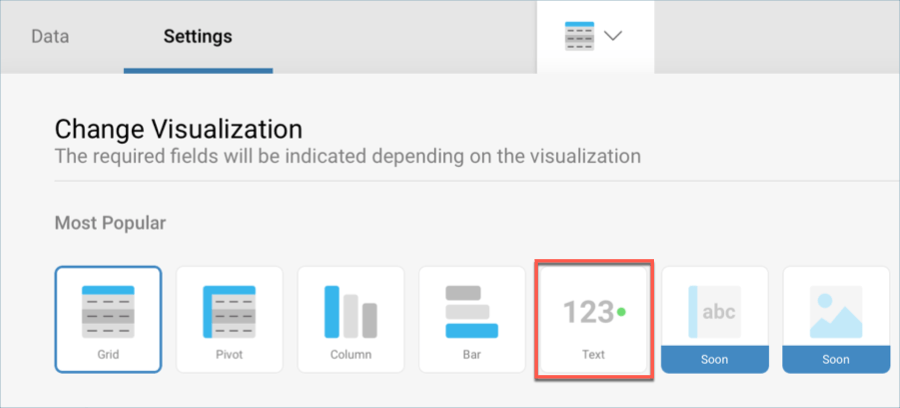
Open the visualizations picker by selecting the grid icon in the top bar, and select the "Text" gauge.
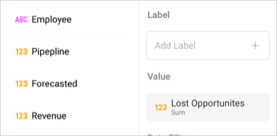
In the Data Editor, drag and drop Lost Opportunities field into Value.
In the sample dashboard, the lost opportunities are represented as a percentage. In order to apply this formatting, select the Lost Opportunities field in the Value placeholder. In the formatting menu:
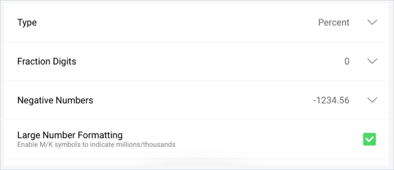
a. Change the Type to Percent.
b. Change the Fraction Digits to 0. Then, select Update Field.
The yellow dash indicator in the sample is meant to represent that the figure has remained stable in comparison with the last period. This marker is created through the bands configurations in the gauge's settings. In order to add it:
Go to the Settings tab in the Visualization Editor.

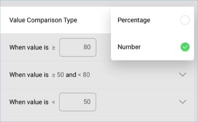
In the "Sales Dashboard" spreadsheet, "Lost Opportunities" equals 0.56 as the value, even though the visualization is expressed as a percentage. Therefore, scroll down to Value Comparison Type and set it to "Number".
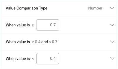
Set your bounds. In this case, the bounds are within 0.7 and 0.5.
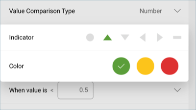
Select each band and select both the color and the indicator.
Change the title of your visualization to "Lost Opportunities" by selecting the pencil icon next to "Sales Dashboard".
Once you are done, go back to the Dashboard Editor by selecting the tick icon in the top right-hand corner.
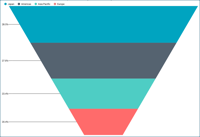
Pipeline by Territory
The Pipeline by Territory visualizations displays the average sales prospects and where they are located in a funnel chart. In order to create it:
Select the + button in the right corner of your dashboard. In the New Visualization dialog, select the Analytics_Dashboard_Tutorials spreadsheet in the Data in Dashboard section. Make sure the Sales Dashboard option is selected, and then press Load Data.
Open the visualizations picker by selecting the grid icon in the top bar, and select the "Funnel" chart.
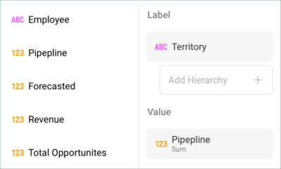
In the Data Editor, drag and drop Territory into Labels and Pipeline into Value.
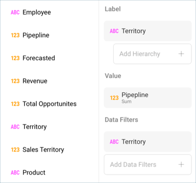
The Territory has many empty values because there are only 4 territories, but more than 1000 values for the other columns in the original data source. In order to filter the values, drag and drop Territory into Data Filters.
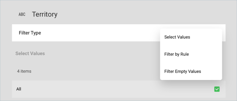
Then, select it to access the Visualization Filter dialog. Once there, change the Filter Type to Filter Empty Values, and select Create Filter.
Change the title of your visualization to "Pipeline by Territory" by selecting the pencil icon next to "Sales Dashboard".
Once you are done, go back to the Dashboard Editor by selecting the tick icon in the top right-hand corner.
Total Opportunities
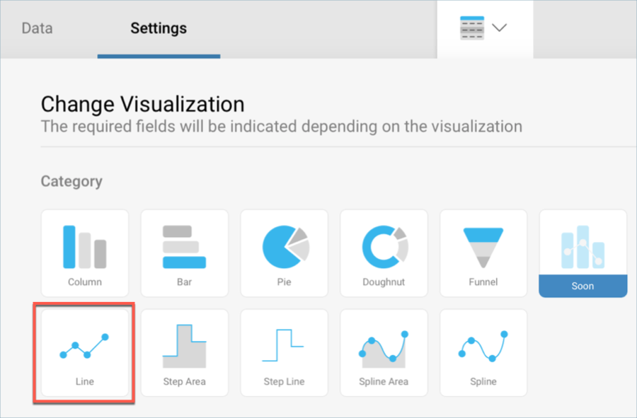
The Total Opportunities visualization displays the revenue the opportunities represented for the company for a 12 month period in a line chart. In order to create it:
Select the + button in the right corner of your dashboard. In the New Visualization dialog, select the Analytics_Dashboard_Tutorials spreadsheet in the Data in Dashboard section. Make sure the Sales Dashboard option is selected, and then press Load Data.
Open the visualizations picker by selecting the grid icon in the top bar, and select the "Line" chart.
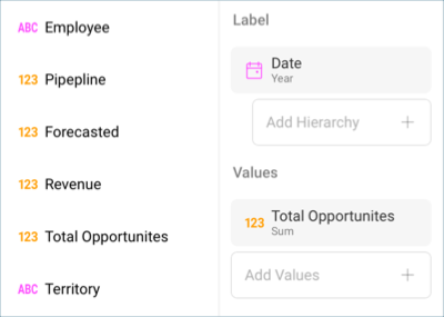
In the Data Editor, drag and drop the Date into Labels and Total Opportunities into Values.
The data displayed in this visualization displays data by month. In order to match this format, select Date in the Label placeholder, and change the Date Aggregation to Month.
Then, select Update Field.
Because the Total Opportunities field has sales information, it should be formatted as currency. Select the Total Opportunities field in Values, and apply the following changes:
Change the Type to Currency.
Change the Fraction Digits to 0
Then, select Update Field.
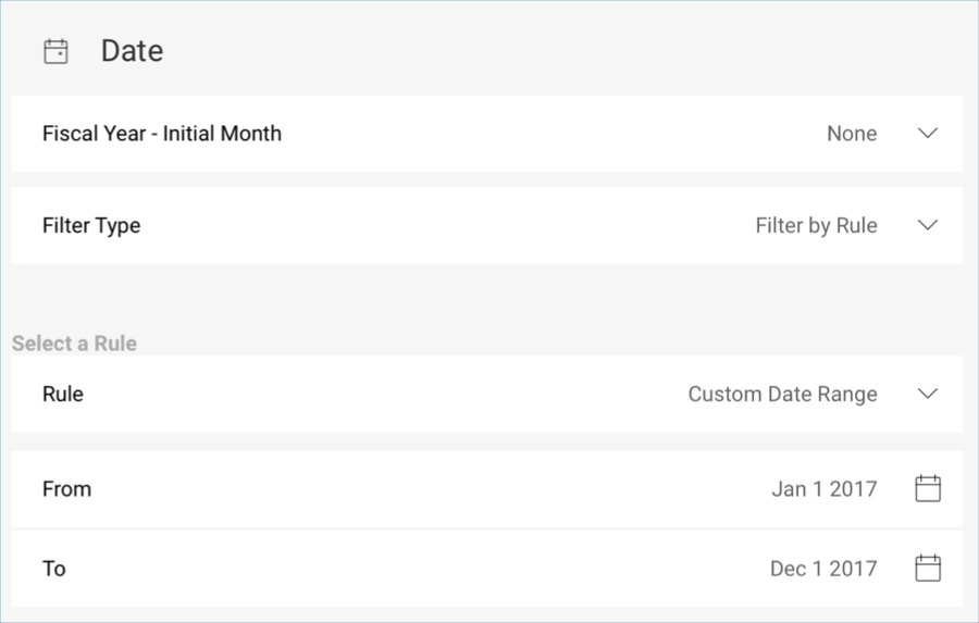
In order for the visualization to display a 12 month period, you will need to add a filter. To do this, drop Date into Data Filters and select it to access the Visualization Filter menu. Within it, select Filter by Rule under Filter Type.
Then, select Custom Date Range under Rule, and enter the following custom range:
Then, select Update Filter.
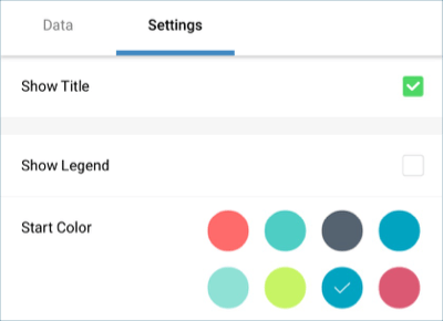
To match the sample visualization's color, go to the Settings section and change the color to the seventh one.
Change the title of your visualization to "Total Opportunities" by selecting the pencil icon next to "Sales Dashboard".
Once you are done, go back to the Dashboard Editor by selecting the tick icon in the top right-hand corner.
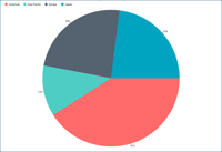
Revenue by Territory
The Revenue by Territory displays the revenue represented by each region for the company in a pie chart. In order to create it:
Select the + button in the right corner of your dashboard. In the New Visualization dialog, select the Analytics_Dashboard_Tutorials spreadsheet in the Data in Dashboard section. Make sure the Sales Dashboard option is selected, and then press Load Data.
Open the visualizations picker by selecting the grid icon in the top bar, and select the "Pie" chart.
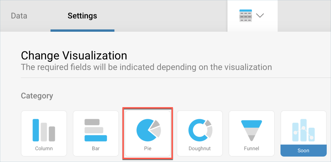
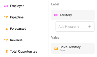
In the Data Editor, drag and drop Territory into Label and Sales Territory into Value.
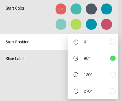
In the sample visualization, the pie chart has a different start position. In order to udpate it, go to the Settings tab of the Visualizations Editor and change the Start Position to 90°.
Change the title of your visualization to "Revenue by Territory" by selecting the pencil icon next to "Sales Dashboard".
Once you are done, go back to the Dashboard Editor by selecting the tick icon in the top right-hand corner.
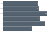
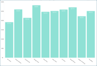
Pipeline per Employee
The Pipeline per Employee visualization displays the top 10 sales prospects per employee in a column chart. In order to create it:
Select the + button in the right corner of your dashboard. In the New Visualization dialog, select the Analytics_Dashboard_Tutorials spreadsheet in the Data in Dashboard section. Make sure the Sales Dashboard option is selected, and then press Load Data.
Open the visualizations picker by selecting the grid icon in the top bar, and select the "Column" chart.
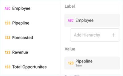
In the Data Editor, drag and drop Employee into Label and Pipeline into Values.
The Pipeline values refer to sales prospects and should, therefore, be formatted as currency. Select the Pipeline field in Values, and apply the following changes:
Change the Type to Currency.
Change the Fraction Digits to 0
Then, select Update Field.
This visualization displays the top 10 prospects, and therefore needs a filter. To do this, select the Add Data Filters and scroll down to the bottom of the list. You will see the aggregated Pipeline field; select it.
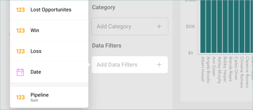
Then, select Top Items under Rule and enter 10.
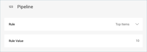
Select Create Filter to apply the changes.
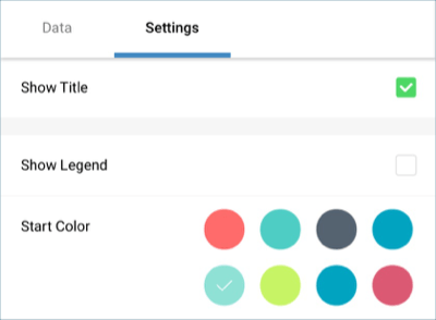
To match the sample visualization's color, go to the Settings section and change the color to the fifth one.
Change the title of your visualization to "Pipeline by Employee" by selecting the pencil icon next to "Sales Dashboard".
Once you are done, go back to the Dashboard Editor by selecting the tick icon in the top right-hand corner.
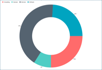
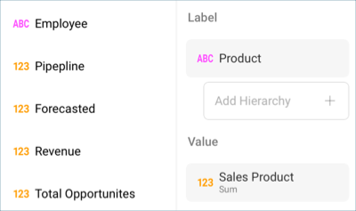
Sales by Product
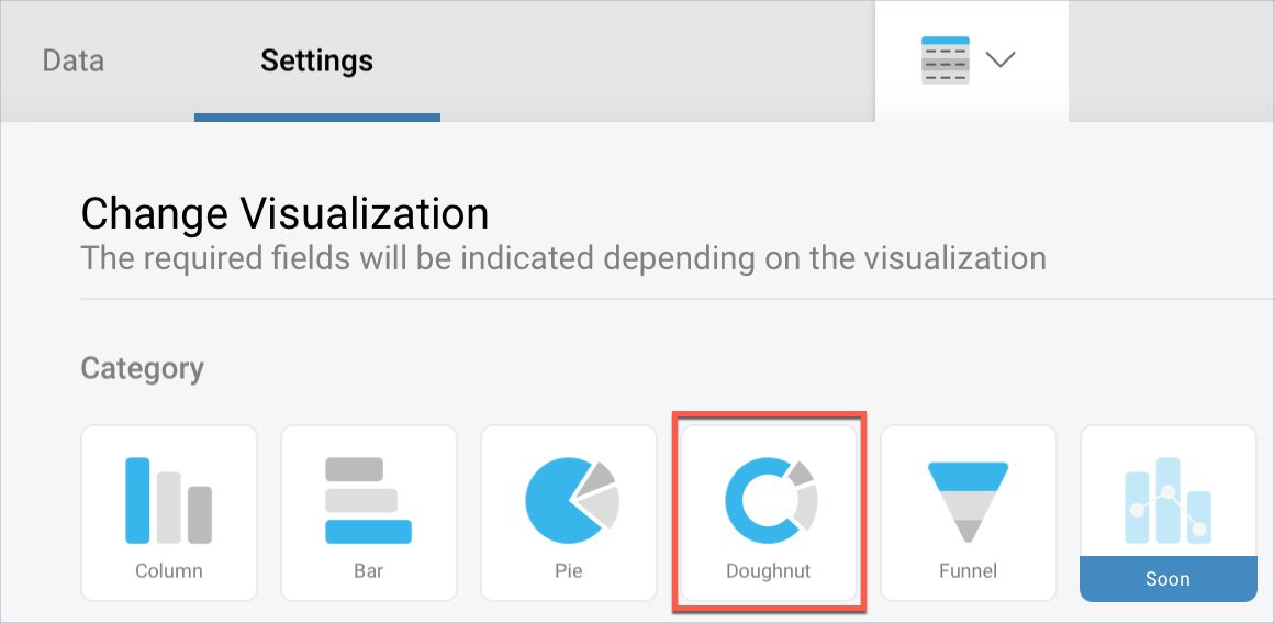
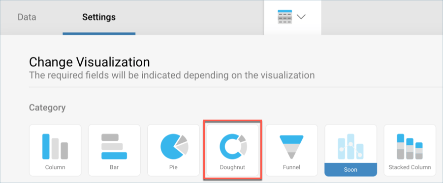
The Sales by Product visualization displays the different company products and the percentage of sales for each one in a doughnut chart. In order to create it:
Select the + button in the right corner of your dashboard. In the New Visualization dialog, select the Analytics_Dashboard_Tutorials spreadsheet in the Data in Dashboard section. Make sure the Sales Dashboard option is selected, and then press Load Data.
Open the visualizations picker by selecting the grid icon in the top bar, and select the "Doughnut" chart.
In the Data Editor, drag and drop Product into Label and Sales Product into Value.
In the sample visualization, the pie chart has a different start position. In order to udpate it, go to the Settings tab of the Visualizations Editor and change the Start Position to 90°.
Change the title of your visualization to "Pipeline by Employee" by selecting the pencil icon next to "Sales Dashboard".
Once you are done, go back to the Dashboard Editor by selecting the tick icon in the top right-hand corner.