Creating Dashboards
The dashboard creation experience in Analytics includes:
Changing the Visualization (optional).
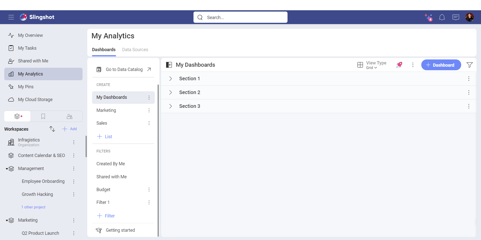
Access the Dashboard Creation Menu
You can create a dashboard by:
- Click/tap on the + Dashboard button in a dashboard list, or the Create Dashboard blue button in the Getting Started section.
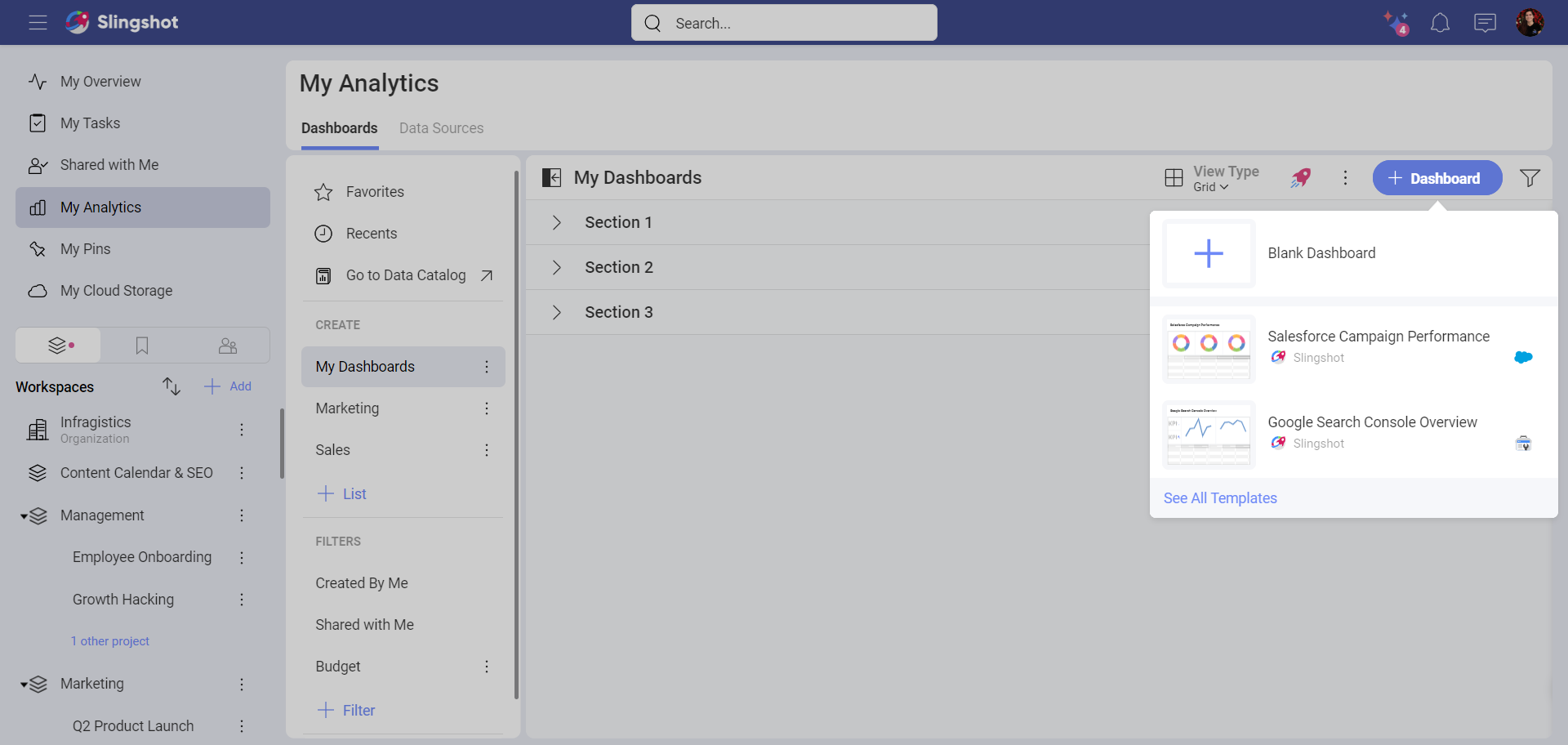
- You will be presented with the options to use a dashboard template (See All Templates button) or to create a new dashboard. Click/tap on the plus icon to create a dashboard.
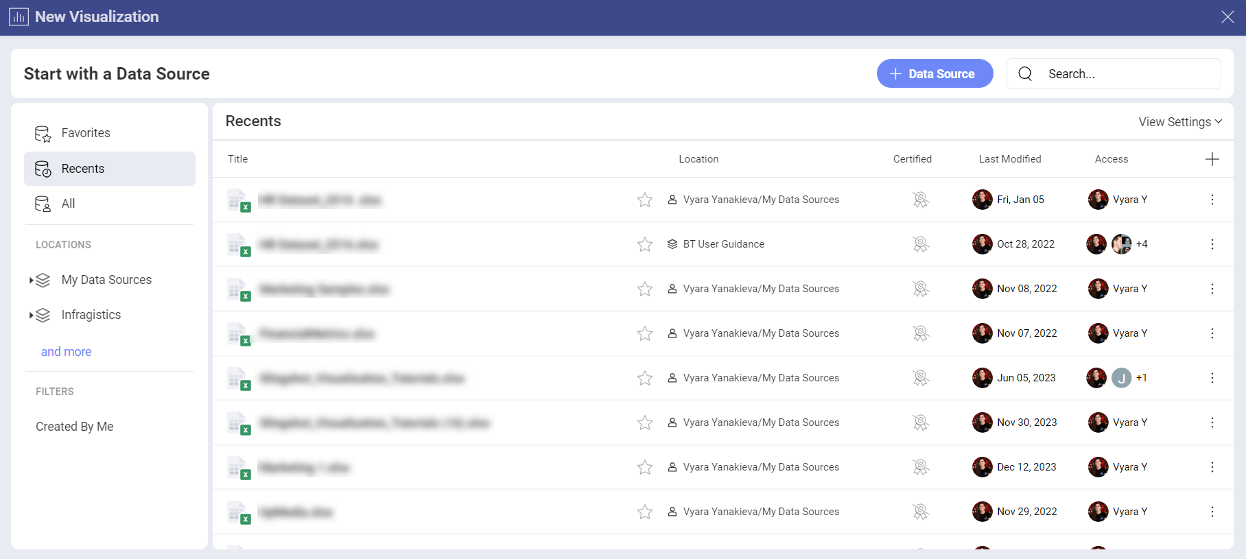
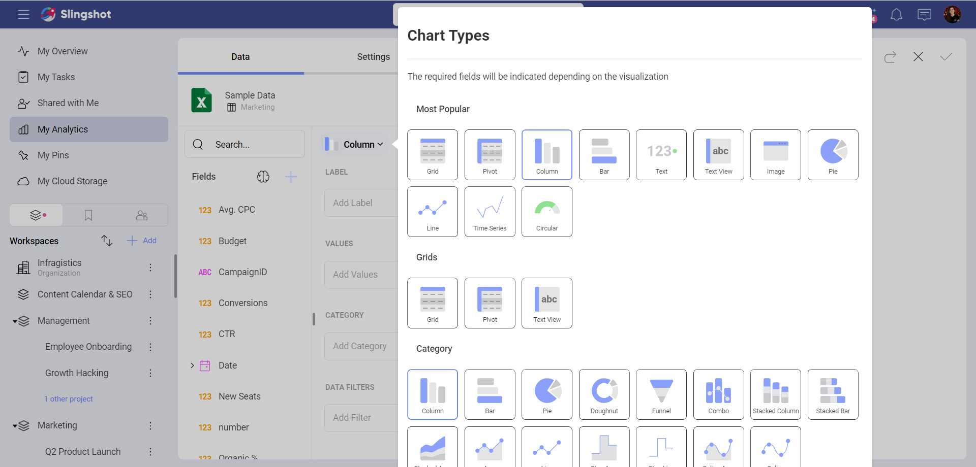
- You will be presented with the New Visualization dialog. You can proceed to create a visualization while using a data source.
Add a Data Source
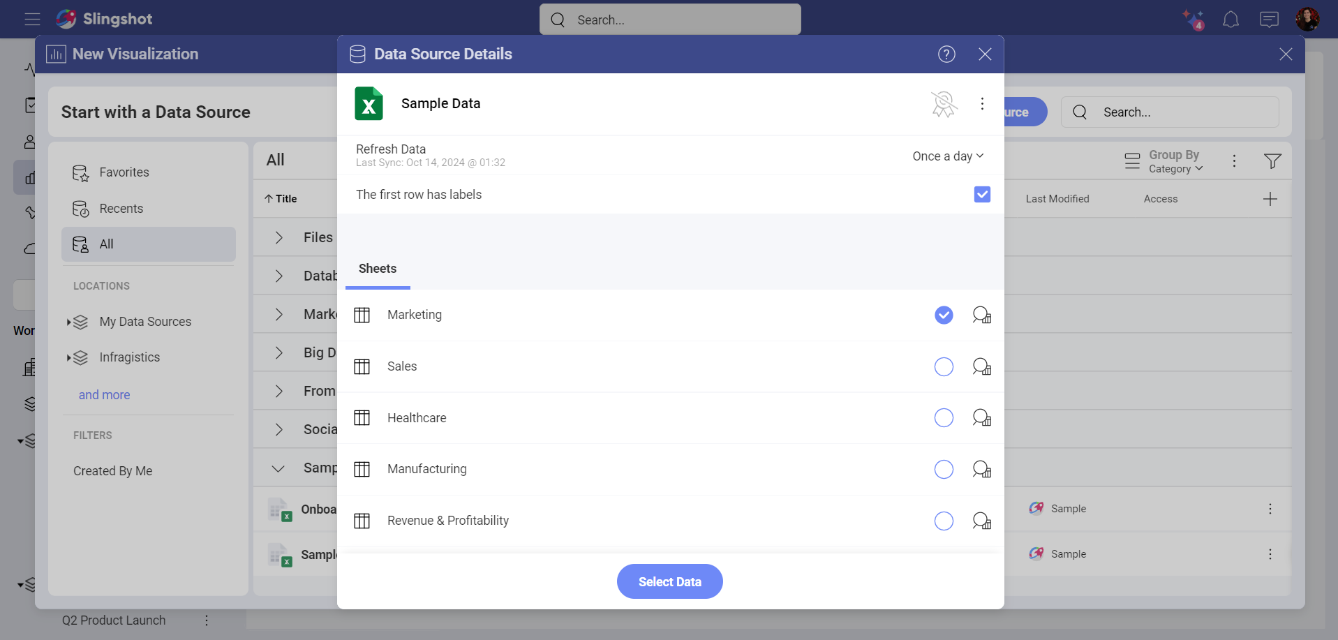
If your data source is not in the data sources list, select the + Data Source button in the top right-hand corner. A new dialog will appear, displaying all data source categories and the available data sources. Feel free to scroll up and down until you see the data source you need.
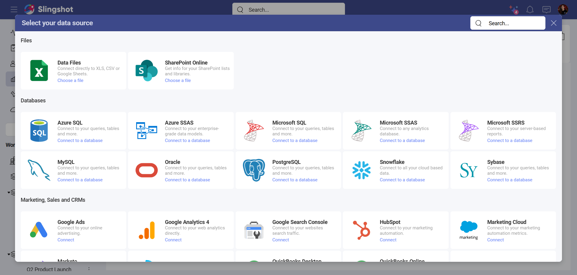
If your data source is a spreadsheet in a content manager, you will be able to select, for example, the specific sheet that you want to use in your visualization.
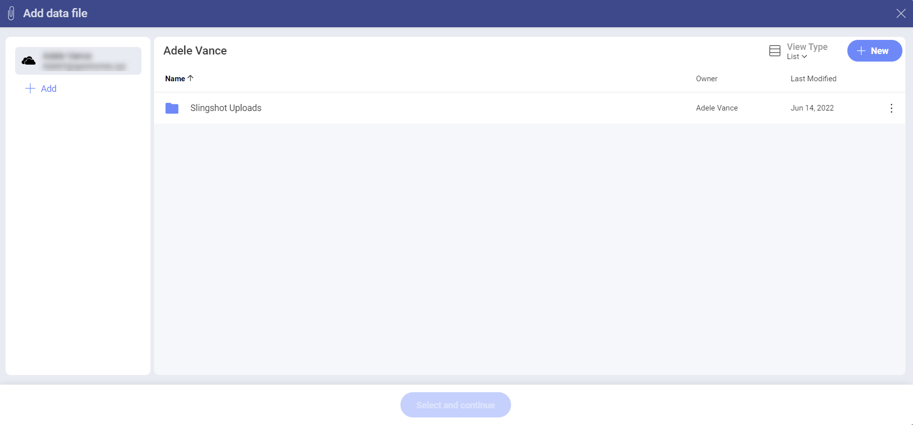
Available Content
With Analytics, you can add many content sources, including Dropbox, OneDrive, Box and Google Drive, which will allow you to browse any folders, files or spreadsheets available in them.
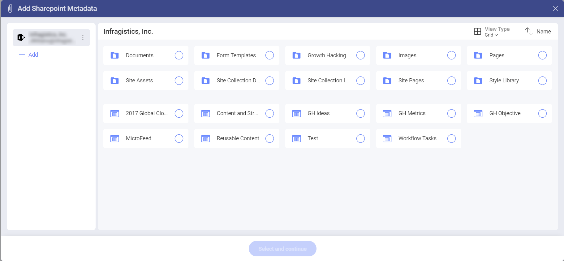
In addition, you can also add SharePoint data sources, which means the ability to access any lists or libraries.
Changing your Visualization
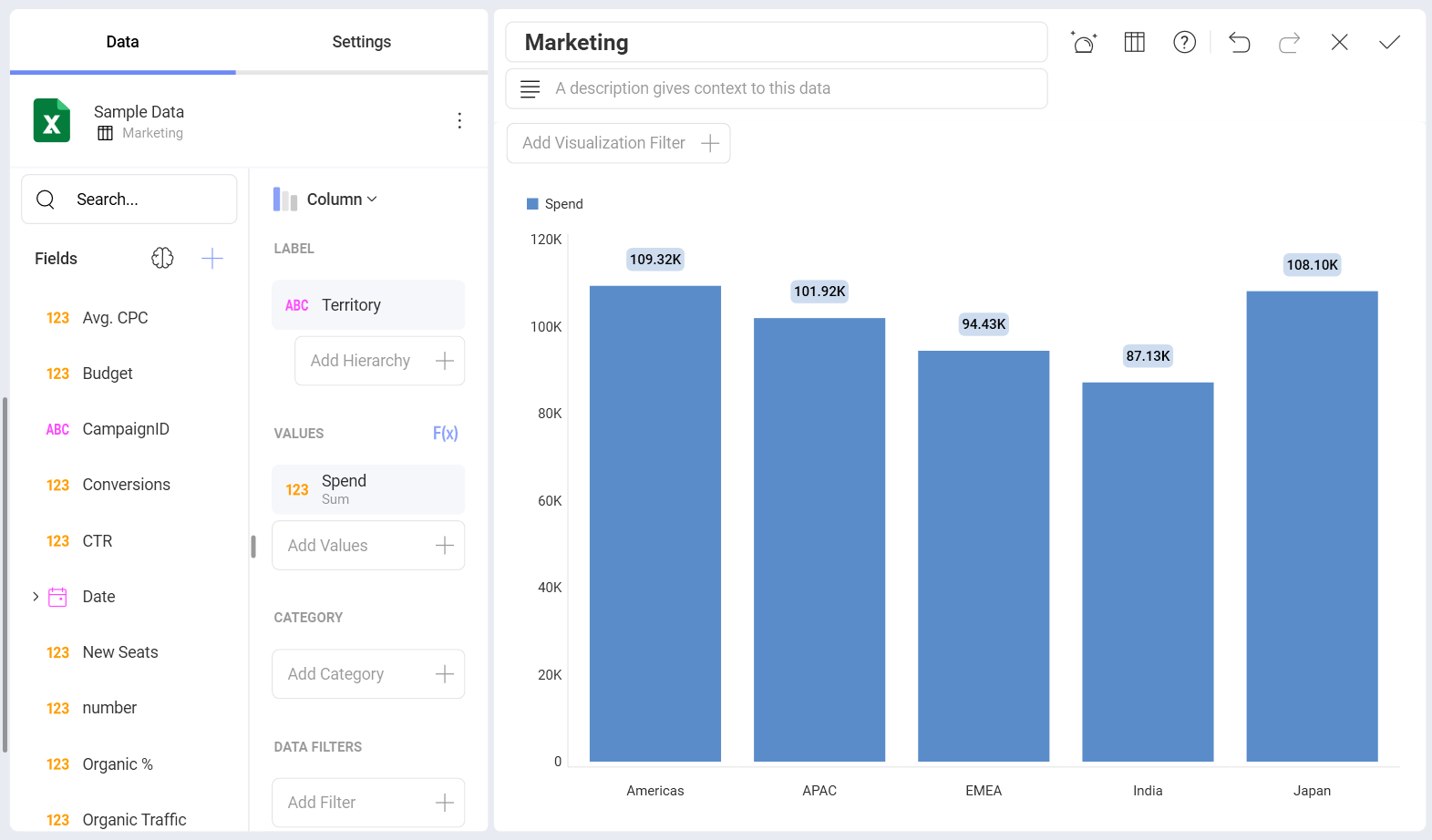
Once your data source has been added, you will be taken to the Visualization Editor. By default, the Column visualization will be selected.
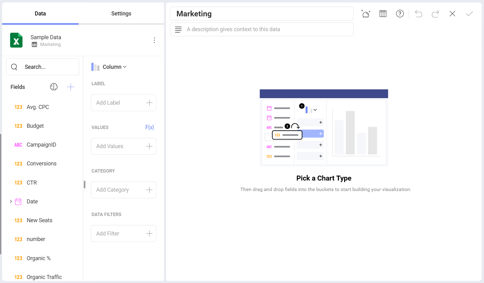
Analytics provides several options to customize the way your information is visualized. You can access the options by selecting the grid icon in the top bar.
Add labels and values to your visualization and preview them in the right-hand pane. If necessary, you can change your visualization's settings or add filters to it.
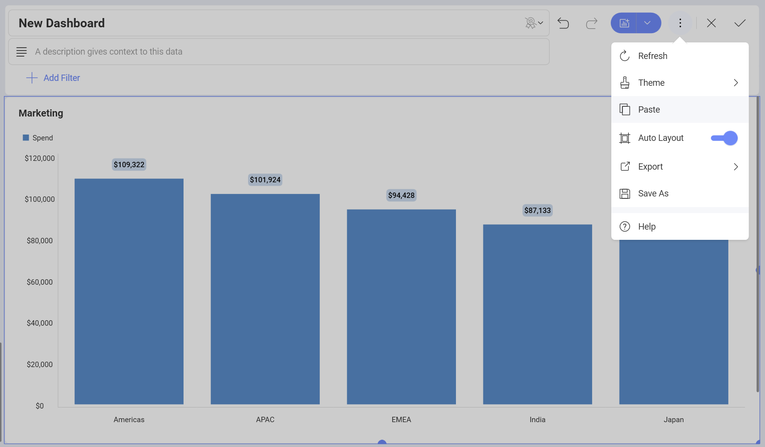
Once you have modified the visualization, you will be taken back to the Dashboard Editor. You will see Undo, Redo, and the +Visualization split button on the top right-hand corner. Next to these buttons you will also find the overflow menu of the dashboard where you can:
Choose to change the dashboard's theme.
Refresh the dashboard.
Paste the dashboard.
Switch on/off Auto Layout.
Export the dashboard.
Save the dashboard.
Find more information about Slingshot dashboards in our Learning Center.
You can also use the overflow menu in the top right corner of the visualization to:
Rename the visualization.
Edit the visualization.
Copy the visualization.
Duplicate the visualization.
Delete the visualization.
Note
The difference between copying and duplicating a visualization is that duplicating works only inside the same dashboard and the copy option allows you to put the visualization in the same or a different dashboard.
After copying a visualization, find the Paste option inside the overflow menu of the dashboard you want to paste the visualization in.
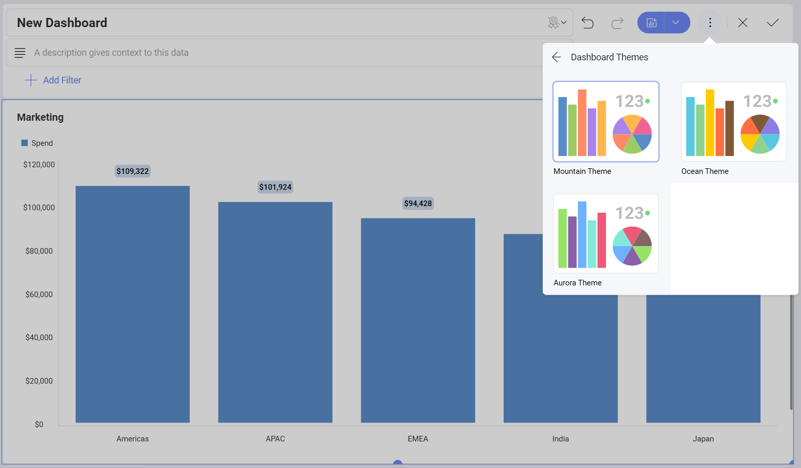
Applying a Theme
Once you have continued to your dashboard, you can:
Open its overflow menu.
Click/tap on Theme.
Switch between Mountain Theme, Ocean Theme and Aurora Theme as shown below.
Save the Dashboard
Once your dashboard is ready, you can:
Click/tap on the tick icon in the top right-hand corner of the dashboard or choose Save As from its overflow menu.
Select a name for your dashboard.
Choose a location for it. You can save the dashboard under My Analytics ⇒ My Dashboards or choose any of the workspaces or projects that you are part of.
When you are ready, click/tap on Save here.
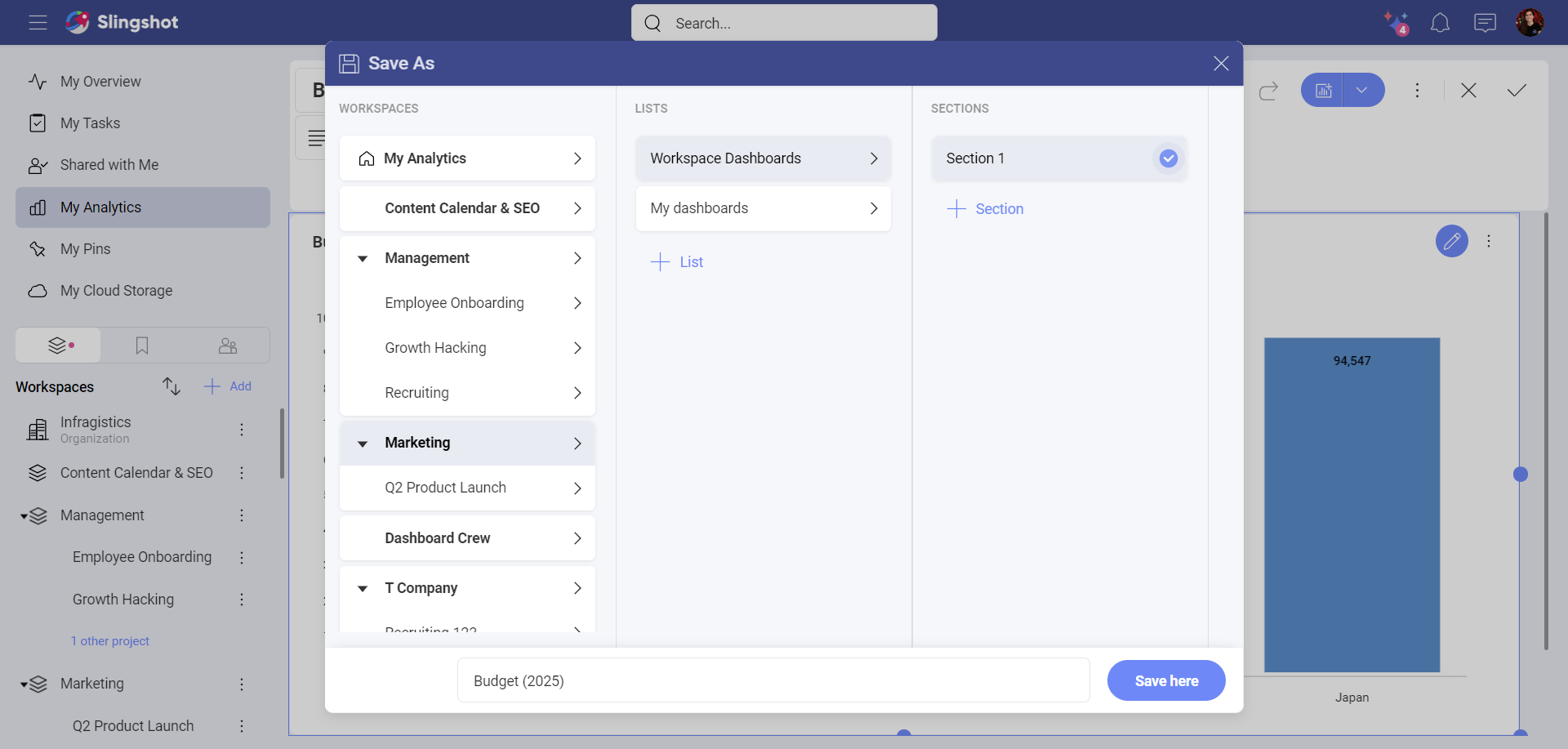
[!Note] To better organize your space, you can create lists and sections by clicking on the +List and +Section buttons at the top right-hand corner, while in the Save as dialog.