Category Charts
These charts are used to associate categories with quantitative information.
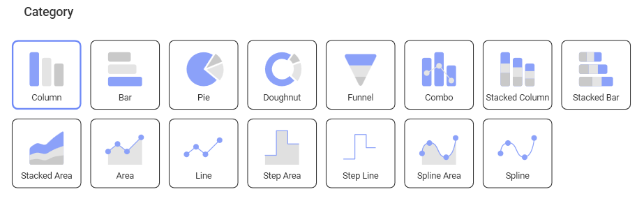
You can select any of the chart icons displayed in the Visualizations options menu as long as it is suitable for your data. Analytics will select the first numeric columns in the dataset and attempts to match the selected chart type data series requirements.
For instance, in a Column Chart, all numeric columns are added to the chart. The automatic selection of columns done by Analytics can be modified in the Chart Settings configuration.
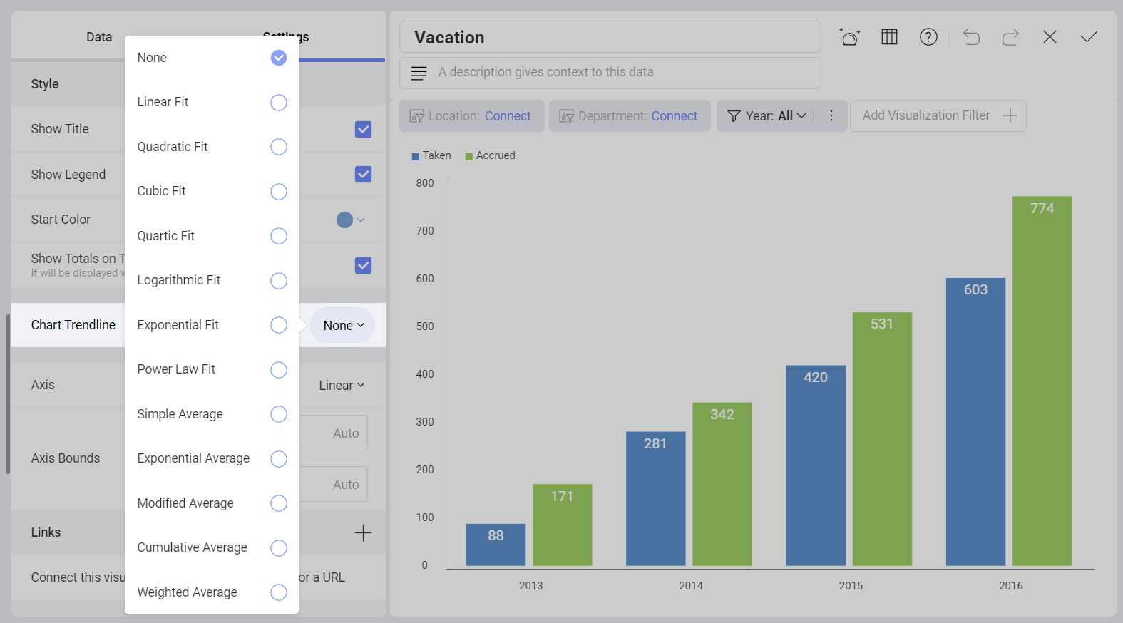
Chart Trendlines
Chart settings enable the display of trend lines, which are lines that are painted across a chart, based on an algorithm. Trendlines are a very simple, yet powerful tool to help you determine trends in datasets, and define thresholds for taking action. The supported algorithms are Linear Fit, Quadratic Fit, Cubic Fit, Quartic Fit, Logarithmic Fit, Exponential Fit, Power Law Fit, Simple Average, Exponential Average, Modified Average, Cumulative Average, Weighted Average.
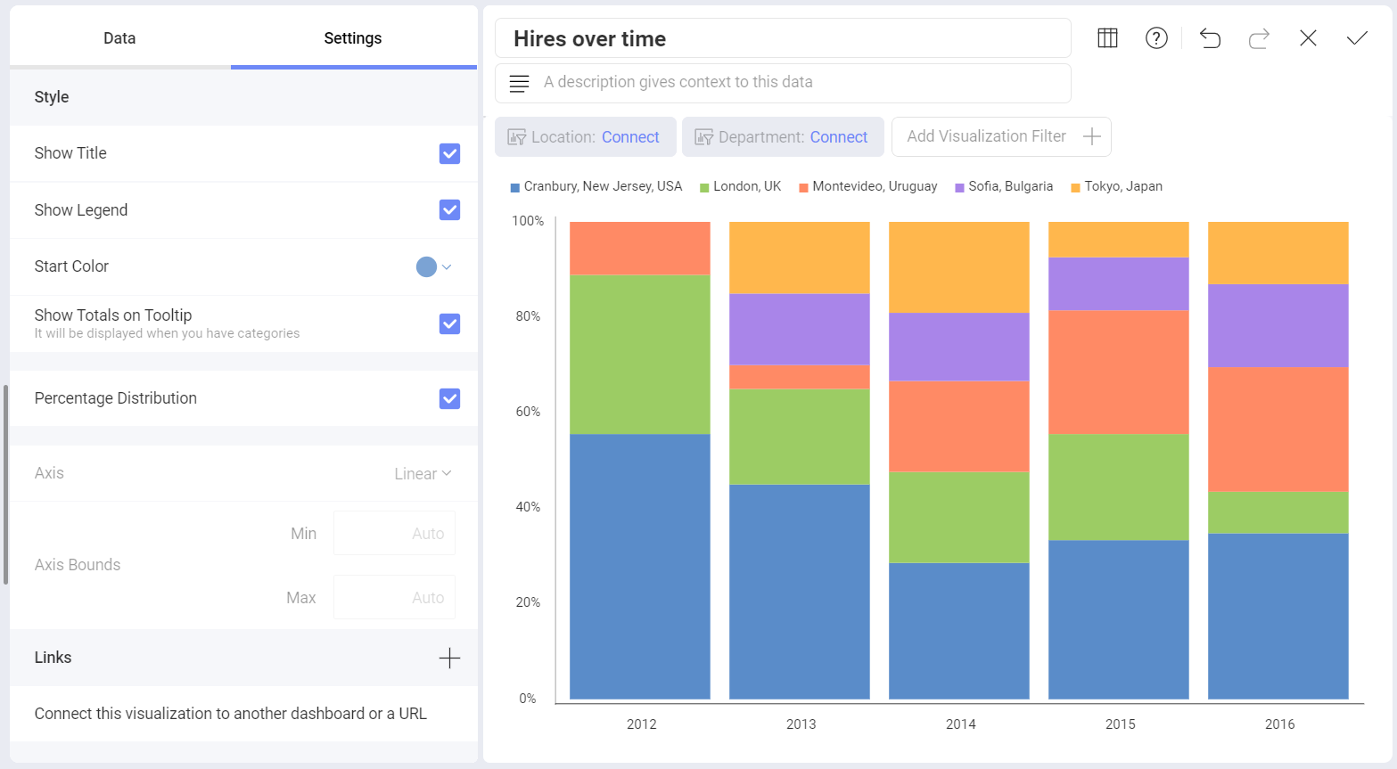
Percentage Distribution
You can also configure this feature for the stacked series charts. It will override the 0-100 default scale and allow you to visualize the percentage distribution of the values in the chart.
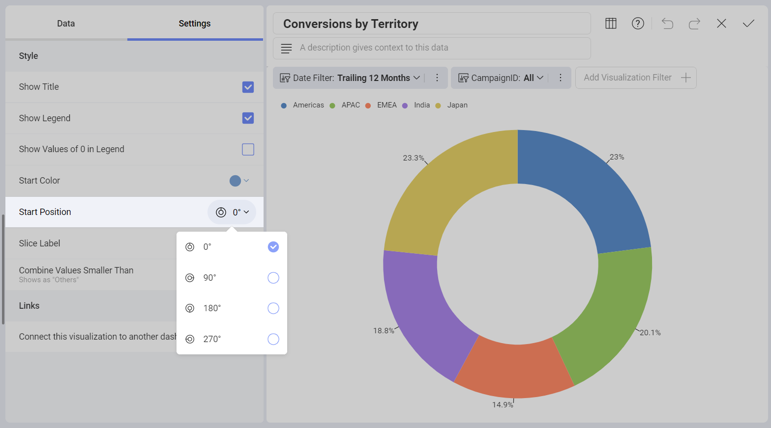
Start Position and Slice Labels
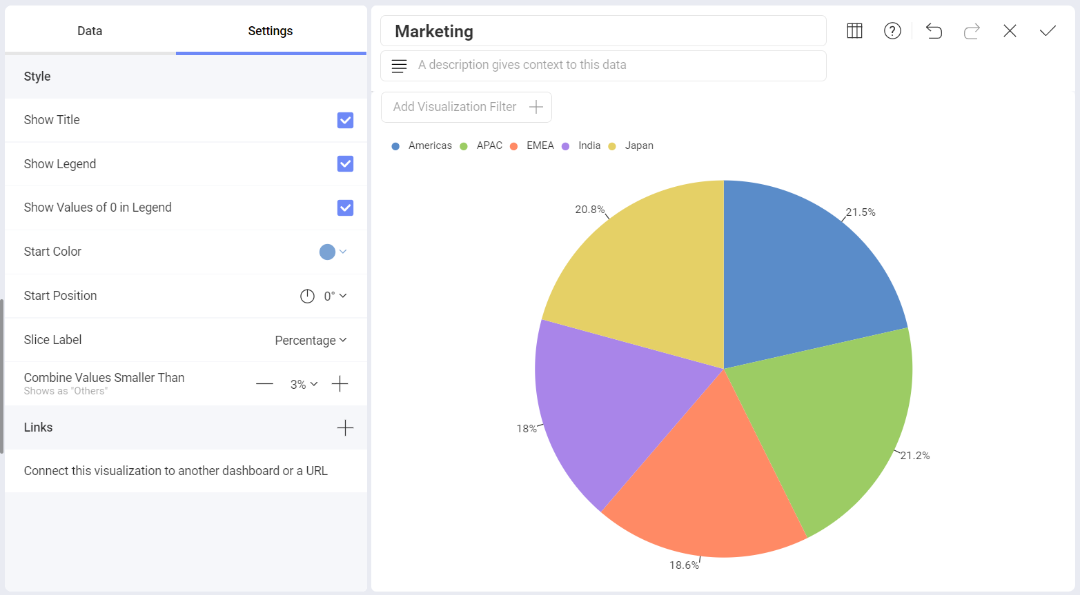
For Pie and Doughnut charts, you can configure the start position for the chart to rotate the slices and change the order in which your data is presented.
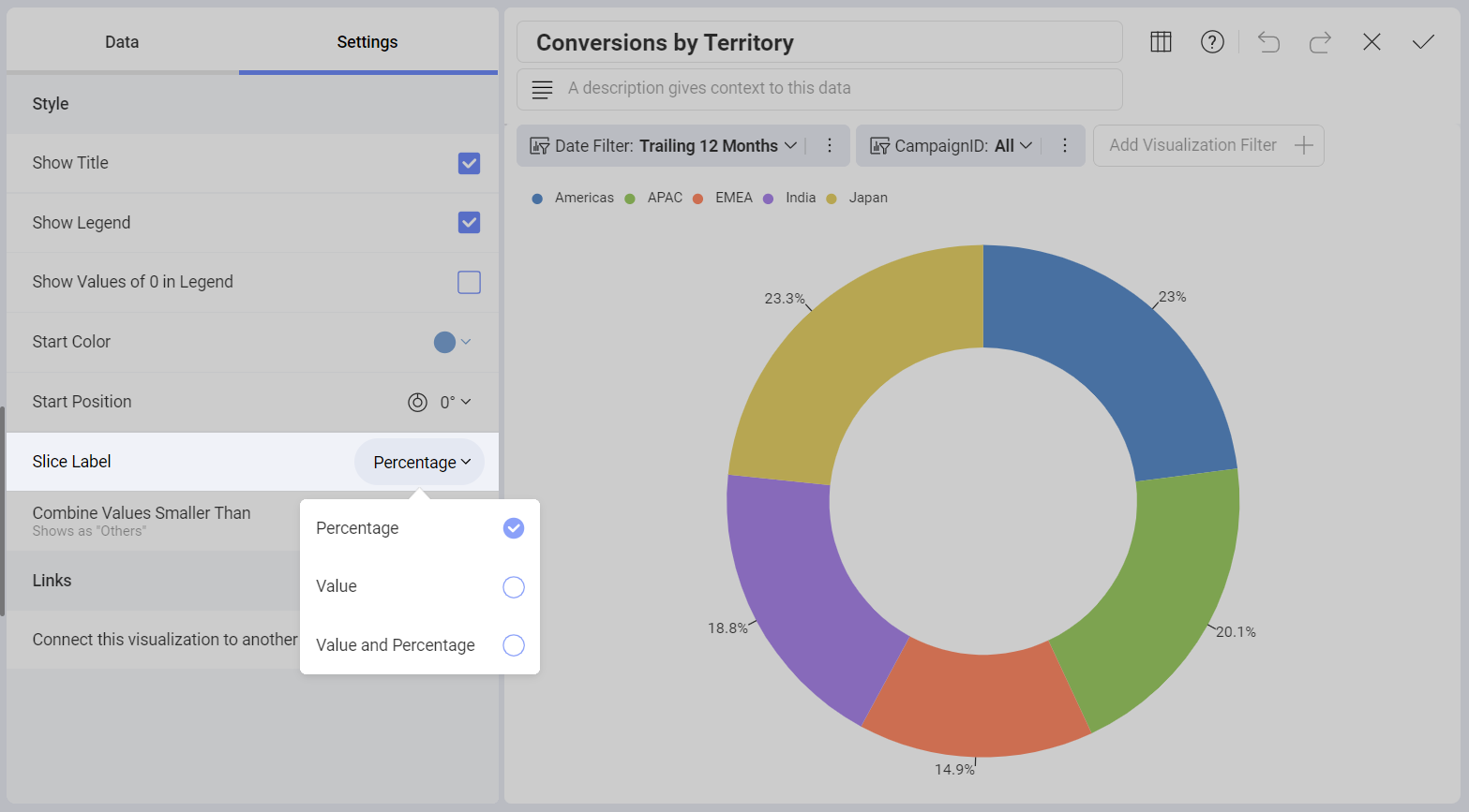
For Funnel, Pie, and Doughnut charts, you can configure slice labels in order for the visualization to display values, percentages, or both at the same time.
Enabling Pie and Doughnut Charts Legends to Show Elements with Value 0
The pie and doughnut visualization legends give you the option to see all the data in the field selected for Label, including elements with value zero.
To enable this setting, go to Settings in the Visualization editor and select Show Values of 0 in Legend, as shown in the screenshot below: