Combo Charts
This type of chart combines two or more chart types in one single chart.
Regular charts usually have one X-axis and one Y-axis. Combo charts can have two Y-axis, allowing you to display two different types of data points in the same chart.
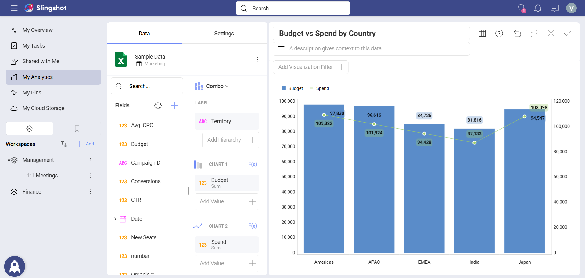
E.g., as shown below, a combo chart can display Budget vs Spend based on Territory.
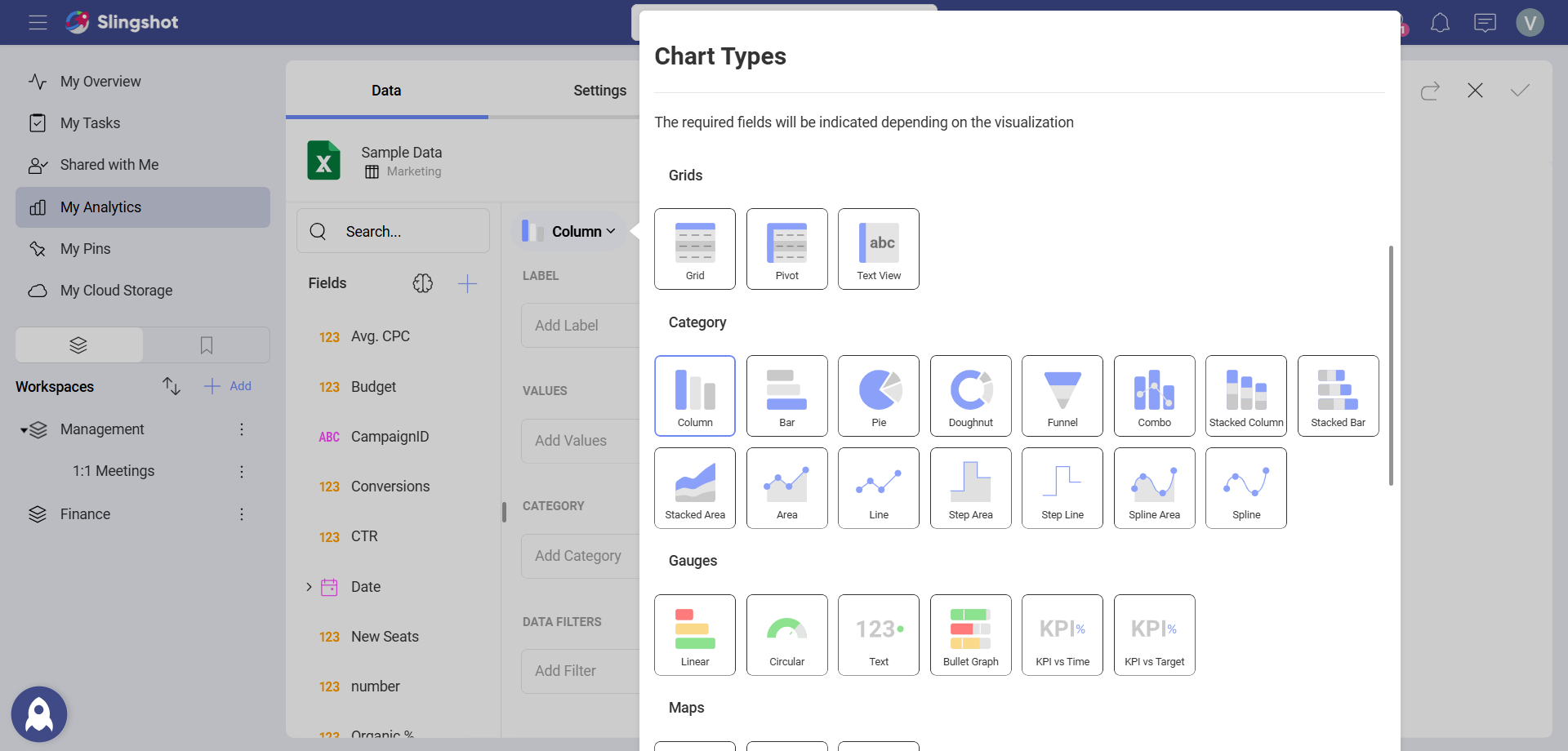
To create a combo visualization, you need to:
Select your data source.
Choose the Combo chart from the list of chart types.
- Configure the label and values for both charts.

Settings for Combo Charts
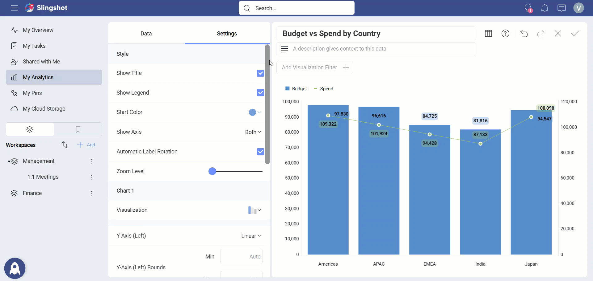
In Settings you can:
Choose the Style. - You can enable the Title, Legend or choose the Start Color.
Hide or show Axis.
Enable the Automatic Label Rotation.
Adjust the Zoom Level.
Change the visualization type for one or both charts. - You can choose between seven available types (Column, Stacked Column, Area, Line, Step Area, Step Line, and Spline Area).
Choose between Linear scale or Logarithmic. - With Logarithmic, the scale for your values will be calculated with a non-linear scale which takes magnitude into account instead of the usual linear scale.
Set up the minimum and maximum values for your charts. - Minimum is set to 0 by default and maximum is calculated automatically depending on your values.
Choose to share the left axis for both charts. - A left and right axis are used by default.
Switch the chart on top. - Analytics applies opacity to the chart displayed behind, to make it visually more transparent.