Gauge Charts
The Gauge chart displays a single value, or a list of values, comparing them with range thresholds. The gauge also allows for conditional formatting of the different ranges. In Slingshot, you can use the following gauge charts: Linear, Circular, Text, KPI and Bullet Graph gauges.
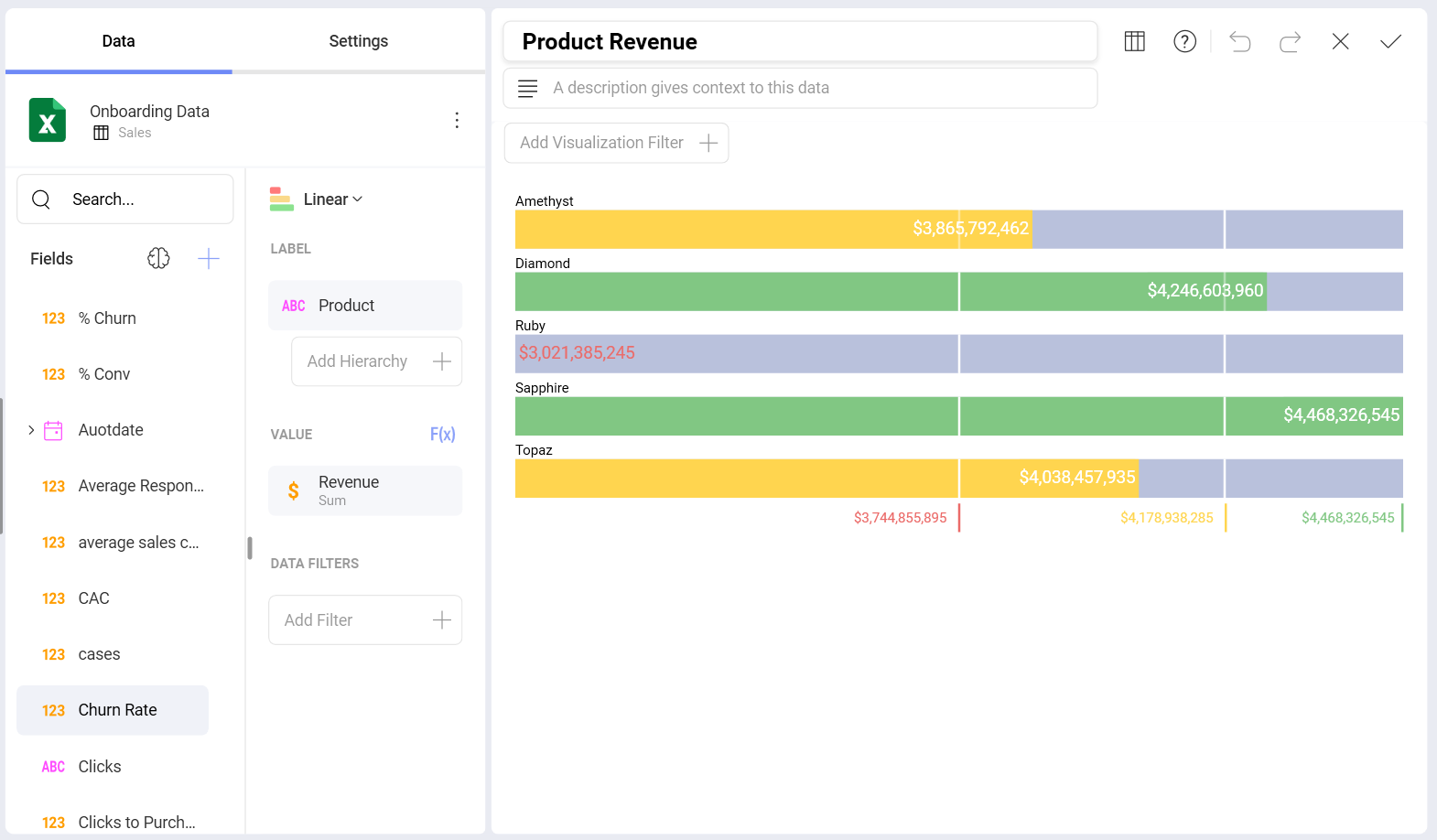
Linear Gauge
The Linear gauge displays a label, the value of which is taken from the Label placeholder configuration, and a value that comes from the configured Value placeholder. The value is charted as a rectangle, and is also displayed in a numeric format within its bounds or next to it. This gauge type is suitable for comparing the values of different rows side by side.
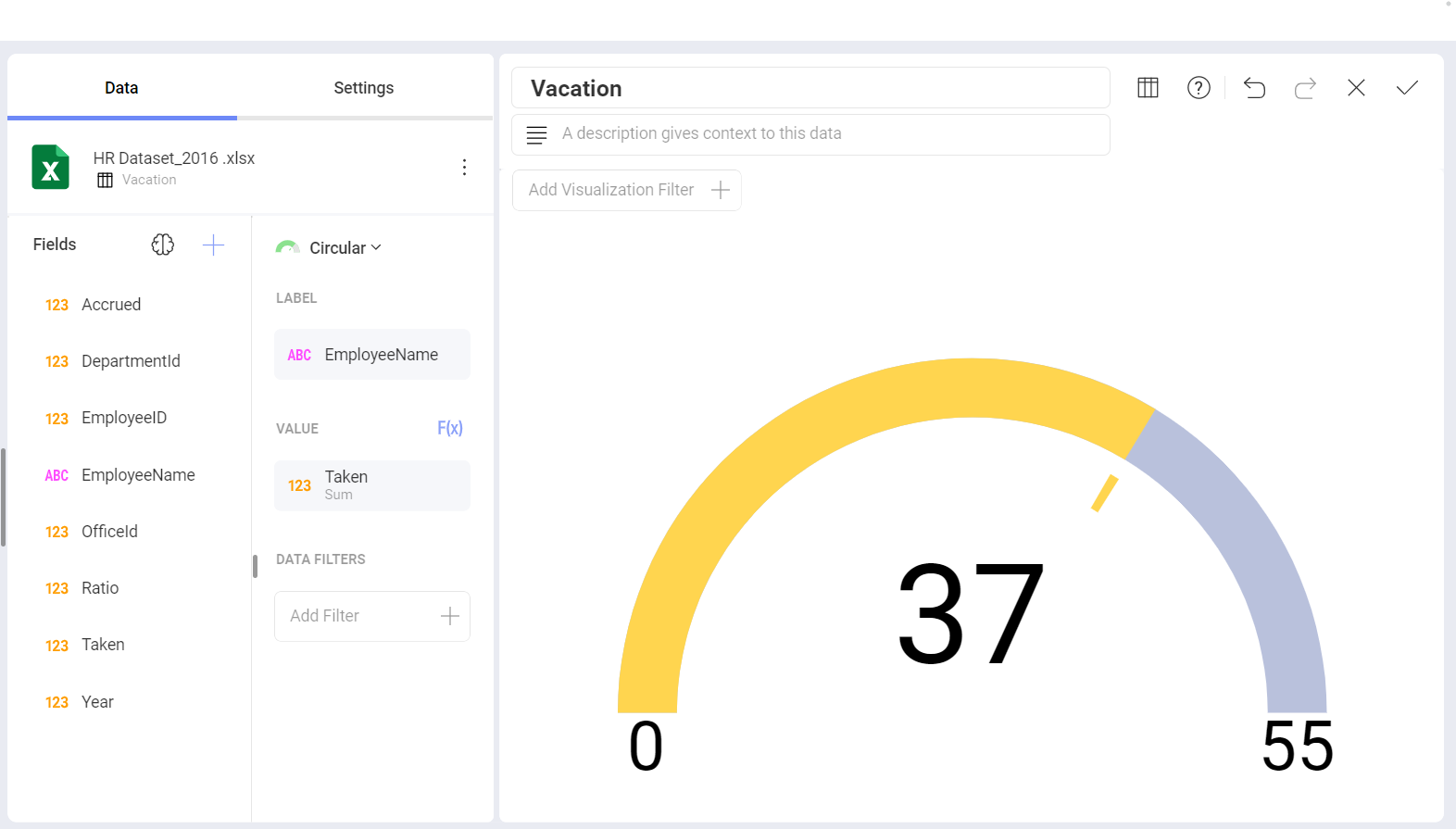
Circular Gauge
The Circular Gauge displays the band's minimum and maximum thresholds, and the current value. It also paints the background with the color of the current range.
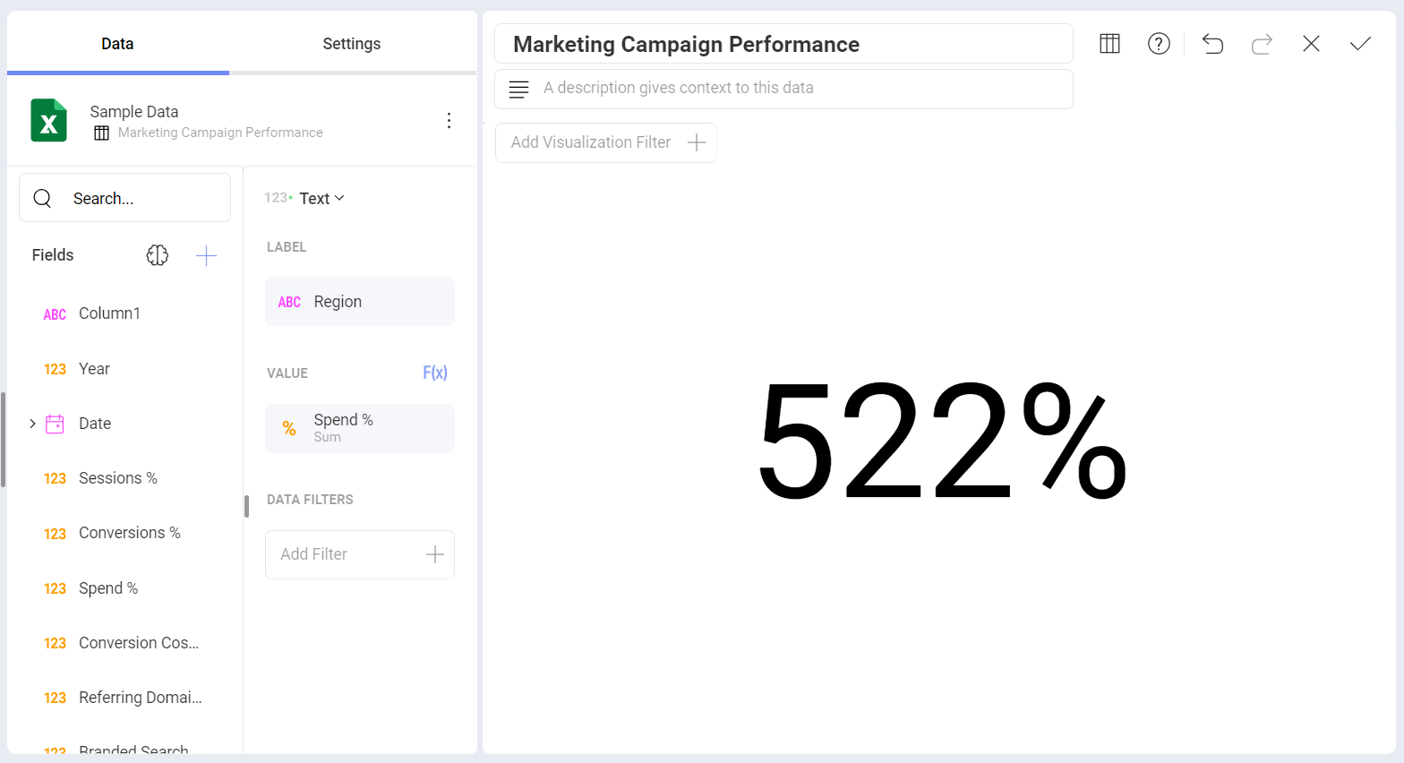
Text Gauge
The Text Gauge displays the Value column data in a large font. This flavor is suitable for very high priority metrics. By default, the gauge will visualize the data from the Value column for the first data row unless any filters are applied so that the chosen data row is different.
Bullet Graph
The Bullet is very similar to a Linear gauge. It displays a label from the Label placeholder and a value from the Value placeholder. The value is charted as a horizontal line, and it is also displayed on the right in a numeric format.
The Bullet Graph adds a new visual indicator to the Linear gauge, a vertical mark that is based on a target value from the Target placeholder. This new indicator is retrieved from a numeric column, meaning that you need two numeric columns and a text column to configure this chart.
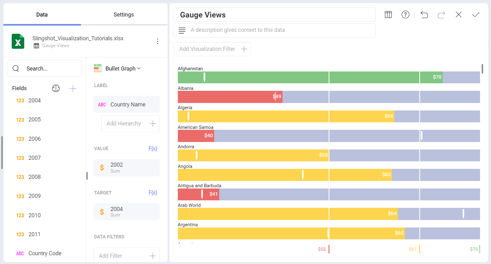
The Bullet is useful for comparing values side by side, while also evaluating the performance from the value (horizontal line) against the target value (vertical mark).
Bands Configuration
All gauge types have a common band range configuration, which you can find in the Settings section of the Visualization Editor. The configuration dialog allows you to:
Set Limits. These values are automatically set as the lowest and highest values in the dataset for the specified value column, but can also be overridden manually with constant values.
Configure Conditional Formatting.
While setting the band configuration, you need to establish two thresholds to split the range in three spaces. The thresholds can be defined as percentage or constant values. Additionally, the definition of the color to associate to each band is configured here. By default, the upper band is colored green, the middle yellow, and the lower in red.
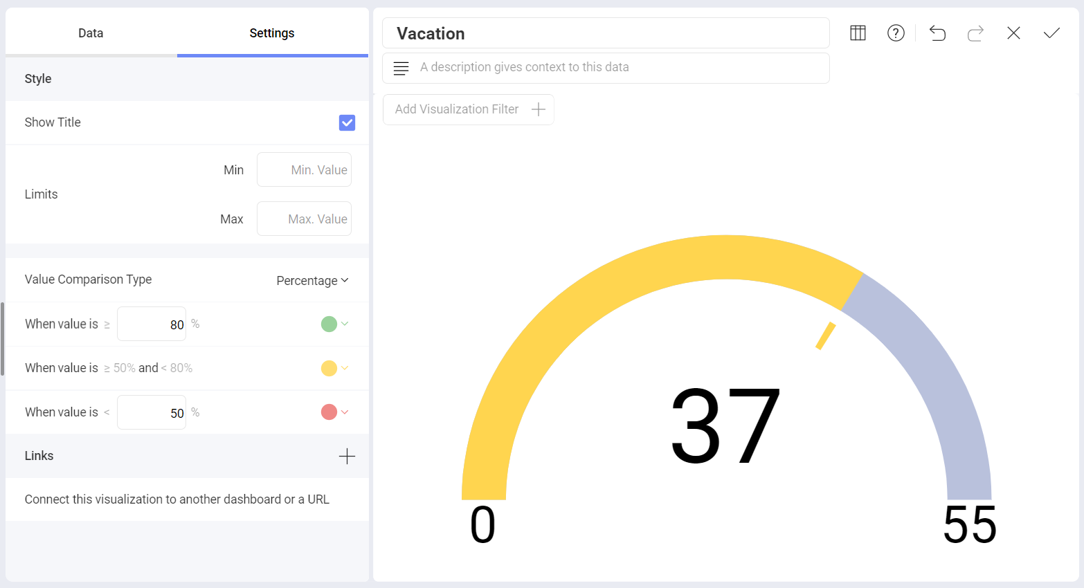
Band Configurations are based on your original data, not on the formatting applied through Analytics. In the circular gauge above, the original data is expressed in percentages, even though the visualization was formatted to display a number. Therefore, the selected Value Comparison Type is Percentage, and the ranges are defined as percentages and not numbers.