Sparkline Charts
Sparkline charts are small charts plotted within a grid chart, without any axes, labels or other chart elements. They are meant to represent trends and their progression in a given date range.
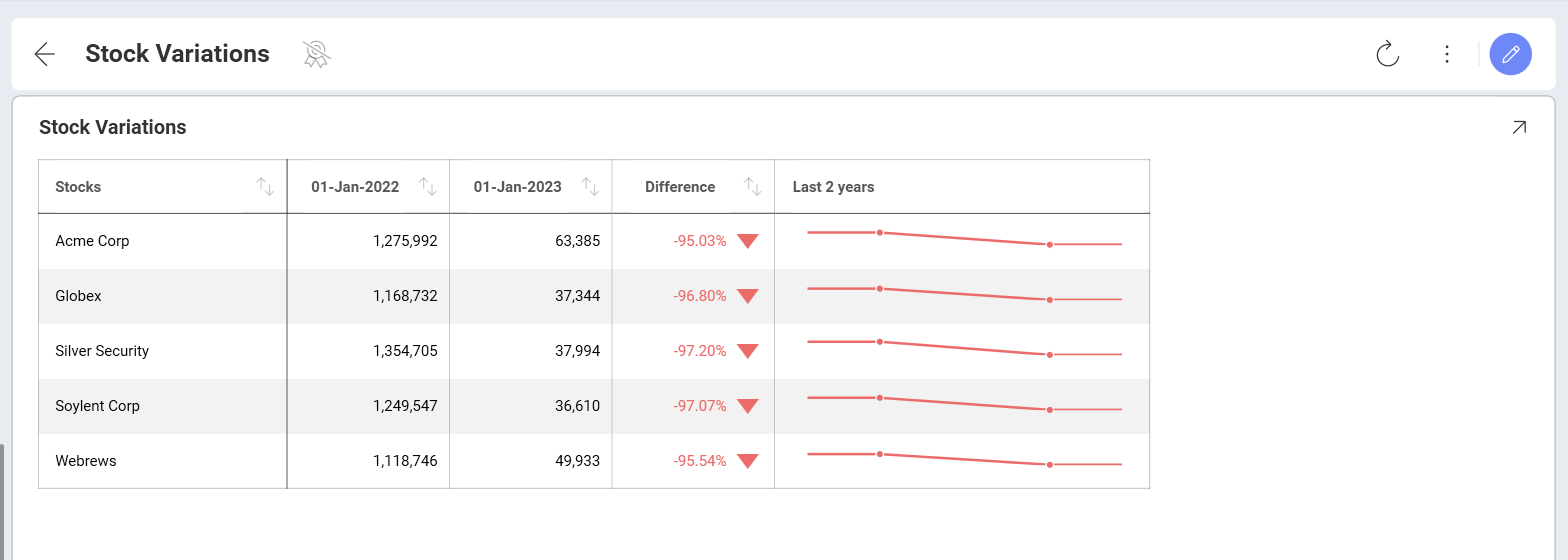
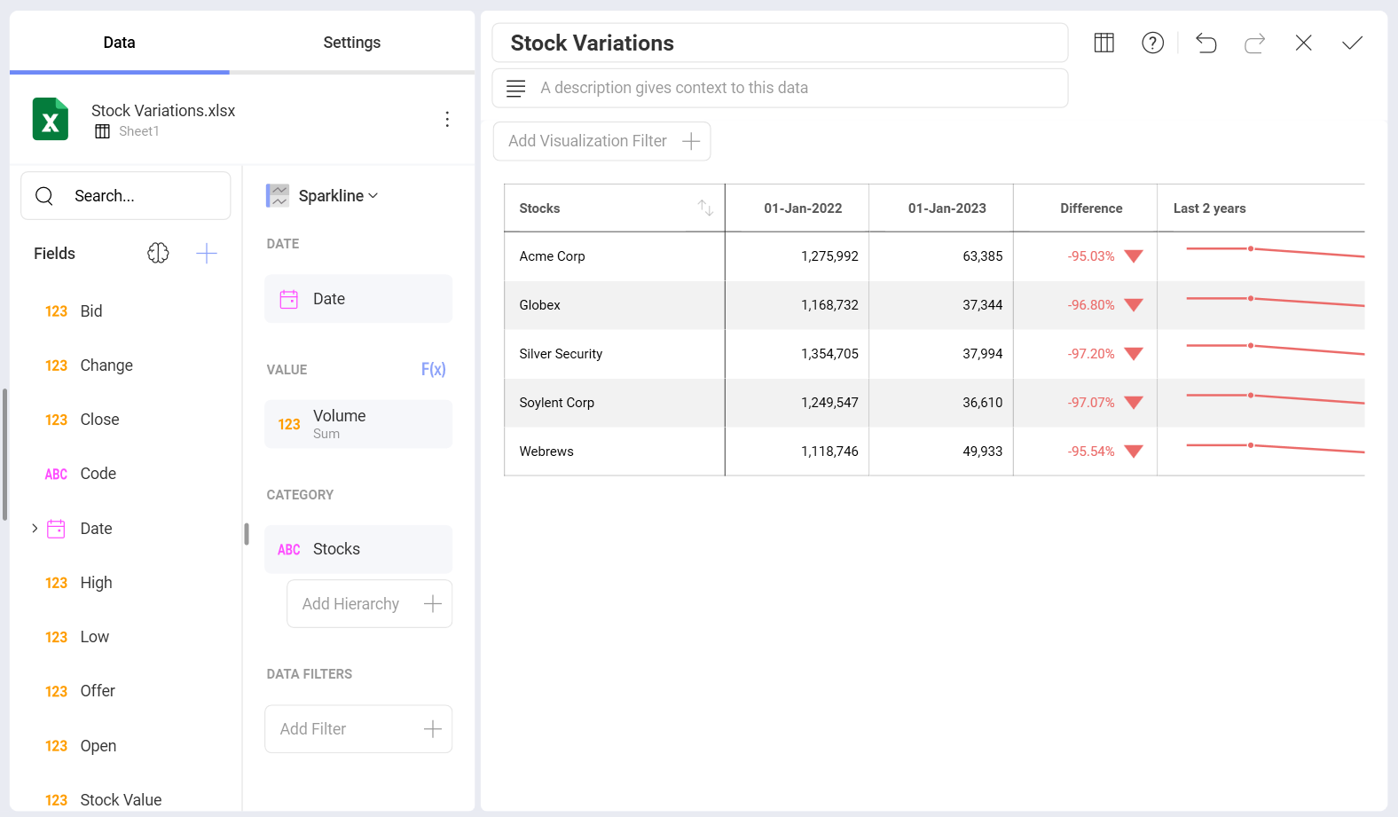
The first column remains fixed in the Visualization Editor, allowing you to scroll through the different columns in your information.
Advanced Sparkline Settings
If you access the Settings section of the visualizations editor, you will be able to modify several settings, including:
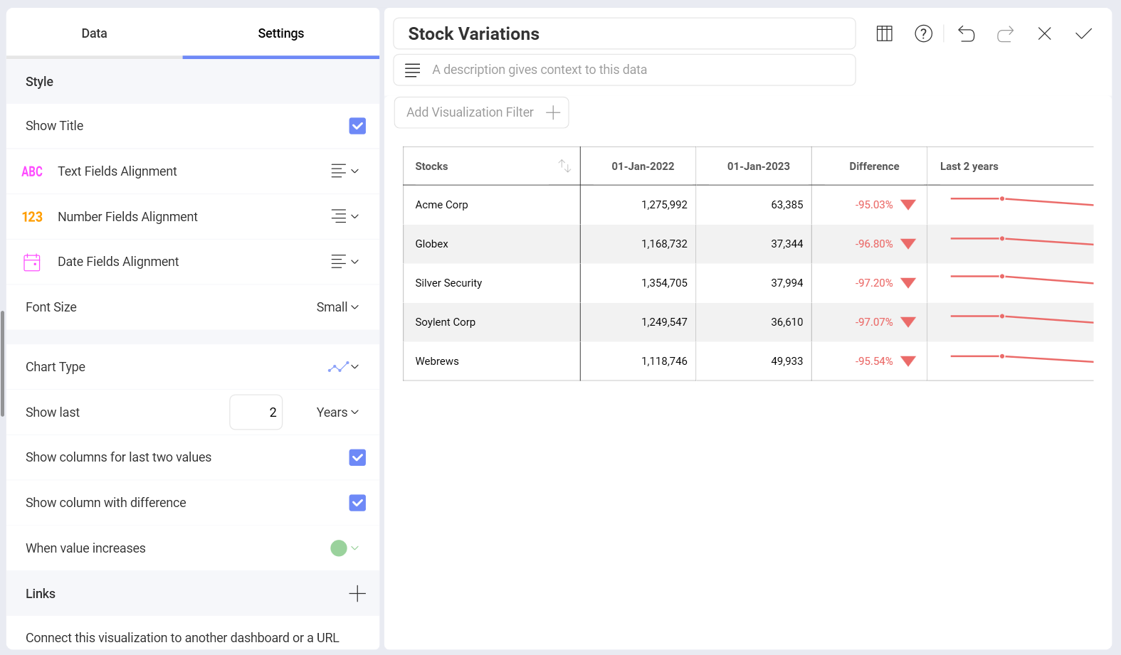
Alignment for texts, numbers, and dates.
Font sizes for your grid elements.
The type of chart for your sparkline: line or area charts.
The Aggregation for your dates.
The number of values you want to include in the sparkline chart within the grid.
The information you want to include in your sparkline columns, including the last two values and the difference between them. In addition, you can also choose whether you want to represent a positive difference in green or red.