Visualization Quick Filters
At a visualization level, you can also apply "quick" filters, which allow you to dynamically filter the visualization contents as the quick filter selection changes. These become part of the dashboard definition and can't be modified by consumers of the dashboard.
In order to define a quick filter, select the Add a Visualization Filter button on top of your visualization in the Visualization Editor:
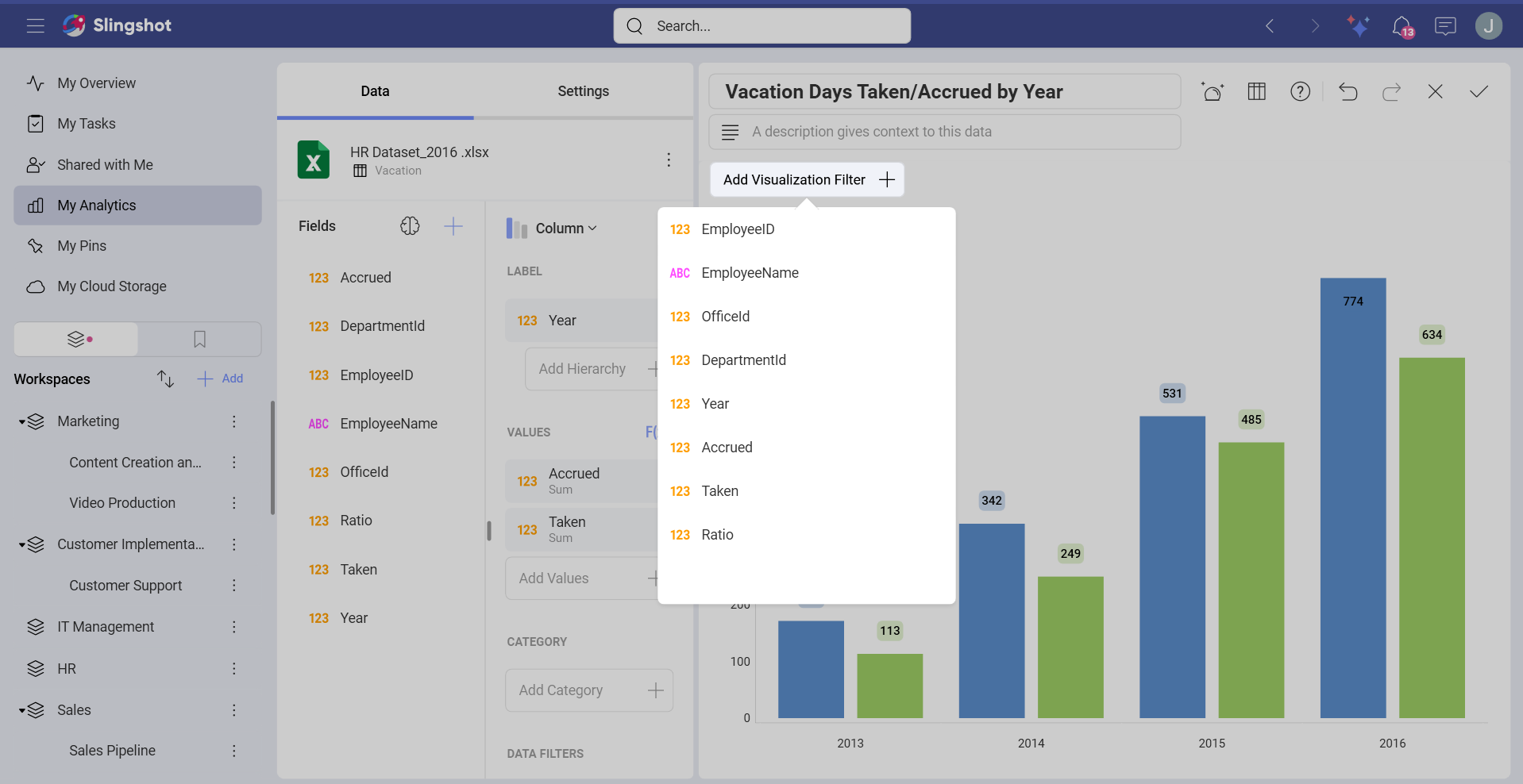
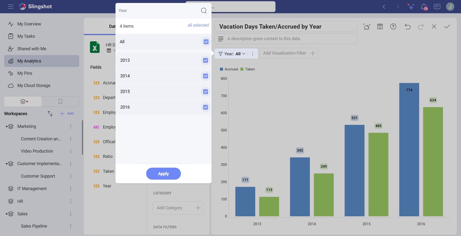
The filter options displayed in the Visualization Filters area depend on the data type of the field. There are three different filter dialogs: text, numeric and date fields. Once created, the quick filter will be displayed on top of your visualization in the Visualization Editor.
When the visualization is maximized in Dashboard View mode, you will see it under the visualization's title.
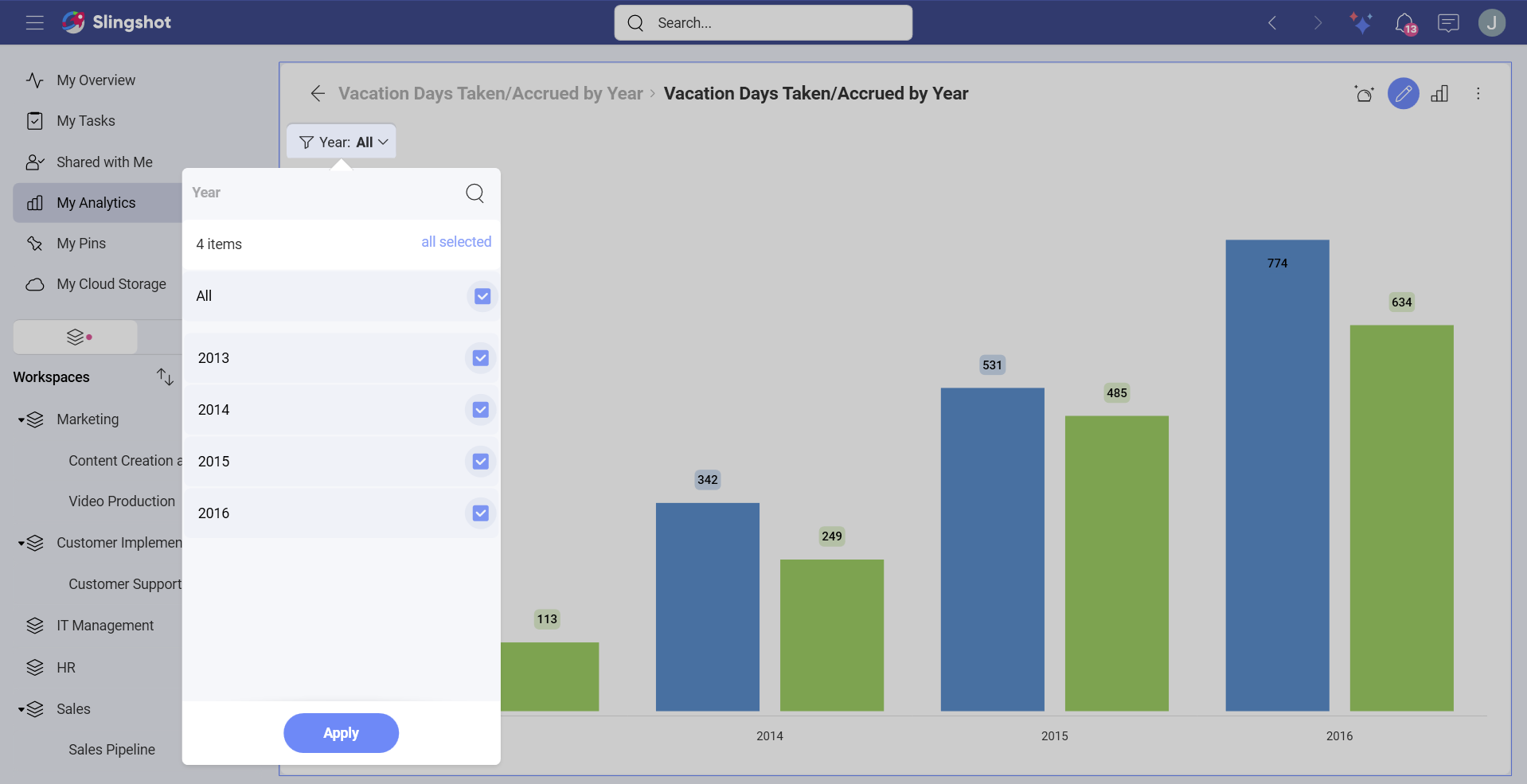
As with Dashboard Filters, this enables a dynamic filtering of the visualization contents as the quick filter selection changes.
Cascading Filters
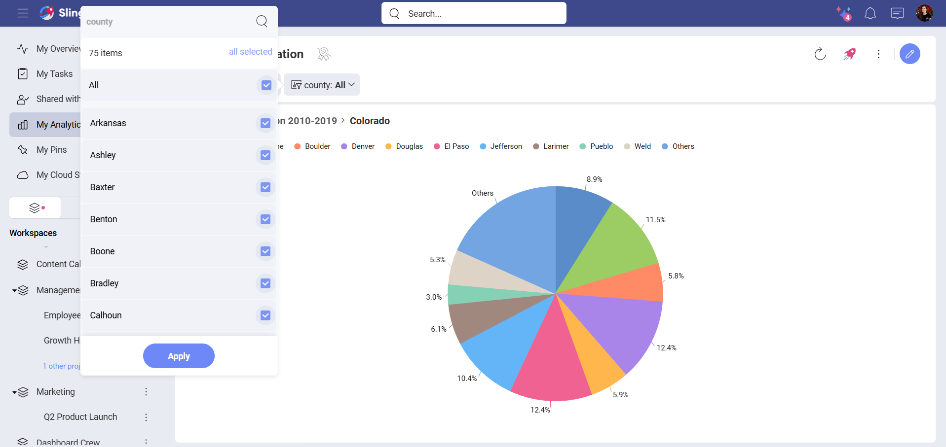
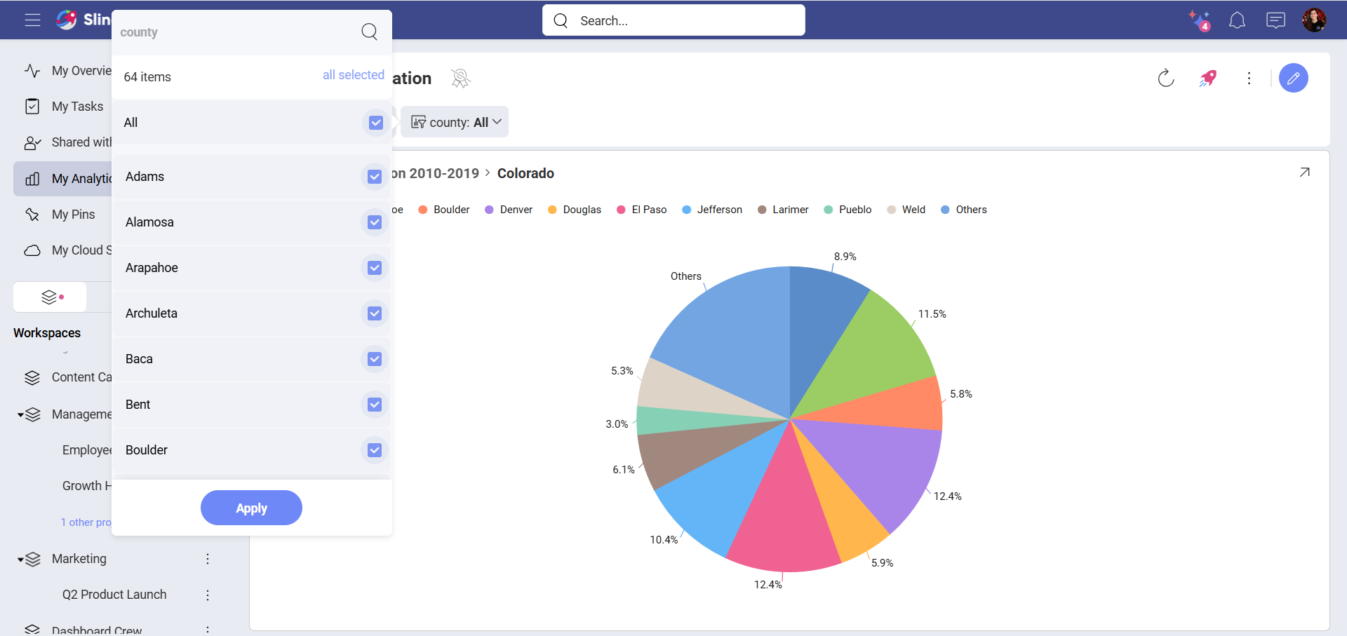
The list of possible values displayed to select from in Quick Filters will be filtered based on previous Quick Filter selections. Fields on the left take precedence and determine the list of possible values on filters to the right.
For instance, in the example below, the State filter was created first, and the County filter was created after that one. After selecting Colorado as a State, the County list was the following:
However, if you select Arkansas instead, the list of County will be a different one.