Creating Gauge Visualizations
In this tutorial, you will learn how to create Gauge visualizations using a sample spreadsheet.
Access the links below for the gauge view walkthroughs:
Key Concepts
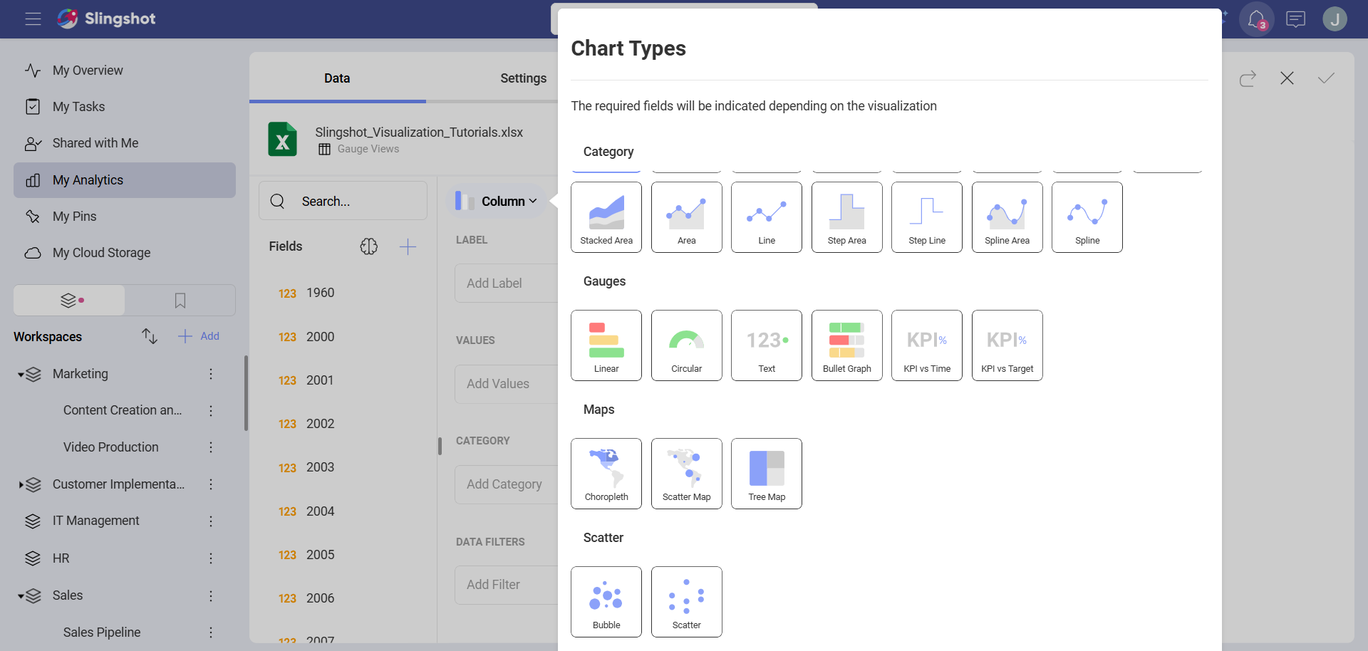
There are two different layouts to choose from when using gauge charts:
Bounds Configuration. The bounds configuration for gauges covers the lowest and highest possible values in your gauges. It is usually set to the lowest value in your data source by default, but you can change it to exclude specific data.
Bands Configuration. The bands configuration allows you to establish three different ranges for your information (Higher than, between, and Less than). You can override the default values with ranges tailored to your data source.
Sample Data Source
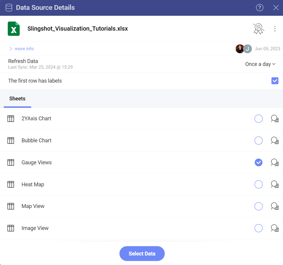
For this tutorial, you will use the Gauge Views sheet in the Slingshot Visualization Tutorials.
Note
Excel files as local files are not supported in this release. In order to follow these tutorials, make sure you upload the file to one of the supported cloud services or add it as a Web Resource.
Creating a Linear Gauge
Depending on where you want to save the dashboard, you can open a dashboard list in My Analytics, a workspace or a project. You can always move the dashboard to another location later on.
Click/tap on the + Dashboard button.
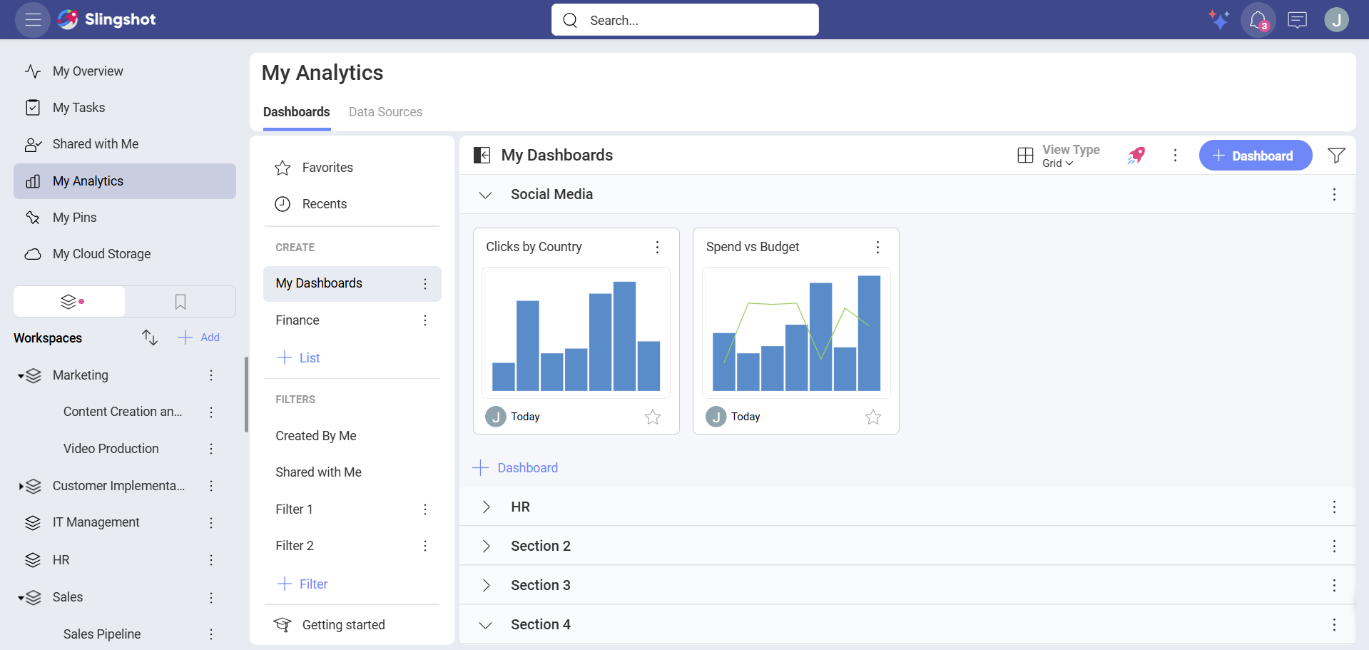
Select your data source (Slingshot Tutorials Spreadsheet) from the list of data sources. If the data source is new, you will need to first add it from the + Data Source button in the top-right corner.
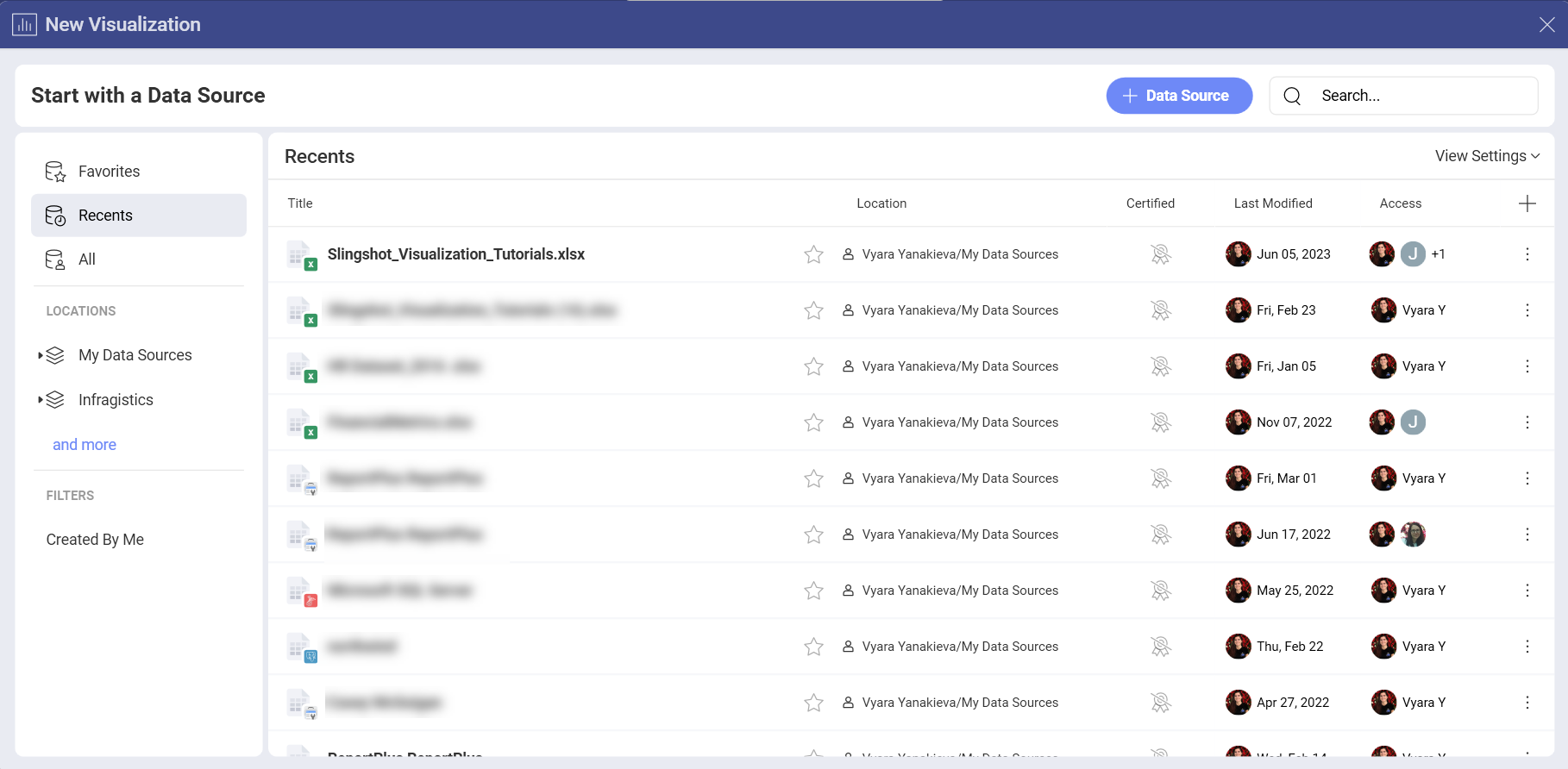
Choose the Gauge Views sheet.
Open the Visualization Picker and select Linear Gauge.
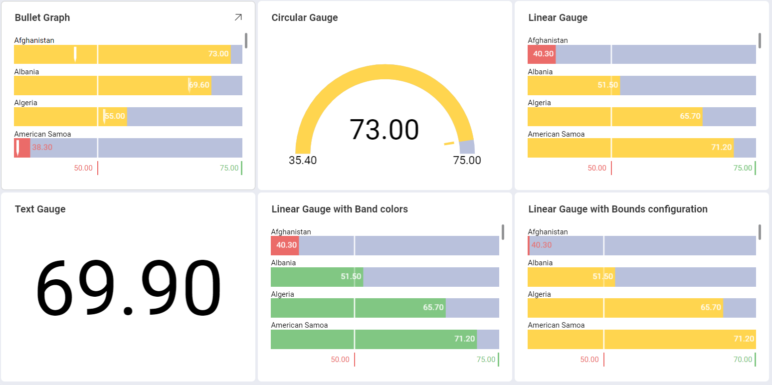
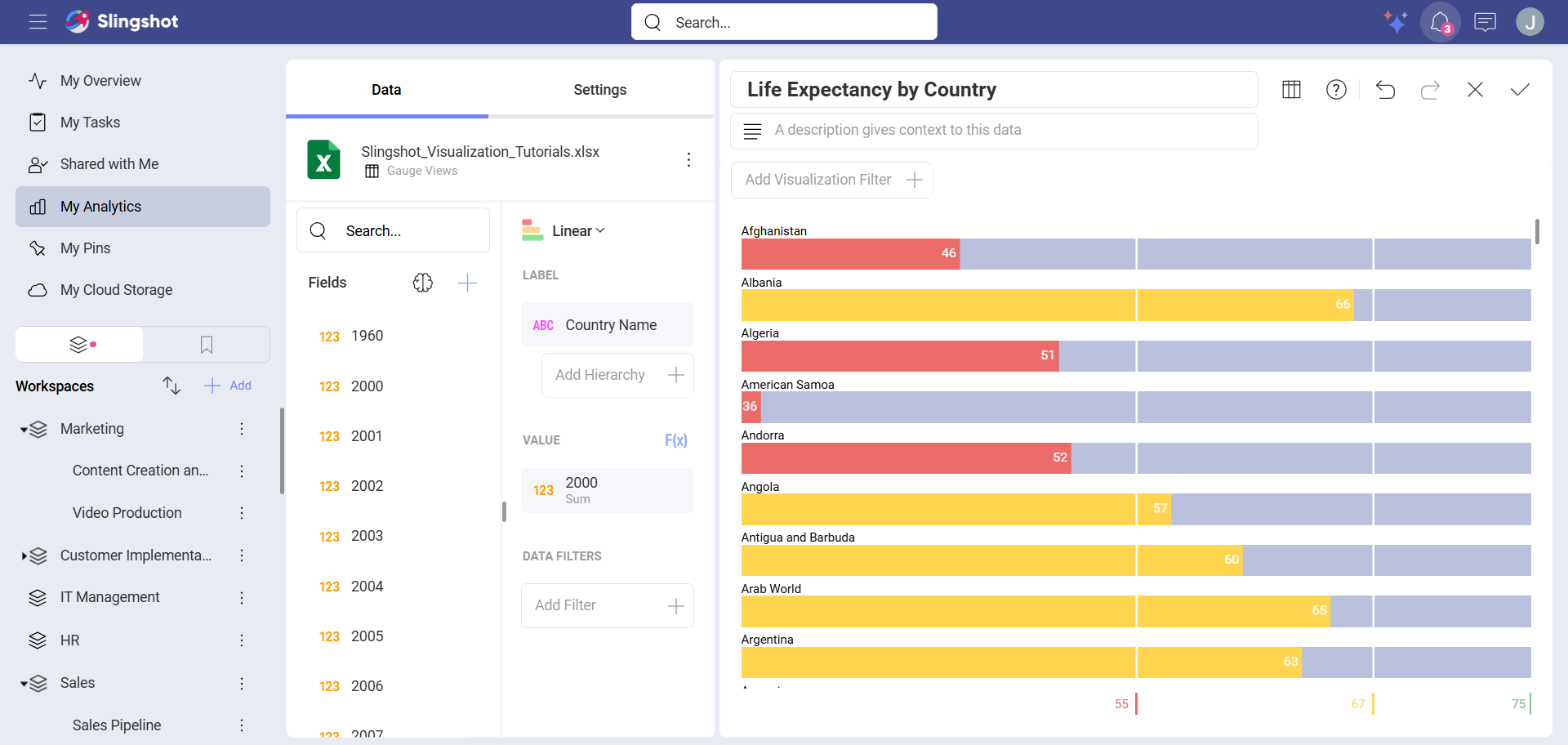
This linear gauge, for example, will display Life Expectancy by Country. Drag and drop the Country Name field to Label and one of the Year fields into Values.
Creating a Circular Gauge
Depending on where you want to save the dashboard, you can open a dashboard list in My Analytics, a workspace or a project. You can always move the dashboard to another location later on.
Click/tap on the + Dashboard button.
Select your data source (Slingshot Tutorials Spreadsheet) from the list of data sources. If the data source is new, you will need to first add it from the + Data Source button in the top-right corner.
Choose the Gauge Views sheet.
Open the Visualization Picker and select Circular Gauge.
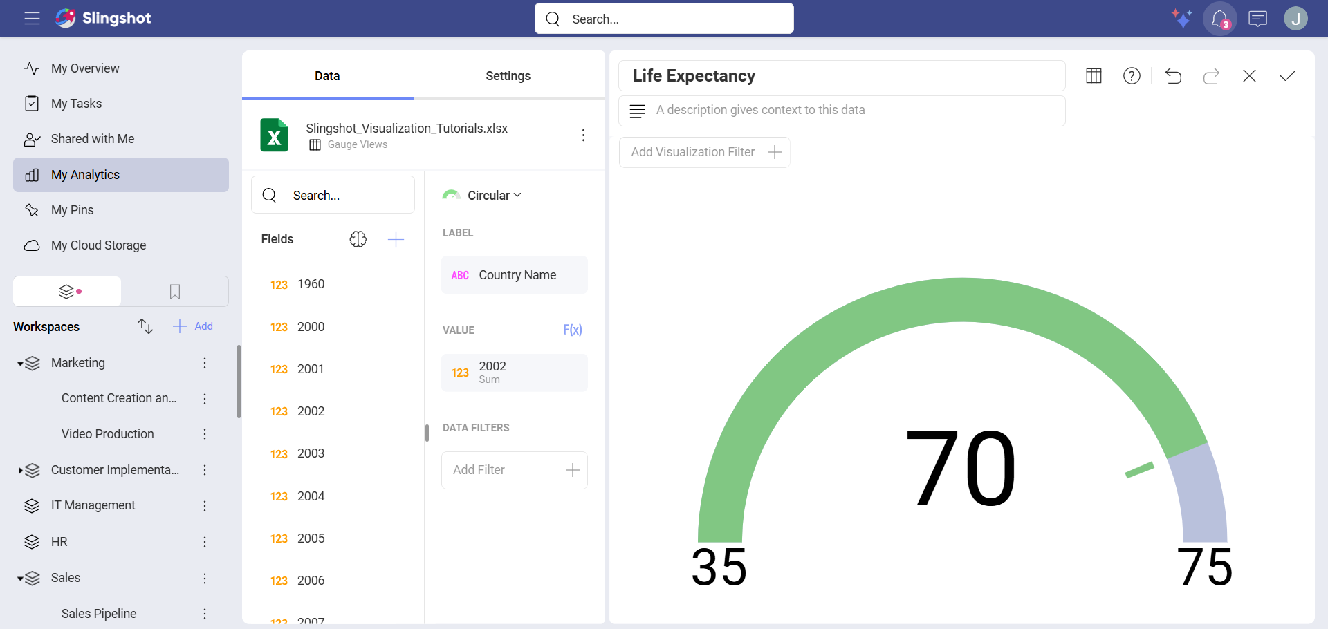
This linear gauge, for example, will display Life Expectancy by Country. Drag and drop the Country Name field to Label and one of the Year fields into Values.
Circular Gauges are particularly useful to show average values as well as sum of values. In order to change the aggregation for the field displayed in Values:
| 1. Access Field Settings for your Value | 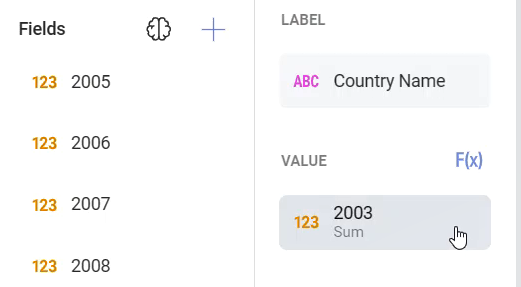 |
Select the field in Value to access |
| 2. Choose a different Aggregation | 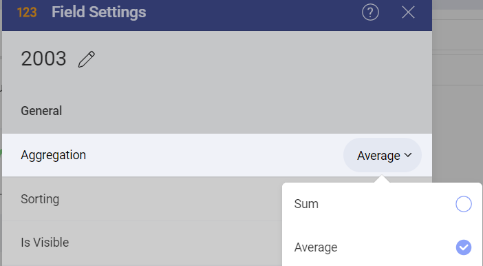 |
Expand the Aggregation drop-down and select a different option (for example, Average). |
Creating a Text Gauge
Depending on where you want to save the dashboard, you can open a dashboard list in My Analytics, a workspace or a project. You can always move the dashboard to another location later on.
Click/tap on the + Dashboard button.
Select your data source (Slingshot Tutorials Spreadsheet) from the list of data sources. If the data source is new, you will need to first add it from the + Data Source button in the top-right corner.
Choose the Gauge Views sheet.
Open the Visualization Picker and select Text Gauge.
This text gauge, for example, will display Life Expectancy by Country. Drag and drop one of the year fields into Values, and then the Country Name field into Data Filters. Then, select the specific country you want by selecting the field.
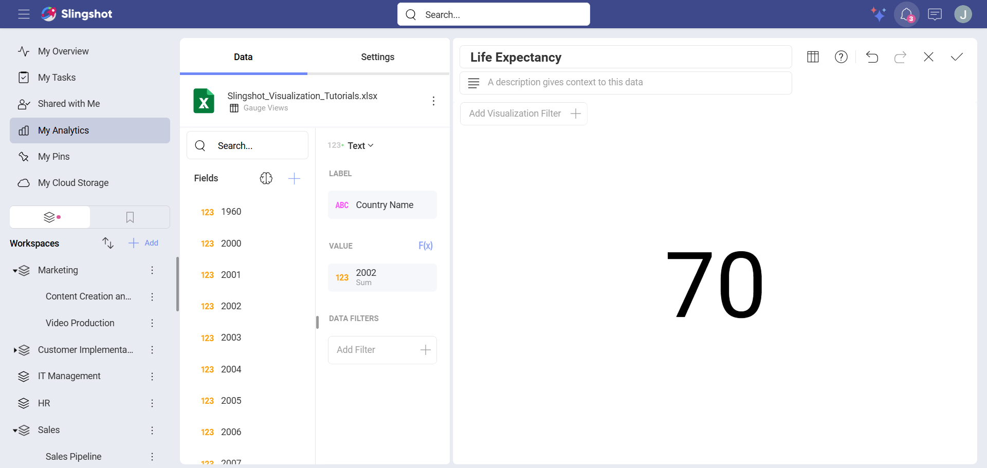
The text gauge sample above utilizes the average aggregation. In order to learn how to change your field's aggregation, review these instructions.
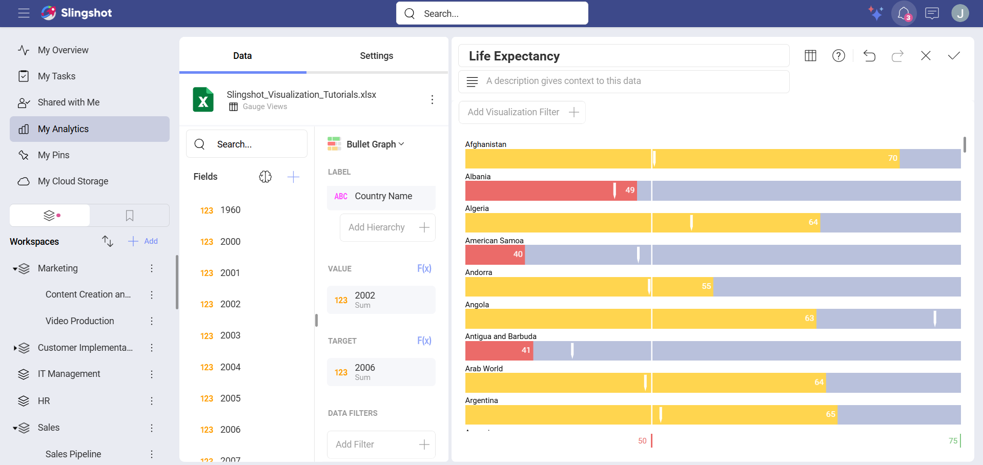
Creating a Bullet Graph
Depending on where you want to save the dashboard, you can open a dashboard list in My Analytics, a workspace or a project. You can always move the dashboard to another location later on.
Click/tap on the + Dashboard button.
Select your data source (Slingshot Tutorials Spreadsheet) from the list of data sources. If the data source is new, you will need to first add it from the + Data Source button in the top-right corner.
Choose the Gauge Views sheet.
Open the Visualization Picker and select Bullet Graph.
This bullet graph, for example, will display Life Expectancy by Country. Drag and drop the Country Name field to Label, one of the years into Values and another Year into Target.
Adding Bounds to your Gauge
Bounds allow you to set the lowest and highest values in your gauges. As mentioned in Key Concepts, you can change it to exclude specific data. In order to do this:
| 1. Change Settings | 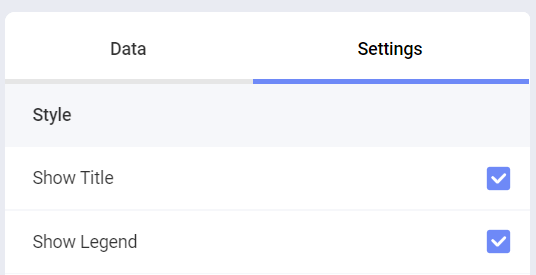 |
Go to the Settings section of the Visualization Editor. |
| 2. Change the Default selection in Limits | 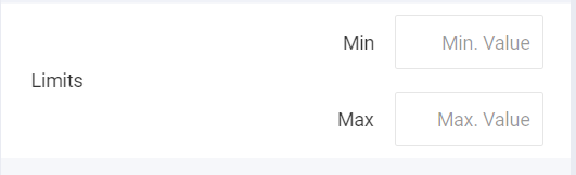 |
Depending on whether you want to set the minimum or maximum value (or both), enter the value you want the chart to start or end with. |
Changing Band Colors
The colors for the three different ranges (Higher than, Lower than and Between) can be changed between the predefined colors. In order to do so:
| 1. Change Settings | |
Go to the Settings section of the Visualization Editor. |
| 2. Access the Colors drop-down | 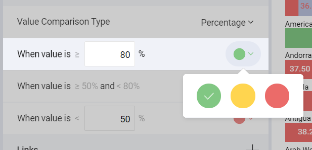 |
Expand the drop-down of the range for which you want to change the color. Select one of Slingshot's three predefined colors for your band color. |