Creating KPI Gauges
In this tutorial, you will learn how to a KPI gauge visualization using a sample spreadsheet.
|
|
|
|
|
Access the links below for the KPI gauge view walkthroughs:
Key Concepts
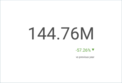
KPI gauges are meant to display performances and their variation within a given time period. To create them, you will need:
One field to be dropped into the Date placeholder of the data editor.
One field to be dropped into Value.
Sample Data Source
For this tutorial, you will use the "KPI View" sheet in the Analytics Tutorials Spreadsheet.
Note
Excel files as local files are not supported in this release. In order to follow these tutorials, make sure you upload the file to one of the supported cloud services or add it as a Web Resource.
Creating a KPI Gauge
| 1. Create a Dashboard |  |
In the dashboard viewer, select the + button in the top right-hand corner of the "My Dashboards" screen. Then, select "Dashboard" from the dropdown. |
| 2. Configure your Data Source | 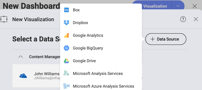 |
In the New Visualization window, select the + button in the bottom right corner and select your data source. |
| 3. Select the Tutorials Spreadsheet | 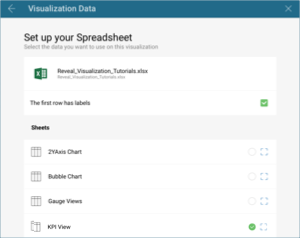 |
Once the data source is configured, select the Analytics Tutorials Spreadsheet. Then, choose the "KPI Gauge" sheet. |
| 4. Open the Visualizations Menu |  |
Select the grid icon in the top bar of the Visualization Editor. |
| 5. Select your Visualization | 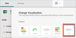 |
By default, the visualization type will be set to "Grid". Select the Sparkline chart. |
| 6. Organize your Data | 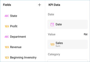 |
Drag and drop the "Date" field into "Date" and the "Sales" field into "Value". |
Creating Multiple KPI Gauges in one Visualization
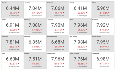
In order to create more than one KPI in one visualization, you will need to add a field to the category placeholder of the data editor.
| 1. Create a Dashboard | |
In the dashboard viewer, select the + button in the top right-hand corner of the "My Dashboards" screen. Then, select "Dashboard" from the dropdown. |
| 2. Configure your Data Source | |
In the New Visualization window, select the + button in the bottom right corner and select your data source. |
| 3. Select the Tutorials Spreadsheet | |
Once the data source is configured, select the Analytics Tutorials Spreadsheet. Then, choose the "KPI Gauge" sheet. |
| 4. Open the Visualizations Menu | |
Select the grid icon in the top bar of the Visualization Editor. |
| 5. Select your Visualization | |
By default, the visualization type will be set to "Grid". Select the Sparkline chart. |
| 6. Organize your Data | 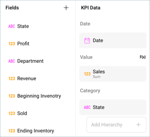 |
Drag and drop the "Date" field into "Date", the "Sales" field into "Value" and the "State" field into "Category". |
Changing the Date Comparison Type
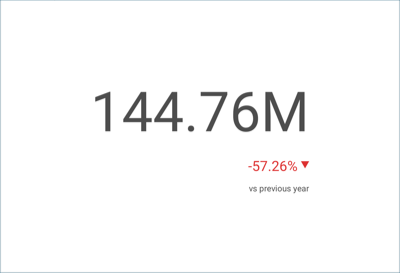
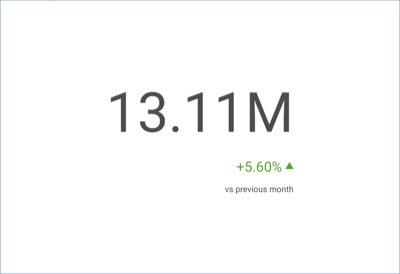
By default, the date type for your KPI Gauge will be Year-over-Year. You can change this by modifying the "Type" field. In order to do so:
| 1. Access the Settings Menu | 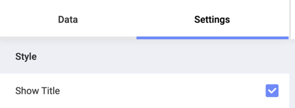 |
Go to the Settings section of the Visualization Editor. |
| 2. Change the Type | 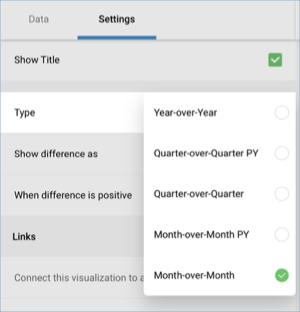 |
By default, the date type will be set to Year-to-Year. Select the dropdown next to Type, and change the selection to Month-over-Month. |
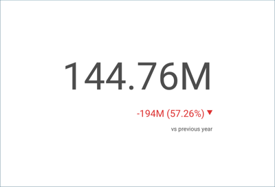
Changing the Difference Labels for the KPI Gauge
| 1. Access the Settings Menu | |
Go to the Settings section of the Visualization Editor. |
| 2. Change the Type | 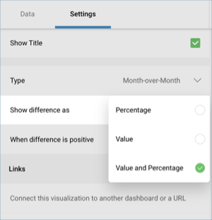 |
By default, the difference label will be set to "Percentage". Select the dropdown next to Show difference as, and change the selection to Value and Percentage. |
Changing the Color of the Difference Marker
The color for the marker in the KPI gauge will be set to green for positive values and red for negative values by default. There might be some cases, however, when you want to represent a decrease as a positive occurrence. In order to change this:
| 1. Access the Settings Menu | |
Go to the Settings section of the Visualization Editor. |
| 2. Change the Type | 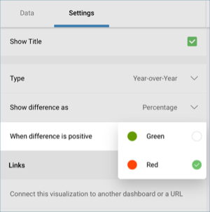 |
By default, the color of the marker will be set to green. Select the dropdown next to When difference is positive, and change the selection to red. |