Creating Sparkline Charts
In this tutorial, you will learn how to create Sparkline charts visualizations using a sample spreadsheet.
Access the links below for the Sparkline chart view walkthroughs:
Key Concepts
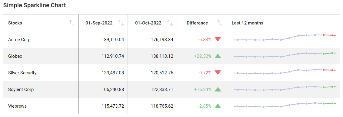
Sparkline charts are meant to display trends and their progression in a given date range. They are particular useful, like OHLC and Candlestick charts, for financial scenarios and stock movement analysis. Sparklines display line charts within a grid cell and require:
One field to be dropped in the Date placeholder of the data editor.
One field to be dropped in Value.
One field to be dropped into Category.
When working with Sparkline charts, you can add, modify, or remove information on top of the data you want to display. This comes in the form of:
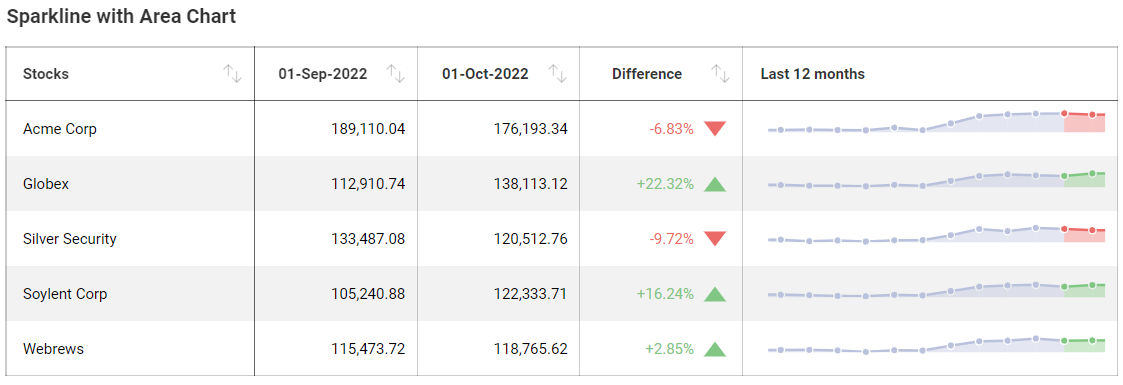
The chart type for your sparkline, which can either be a Line or Area chart.
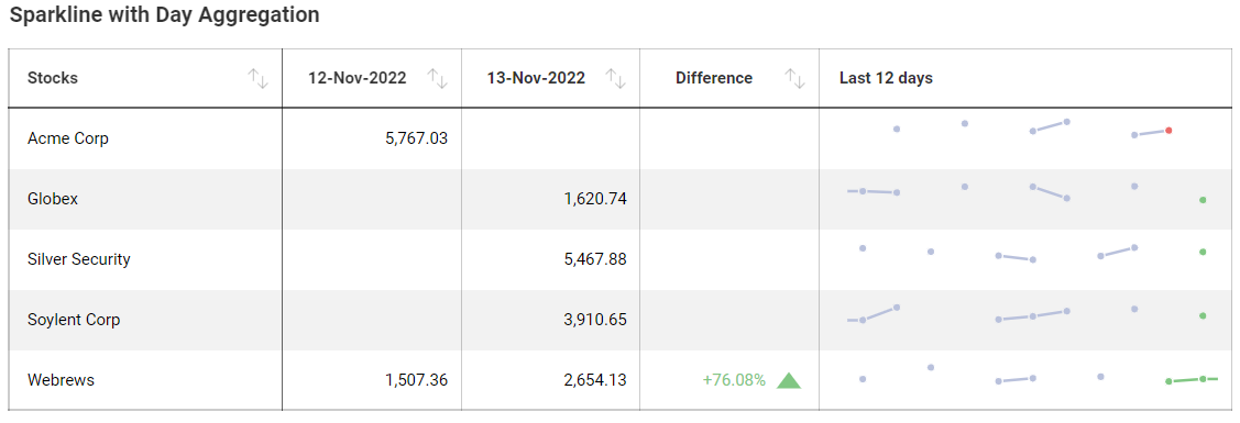
The aggregation for the dates in your chart.
The number of values displayed within that same chart.
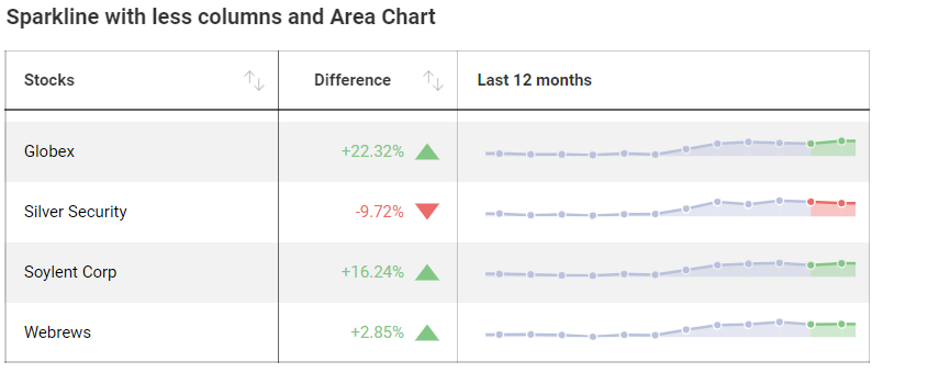
The explicit information you want to include in your sparkline's grid, including whether or not you want to include the last two months in your data and the difference between them.
Sample Data Source
For this tutorial, you will use the Sparkline Charts sheet in the Slingshot Visualization Tutorials.
Note
Excel files as local files are not supported in this release. In order to follow these tutorials, make sure you upload the file to one of the supported cloud services or add it as a Web Resource.
Creating a Sparkline Chart
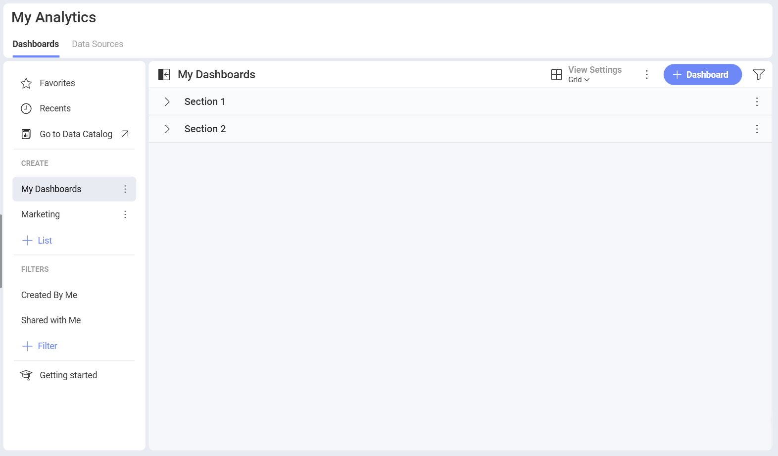
Select the + Dashboard button in the top right-hand corner of My Analytics.
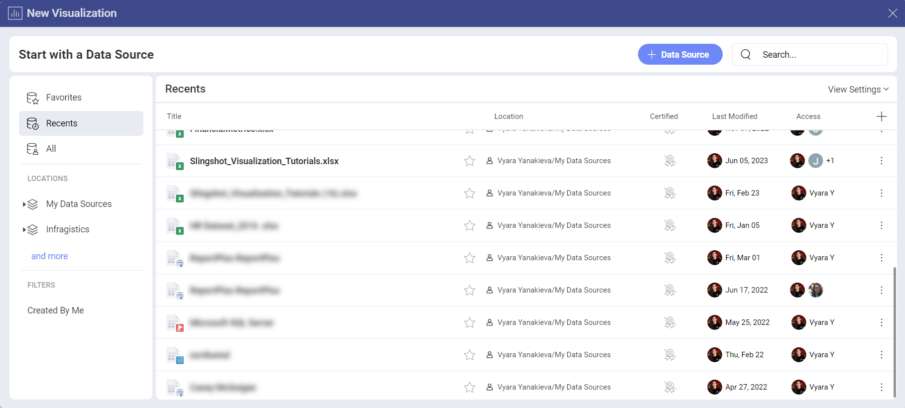
Select your data source (Slingshot Tutorials Spreadsheet) from the list of data sources. If the data source is new, you will need to first add it from the + Data Source button in the top-right corner.
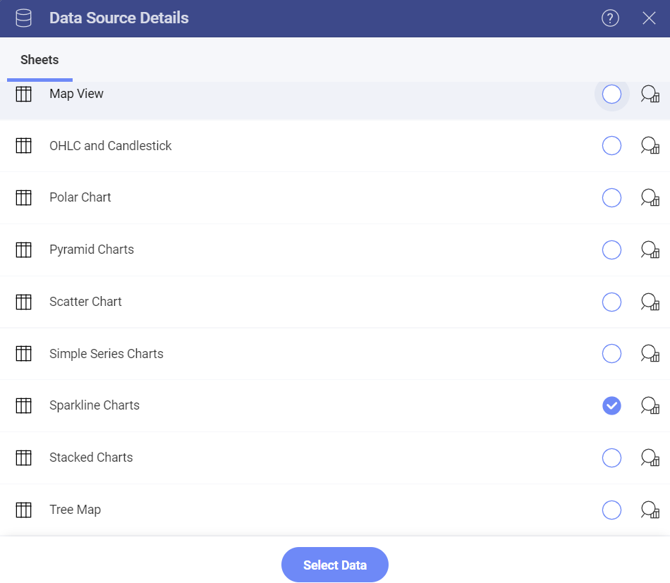
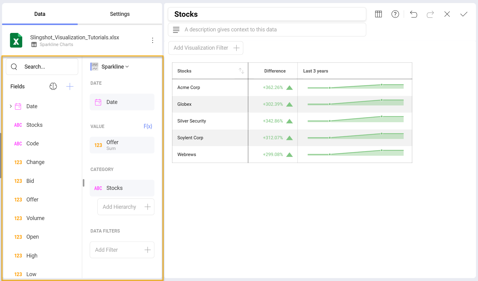
Select the Sparkline Charts sheet.
Open the Visualization Picker and select the Sparkline Chart. By default, the visualization type will be set to Column.
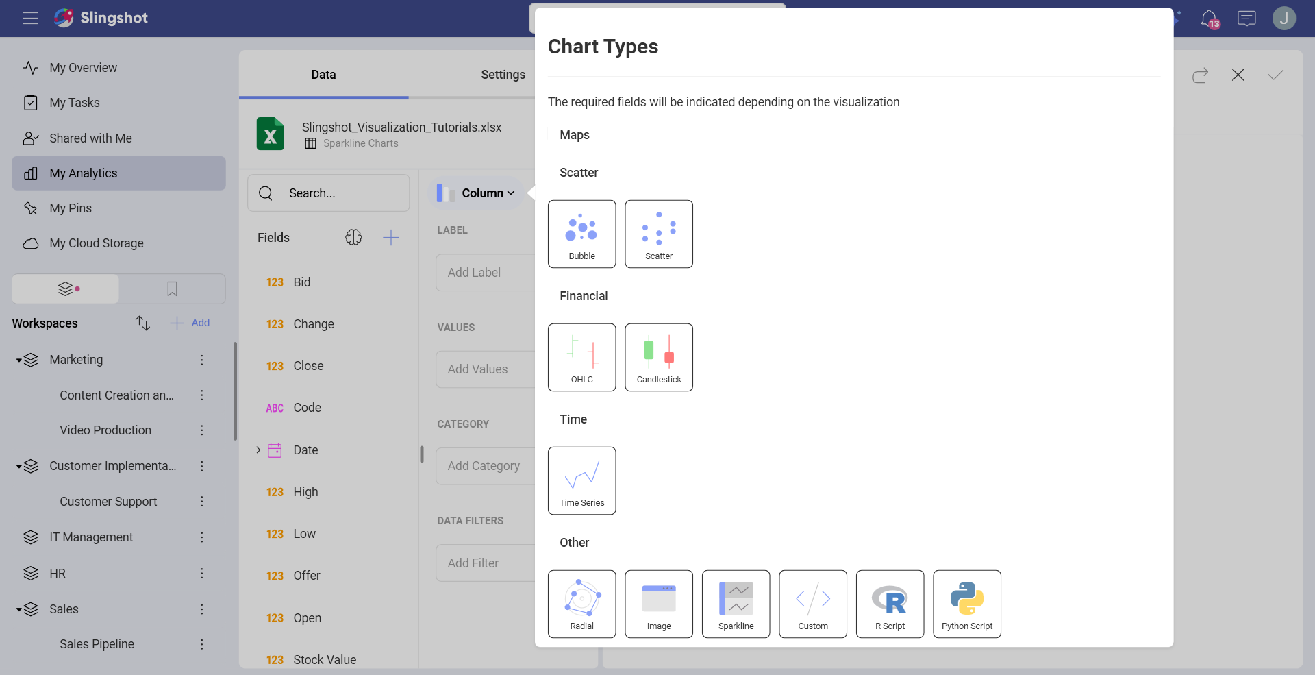
Drag and drop the Date field into Date, Offer into Value and Stocks into Category.
Changing the Chart Type for the Sparkline
You may want to change the type of chart you want to use for your sparkline chart. In order to do this:
| 1. Access the Settings Menu |  |
Go to the Settings section of the Visualization Editor. |
| 2. Change the Chart Type | 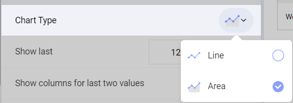 |
By default, the chart type will be set to line. Set it to Area. |
Changing the Date Aggregation
By default, the aggregation for your information will be 12 months. You can change this by modifying the Show Last settings. In order to do so:
| 1. Access the Settings Menu | |
Go to the Settings section of the Visualization Editor. |
| 2. Change the Aggregation | 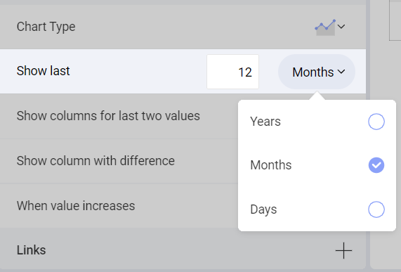 |
By default, the Show Last setting will be set to Months. Select the dropdown next to Months and change the selection to either Years or Days. |
You can also choose to display more or less data by changing the number next to the date's aggregation.
Modifying the amount of columns in the Sparkline
In Slingshot, the amount of columns in the visualization is defined by whether or not you want to display the last two months and the difference between them. By default, these will be enabled. In order to remove them:
| 1. Access the Settings Menu | |
Go to the Settings section of the Visualization Editor. |
| 2. Change the Displayed Columns | 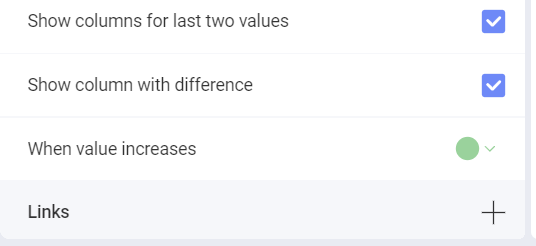 |
Uncheck the "Show columns for last two values" or "Show column with difference" boxes if you do not want to display either of them in the Sparkline. |