Time Series Charts
A Time Series chart is used to display data points indexed in time order. It is commonly used to detect trends at a glance, allowing an easy observation of development over time.
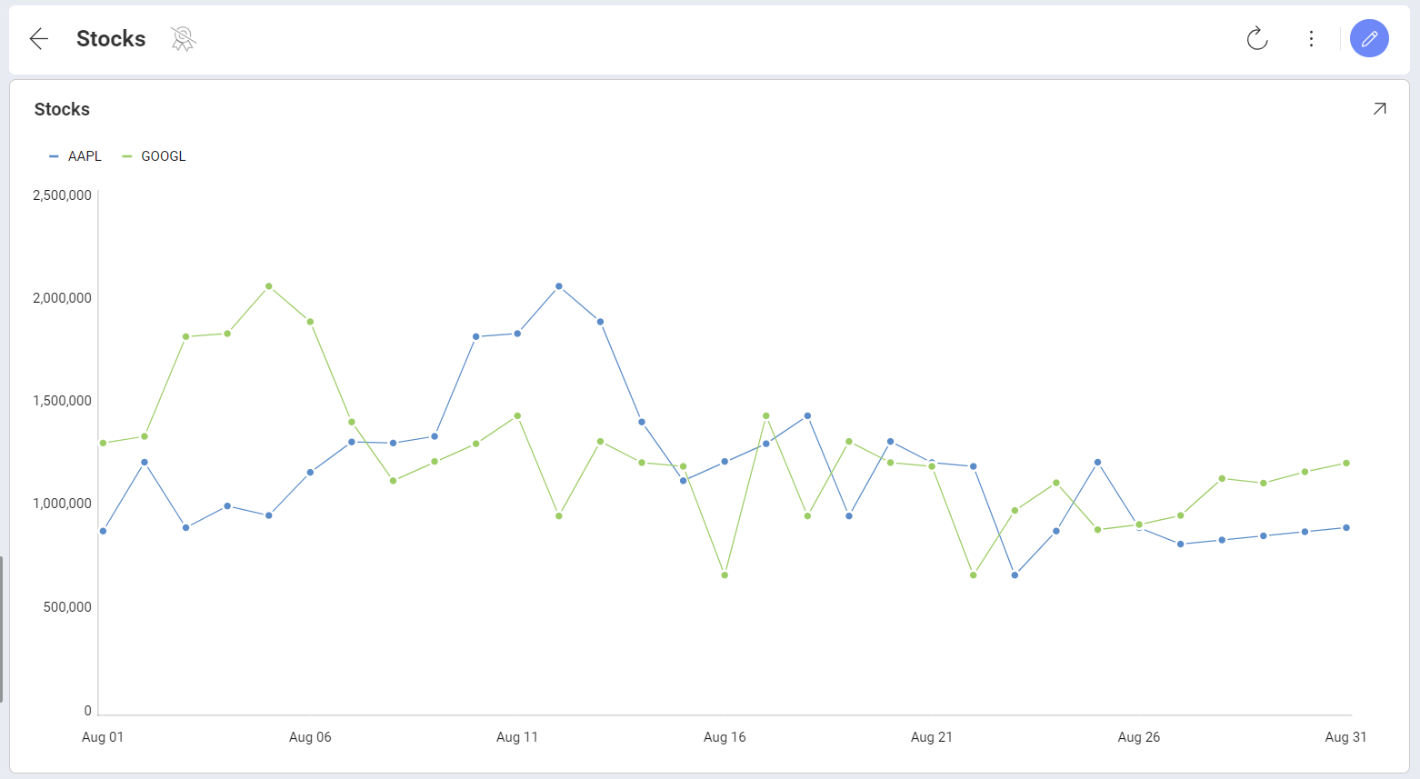
Very similar to a conventional line chart, the Time Series chart always has a time-based horizontal axis (x-axis).
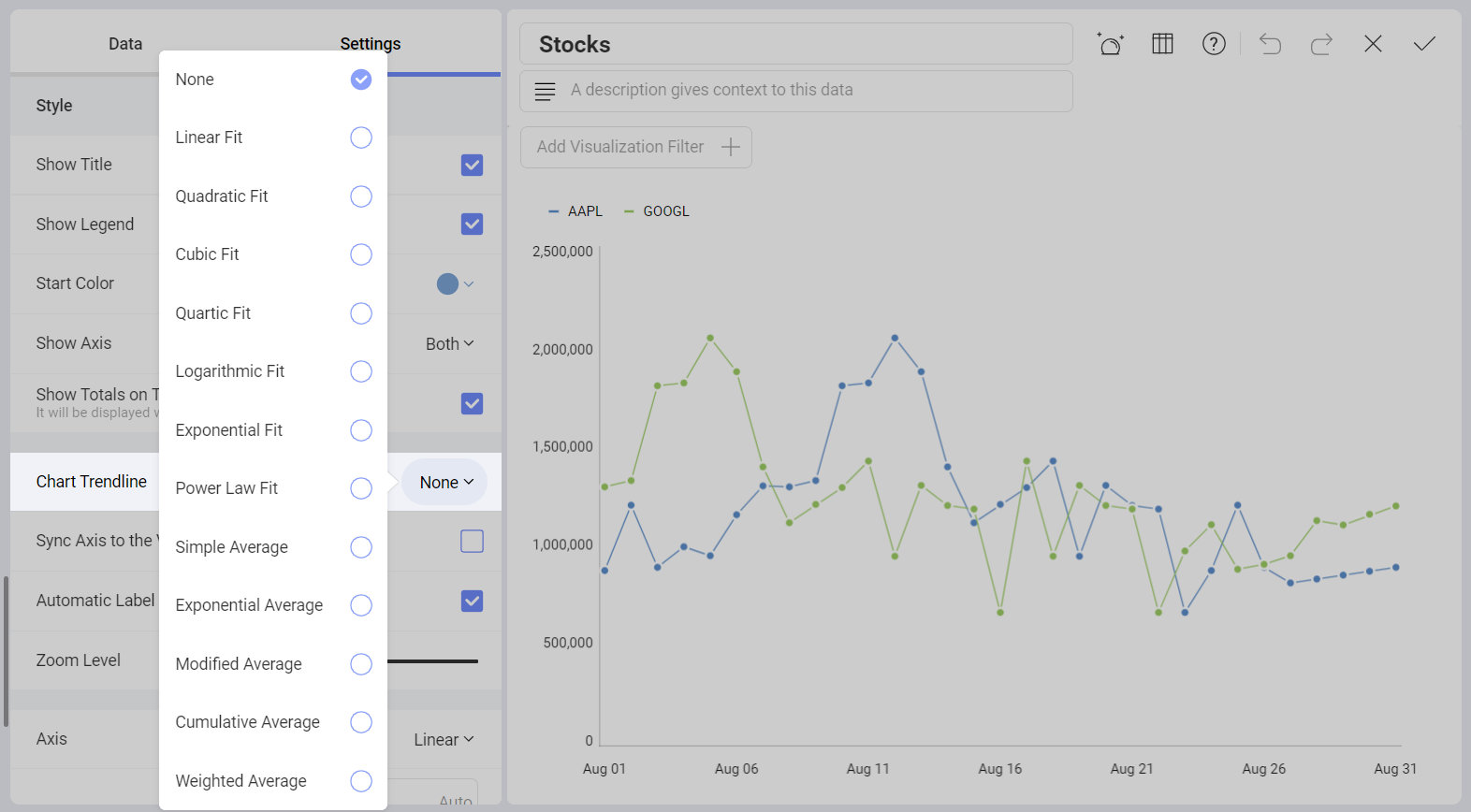
Chart Trendlines
Chart settings enable the display of trend lines, which are lines that are painted across a chart, based on an algorithm. Trendlines are a very simple, yet powerful tool to help you determine trends in datasets, and define thresholds for taking action. The supported algorithms are Linear Fit, Quadratic Fit, Cubic Fit, Quartic Fit, Logarithmic Fit, Exponential Fit, Power Law Fit, Simple Average, Exponential Average, Modified Average, Cumulative Average, Weighted Average.
Settings for Time Series Charts
In Settings you can:
Hide elements displayed by default. You can choose to hide the title, legend, and tooltip totals (only available when you have categories). You can also choose the starting color and to show or hide different Axis.
Display Trendlines. Chart settings enable you to display trendlines, choosing among different supported algorithms as described in the previous section.
Sync Axis to the Visible Range.
Show the Automatic Label Rotation.
Adjust the Zoom Level.
Choose between Linear scale or Logarithmic. With Logarithmic, the scale for your values will be calculated with a non-linear scale which takes magnitude into account instead of the usual linear scale.
Setup the minimum and maximum values for your charts. Minimum is set to 0 by default and maximum is calculated automatically depending on your values.
Choose Compact Labels. With this setting you avoid redundant label information when you zoom your chart.
Zooming and Panning
When the Time Series chart is maximized, you can zoom in and out. This allows you to focus on a specific time interval and is a clear scenario where using the Compact Labels setting makes sense.
Statistical Functions
Analytics provides you with three types of advanced predictive analysis. These are Time series forecast, Linear regression and Detect outliers. You can use them to make predictions, recognize and evaluate trends, or discover outliers in your data series.