Creating Stacked Chart Visualizations
In this tutorial, you will learn how to create Stacked chart visualizations using a sample spreadsheet.
Access the links below for the Stacked Chart view walkthroughs:
Key Concepts
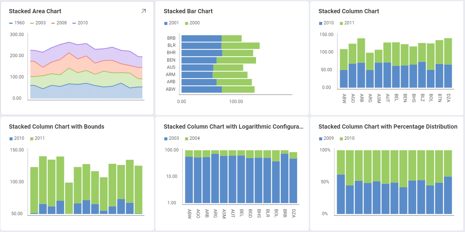
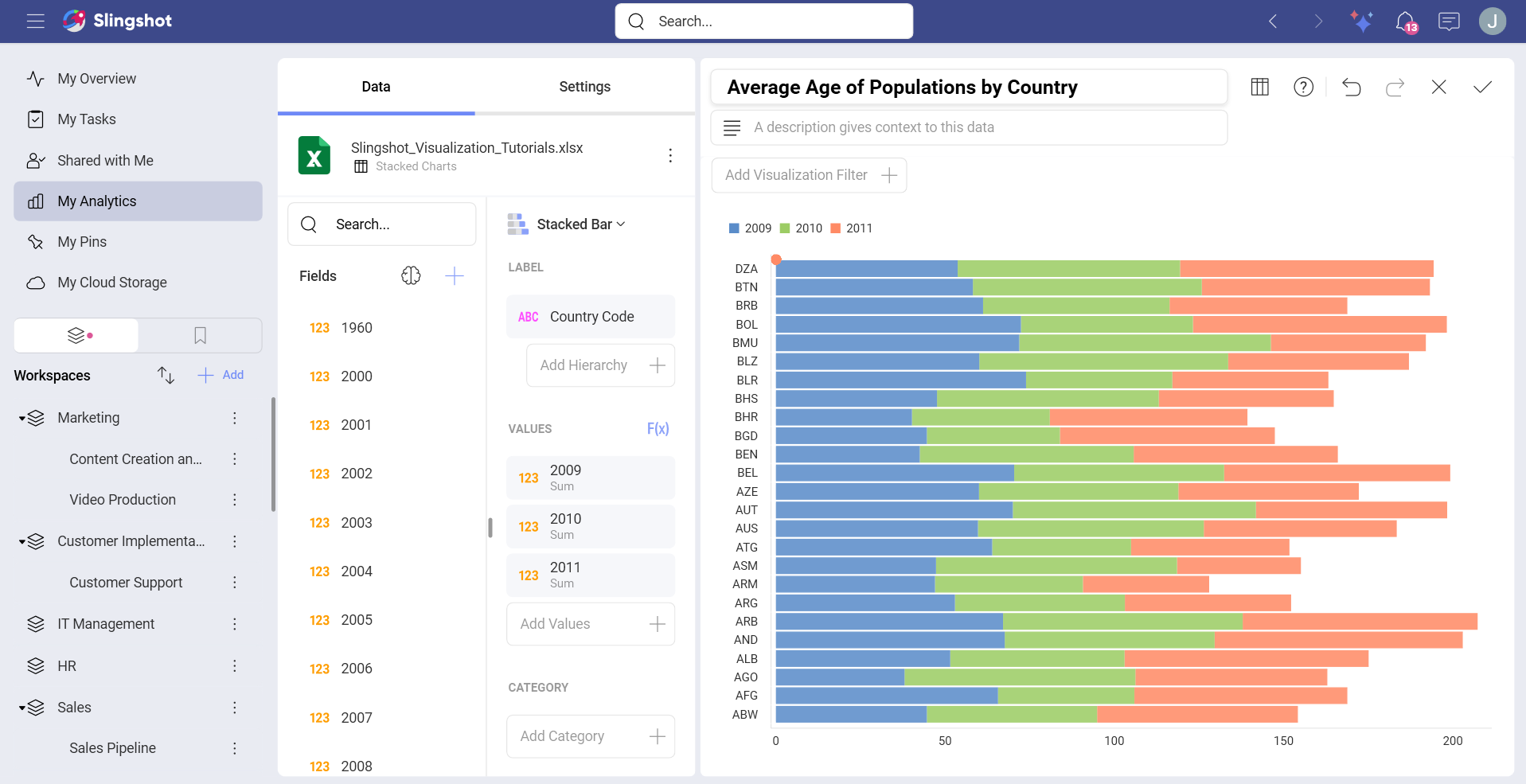
There are three different layouts to choose from when using stacked charts: Area, Column and Bar.
You can also configure the following settings:
Axis Configuration: the axis configuration lets you configure the minimum and maximum values for your charts. The minimum value is set to 0 by default and the maximum calculated automatically depending on your values.
Logarithmic Axis Configuration: if you check the Logarithmic checkbox, the scale for your values will be calculated with a non-linear scale which takes magnitude into account instead of the usual linear scale.
Sample Data Source
For this tutorial, you will use the Stacked Charts sheet in the Slingshot Visualization Tutorials.
Note
Excel files as local files are not supported in this release. In order to follow these tutorials, make sure you upload the file to one of the supported cloud services or add it as a Web Resource.
Creating a Stacked Chart
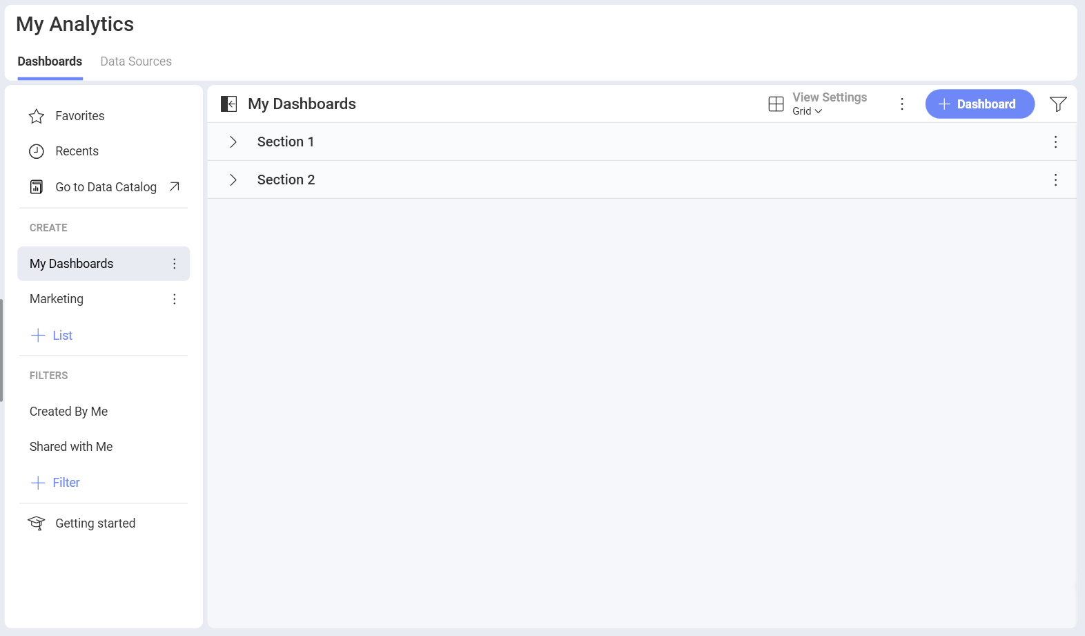
Select the + Dashboard button in My Analytics.
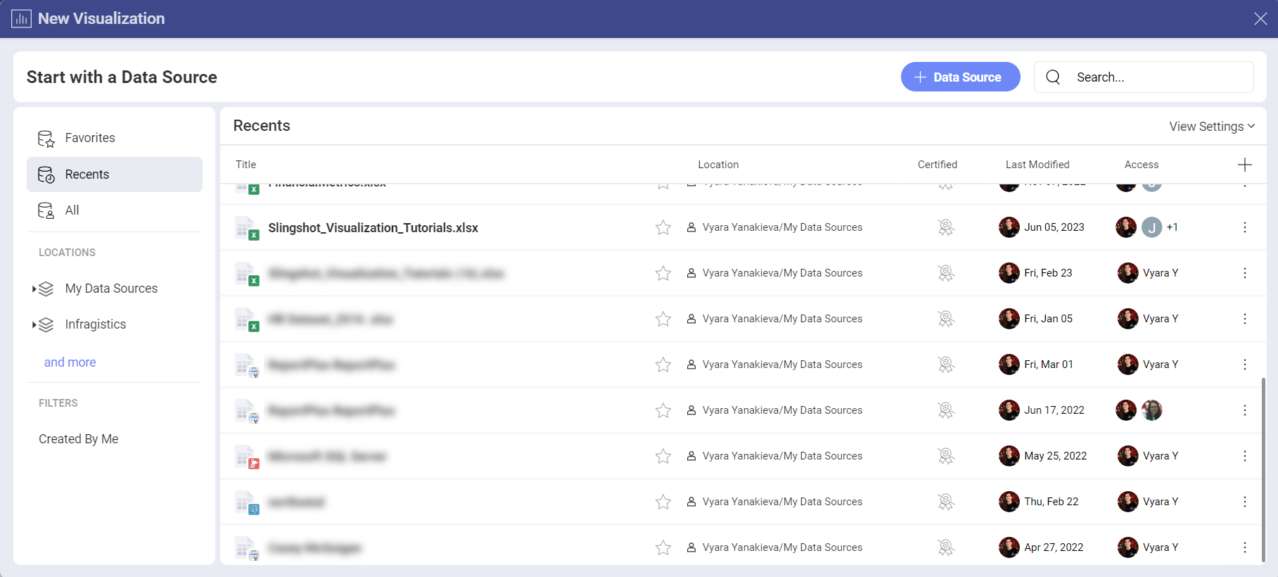
Select your data source (Slingshot Tutorials Spreadsheet) from the list of data sources. If the data source is new, you will need to first add it from the + Data Source button in the top-right corner.
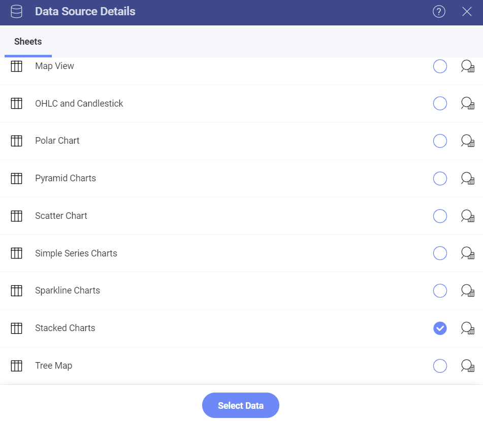
Choose the Stacked Charts sheet.
Select the Grid icon in the top bar of the Visualization Editor. By default, the visualization type will be set to Column. You can always change it by selecting any of the stack visualizations.
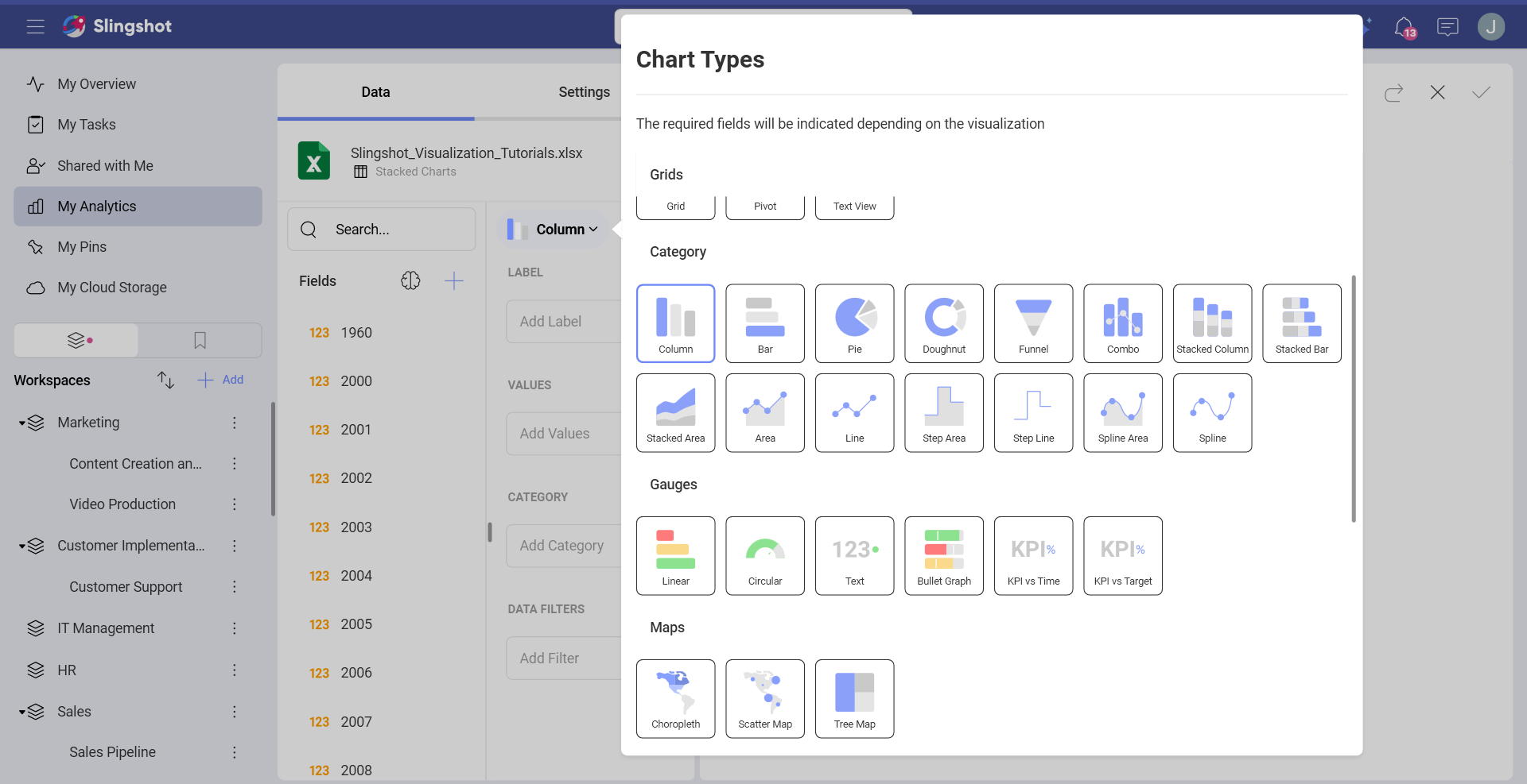
Stacked charts require two or more fields to be dragged and dropped into the Values placeholder of the data editor. In this case, the 1960, 2003, 2008 and 2010 fields have been dropped into Values and Country Name in Label.
Changing your Axis Configuration
Similarly to the Gauge bounds, the chart axis configuration allows you to set the lowest and highest values in your chart. You can use this feature to include or exclude specific data.
| 1. Change Settings | 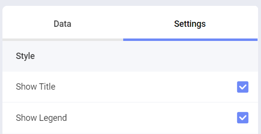 |
Go to the Settings section of the Visualization Editor. |
| 2. Access the Axis Bounds section | 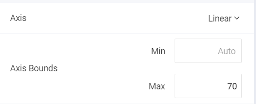 |
Navigate to Axis Bounds. Depending on whether you want to set the minimum or maximum value (or both), enter the value you want the chart to start or end with. |
Setting your Axis Configuration as Logarithmic
| 1. Change Settings | |
Go to the Settings section of the Visualization Editor. |
| 2. Access the Axis option | 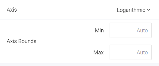 |
Expand the Axis dropdown by selecting the down arrow. Then select Logarithmic. |
Enabling Percentage Distribution
For stacked charts, you can configure the Percentage Distribution. It allows you to switch between values and percentage distribution scales for those types of charts. In order to do this:
| 1. Change Settings | |
Go to the Settings section of the Visualization Editor. |
| 2. Enable Percentage Distribution | 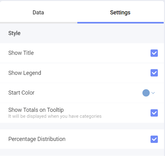 |
Enable the percentage distribution setting by checking the Percentage Distribution box. |