Interacting with Dashboards
You can open existing dashboards by selecting the dashboard thumbnail image in the initial view and clicking/tapping on the arrow in the top right corner. Alternatively, you can click/tap on the pencil icon in the upper right corner.
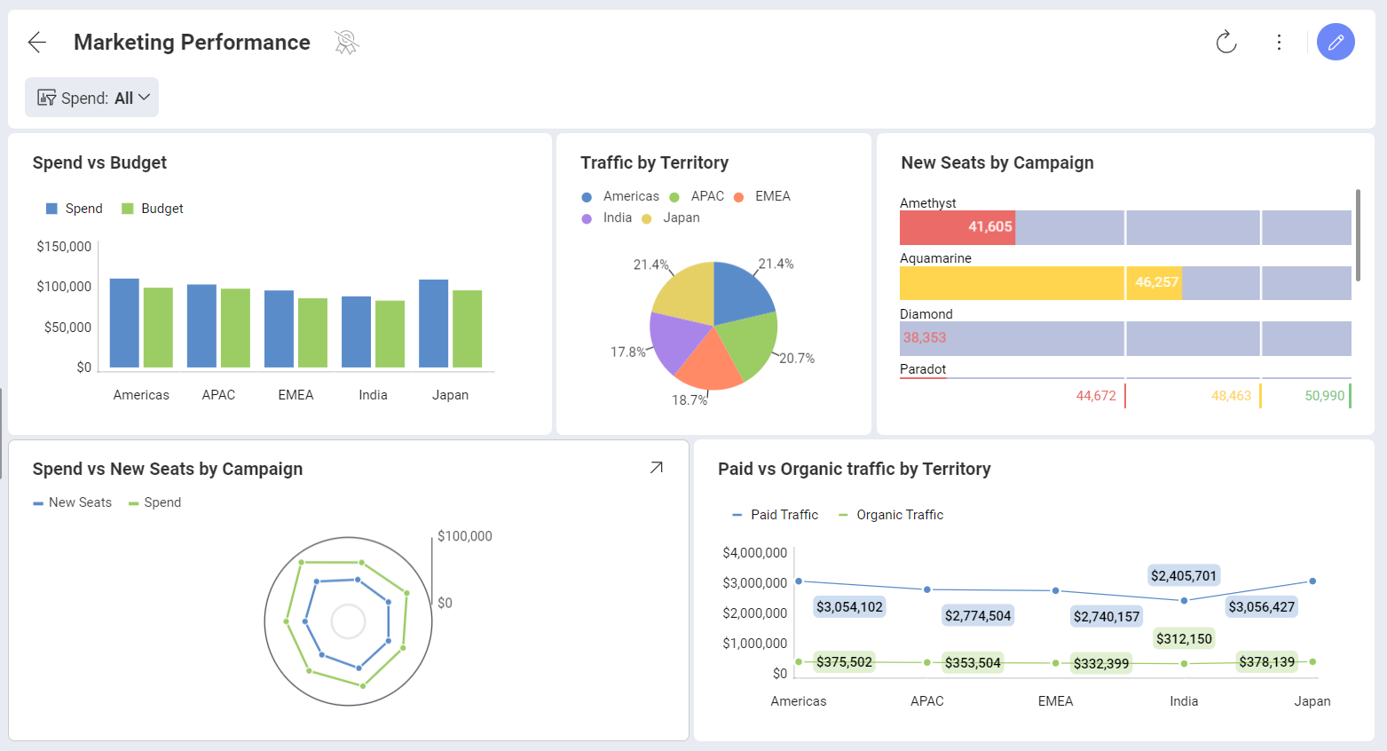
You can interact with dashboard visualizations in various ways. For instance, if the visualization is a grid chart, you can scroll horizontally and vertically. The chart view supports zooming and panning. Also drill down & drill up actions become possible if the underlying data model supports it.
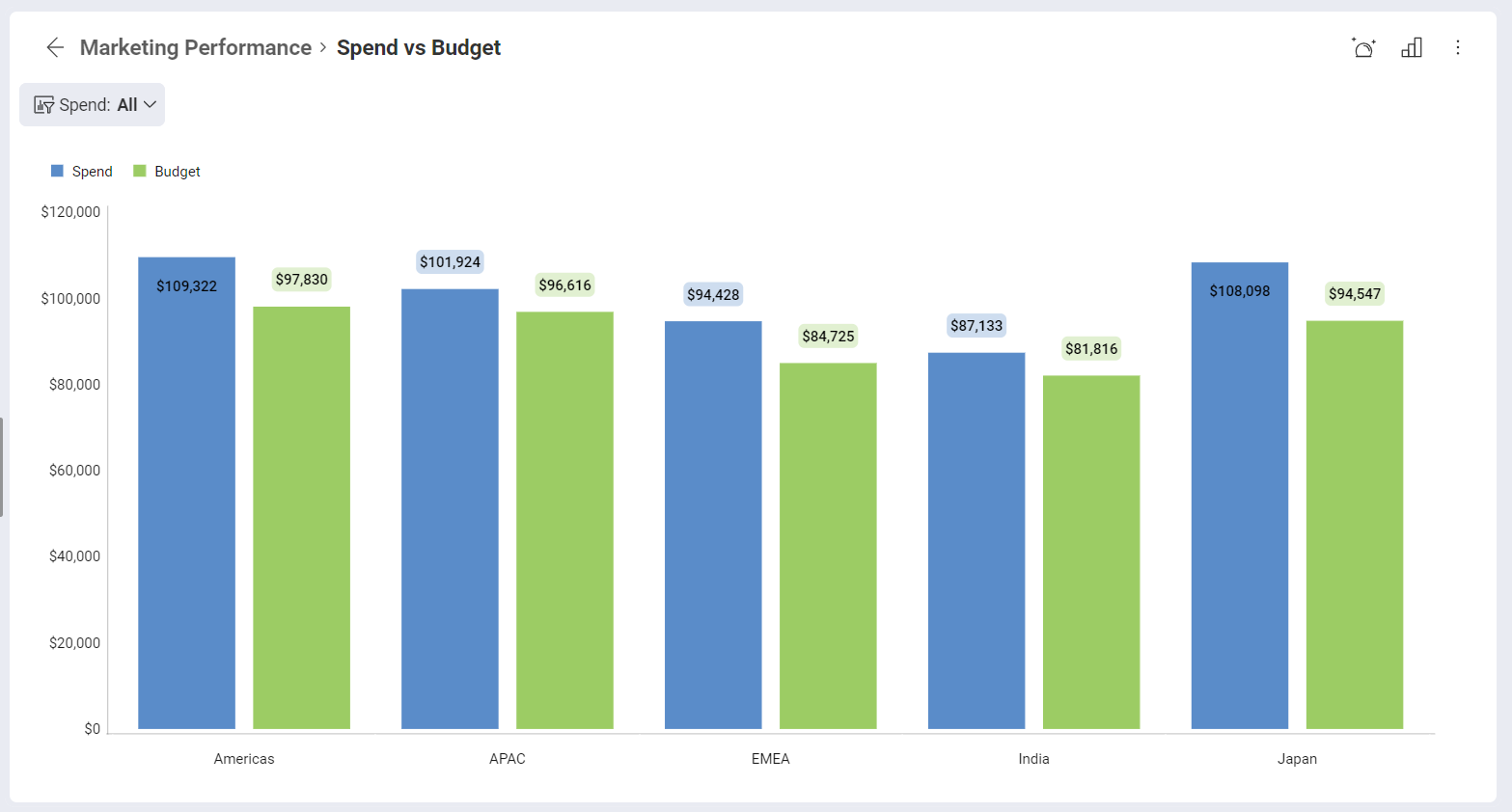
Maximized view
Once the dashboard is opened, you can maximize any of the dashboard visualizations by hovering over them and click/tap on the arrow in the right top corner.
The maximized view allows a larger display of the information.
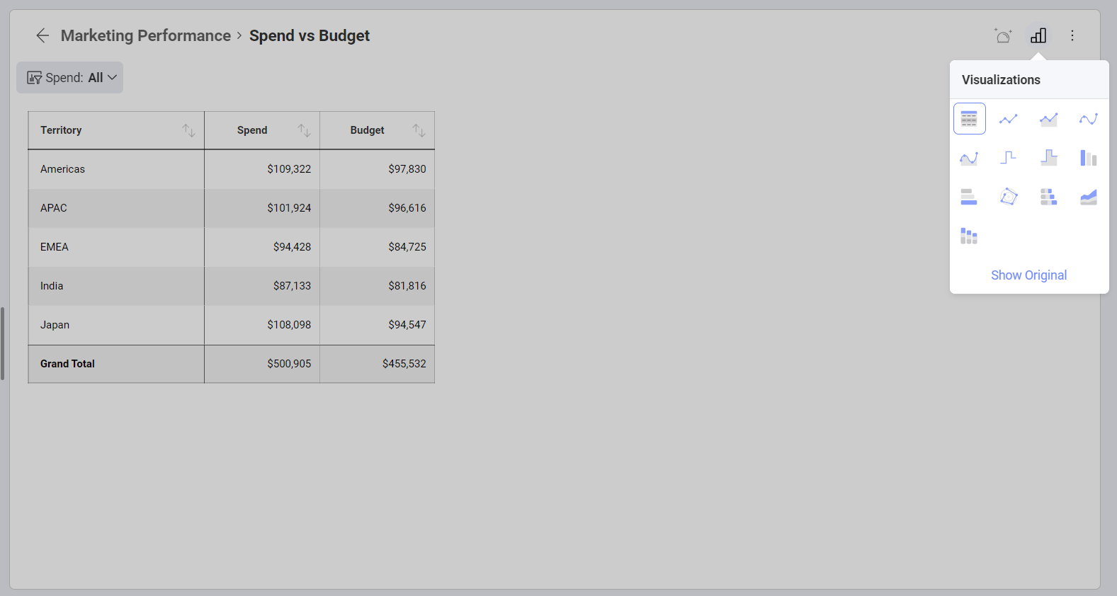
In this mode, you can also switch the maximized view to other visualizations by selecting the small chart icon in the top right corner. Different visualizations are displayed based on the data that was used in the editor. Only chart types that work well with your data will be offered.
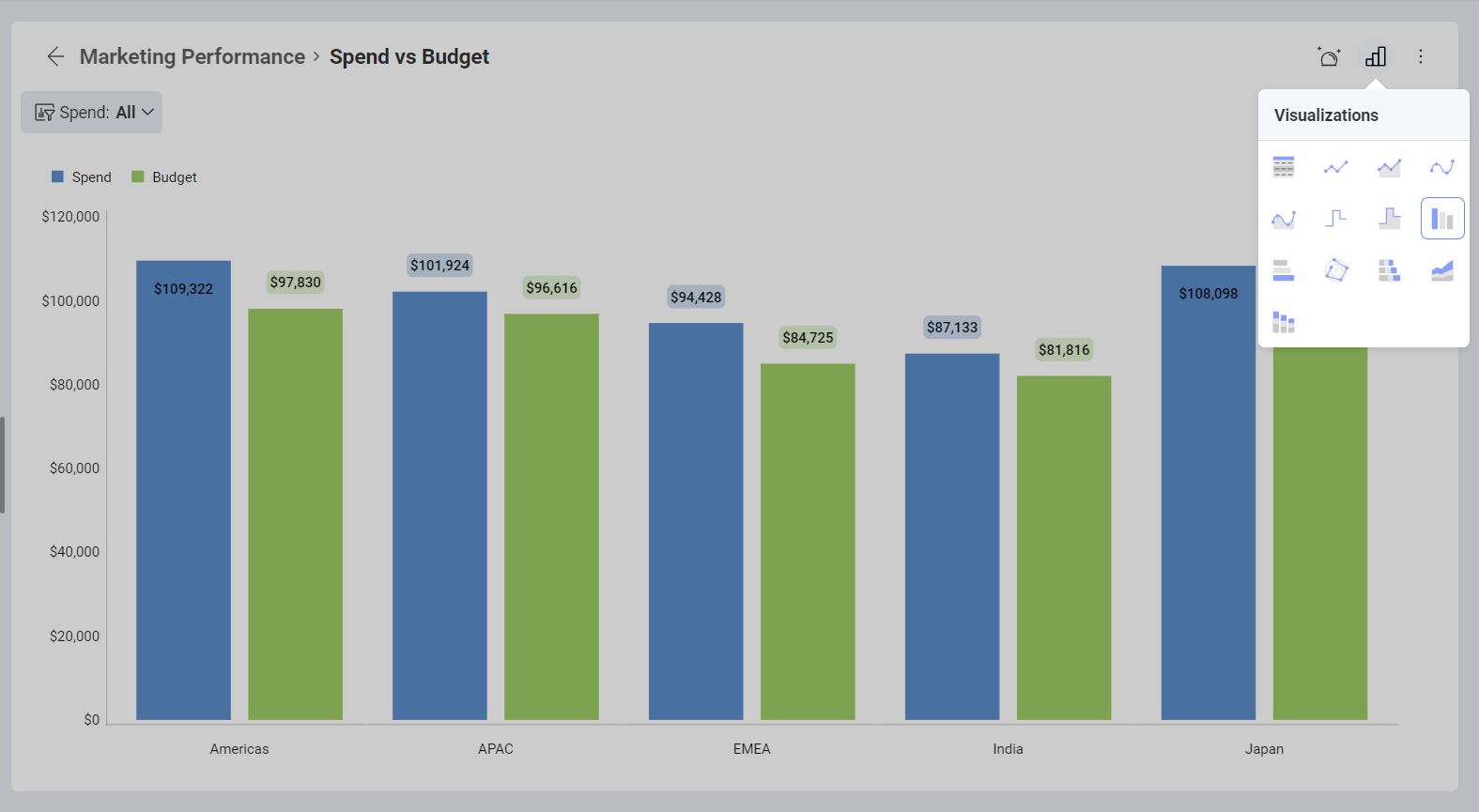
If you want to save the changed visualization, you need to have edit permissions, be in dashboard Edit Mode and explicitly save the changes by selecting the check icon in the top right corner. You have edit permission for dashboards that are created by you or shared with you with Owner or Modify permissions.
If, at any point, you want to revert back to the original visualization, you can select the Show Original link.
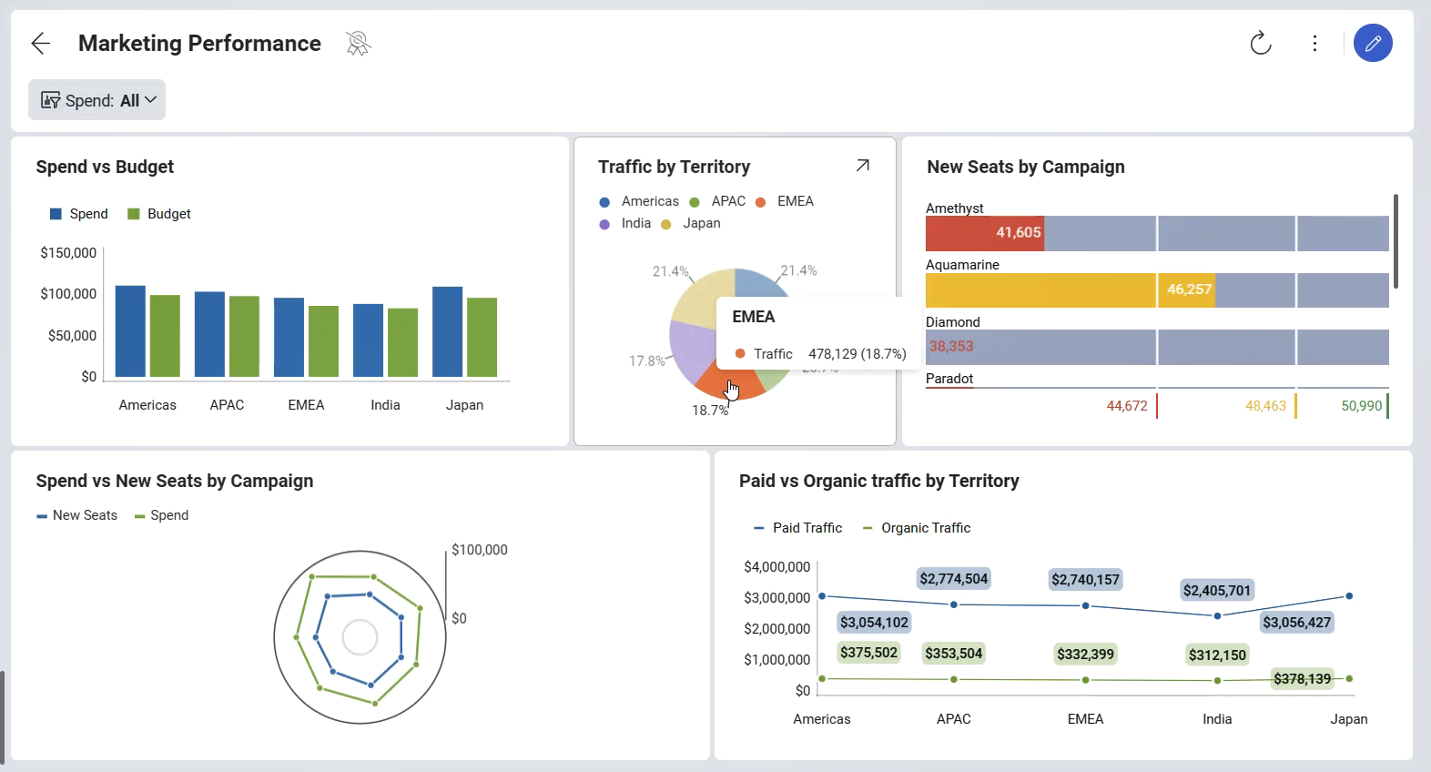
Regular Tooltips
By clicking on particular visualizations (press and hold in touch environments), you can see tooltips popups. Tooltips help you see values at a particular point of your chart like:
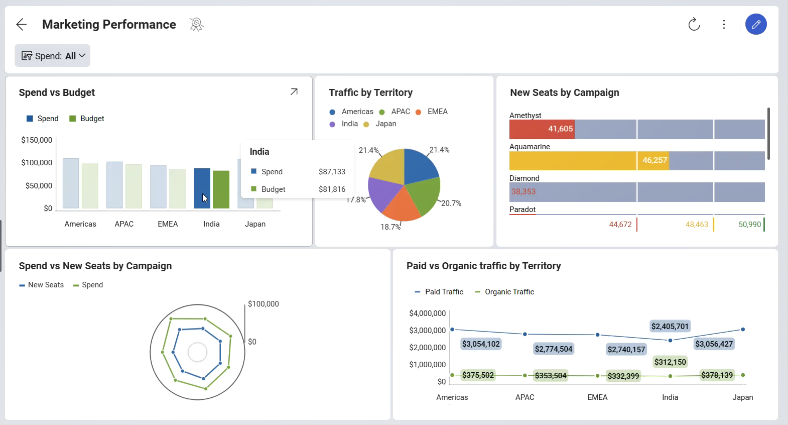
To close regular tooltips just click or tap away.
Hover Tooltips & Crosshairs
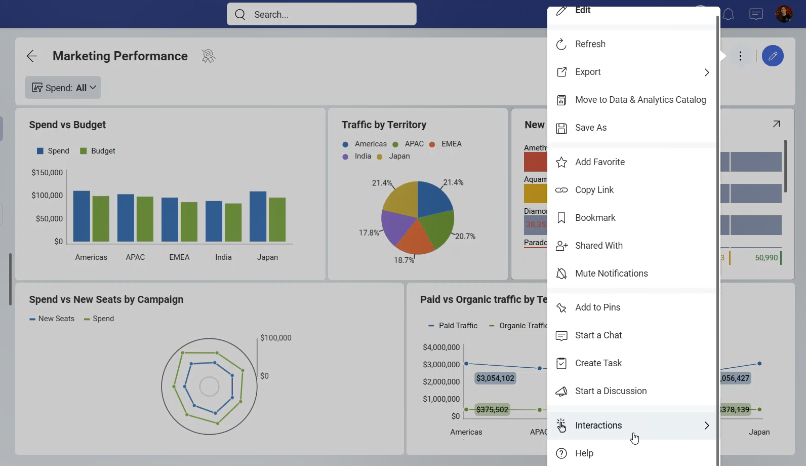
You will find two options in the Interactions menu: Hover tooltips and Crosshairs. Both are only available in Dashboard View mode. They can't be used in Dashboard Edit mode.
With Hover Tooltips enabled, you can see tooltips popups when you hover over data (press and hold in touch environments).
By clicking the data (releasing drag tooltips in touch environments), you can access the Tools section with tooltip interactions like drill down, drill up or linked dashboards, if applicable.
With Crosshairs enabled, Slingshot shows crosshairs elements along with the tooltips. Giving more context to the tooltip.
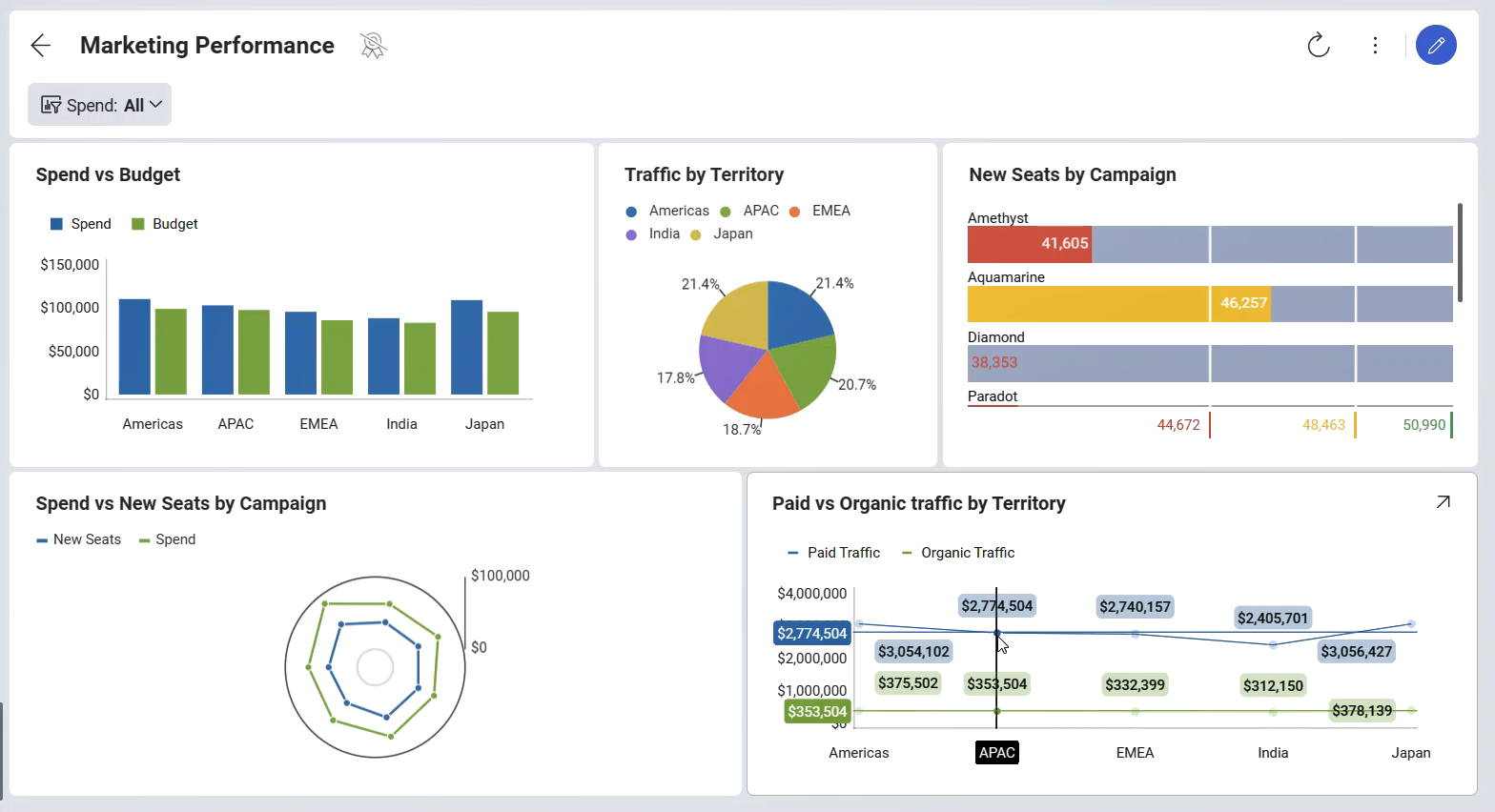
Crosshairs are currently supported for the following data visualizations: Scatter, Bubble, Area, Candlestick, Line, Spline, SplineArea, StepArea, StepLine, Candlestick and OHLC.
Tooltips Totals
When displaying tooltips, you can configure them to display total values by Category.
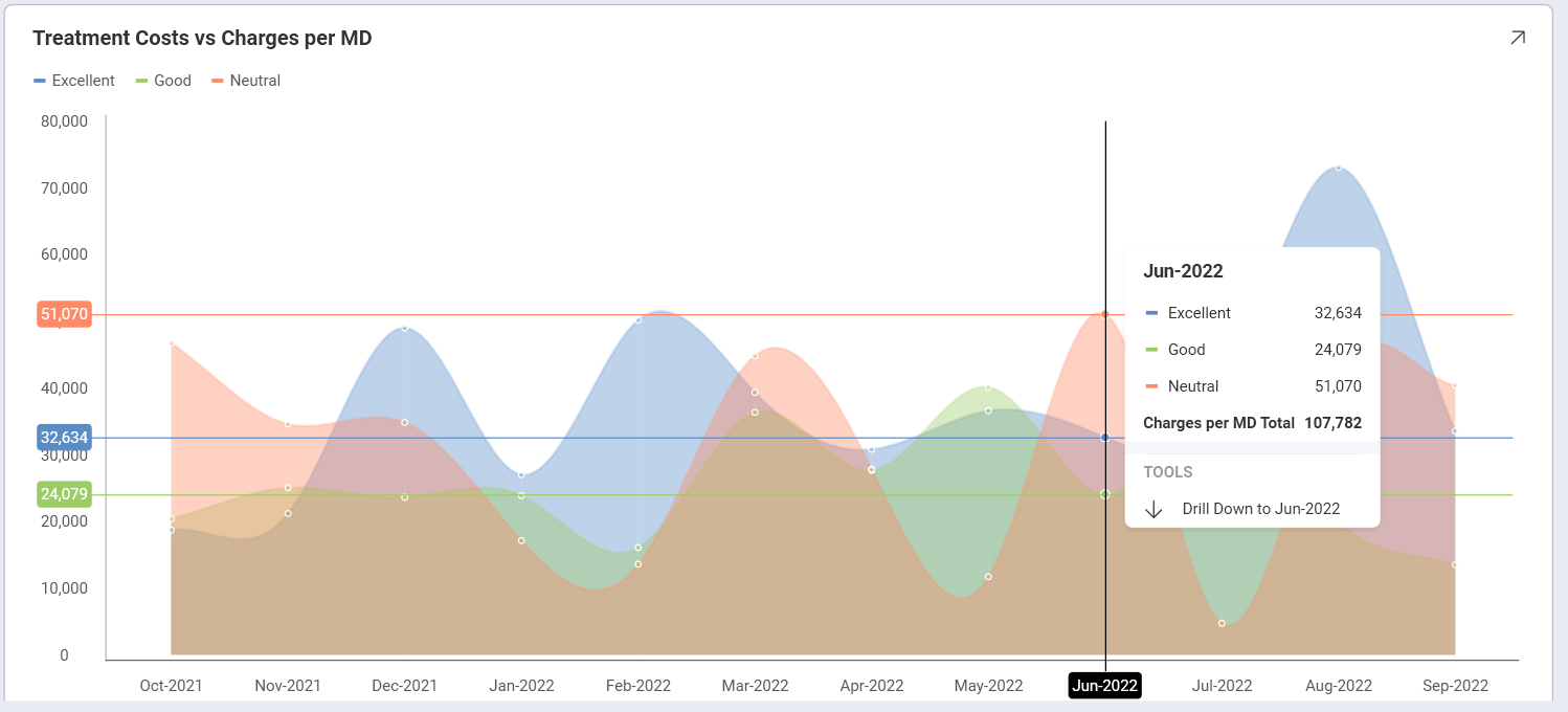
To enable this feature, go to Settings ⇒ Show Totals on Tooltip, like shown below:
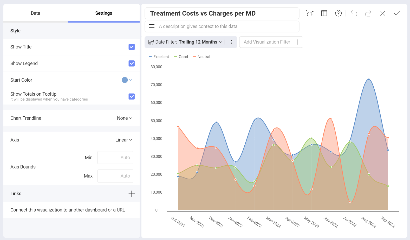
When enabling totals, make sure you added a Category to show multiple values in your visualization.
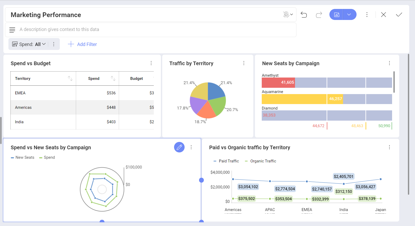
View & Edit Modes
When first opening a dashboard, you will be browsing it in View mode. This mode allows you to navigate and filter the information displayed in it, but you won't be able to change the dashboard definition.
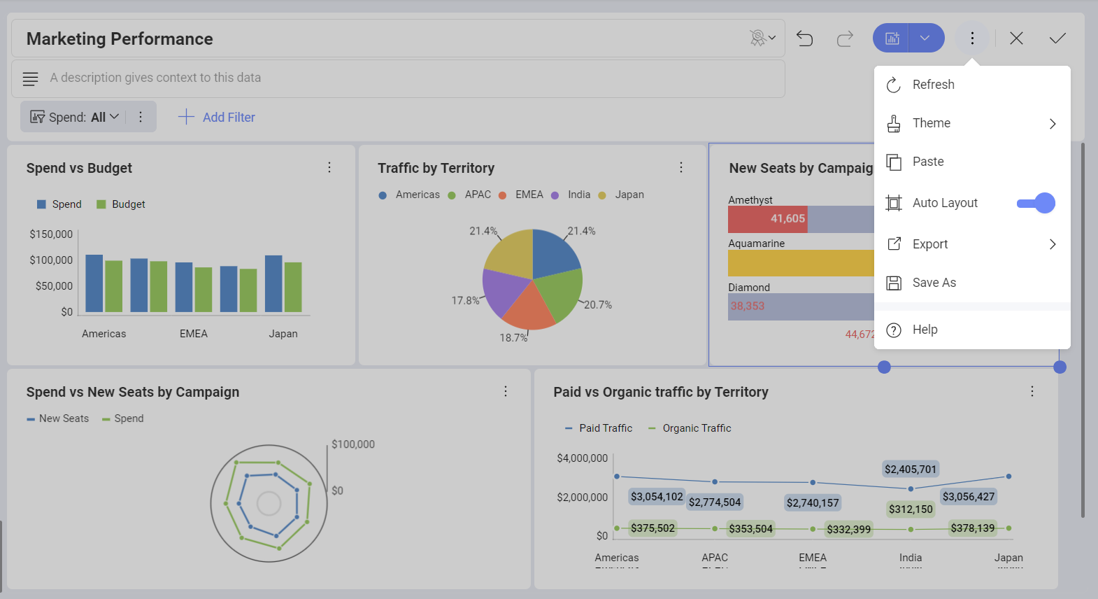
In order to apply changes to a dashboard, you must switch to Dashboard Edit mode. You can do this by selecting Edit from the overflow menu in the top right corner of the dashboard. Alternatively, you can click/tap on the pencil icon. While editing, you can make different changes, such as applying Auto Layout and changing the dashboard Theme.
Shown below is a dashboard in Dashboard Edit mode:
To exit Edit mode, you need to select the check icon in the top right-hand corner. This switches back to View Mode.
Dashboard Filters
It is possible to filter information at a dashboard or a visualization level.
Dashboard filters are available, when you open Dashboard Edit mode (select Edit from the overflow menu of your dashboard to access this mode). In the left top corner of the screen, you will see the current dashboard filters and an option to add new ones.
Visualization filters (a.k.a. Quick Filters) are displayed in maximized mode. You can find them in the top section of the visualization under the visualization's name.
For more information on dashboard or visualization Filters, check out this section.
Auto Layout for Visualizations
Slingshot's Auto Layout dynamically sizes all visualizations in your dashboard based on the size constraints of your device and on the amount of visualizations it has.
To start resizing visualizations while Auto Layout is enabled, just drag their corners downwards or to the side. This will automatically turn Auto Layout off.