How Stephen Gould Scaled Its Capacity by 30% without Making a Single Hire
This update enhances your dashboards with new features that help your team present data more clearly and interpret insights faster. Slingshot now includes Fixed Lines, Axis Titles, Legend Location & Alignment, and Grid Paging, improving usability, streamlining reporting, and making it easier to compare key metrics at a glance.
Executive Summary:
This update enhances your dashboards with new features that help your team present data more clearly and interpret insights faster. Slingshot now includes Fixed Lines, Axis Titles, Legend Location & Alignment, and Grid Paging, improving usability, streamlining reporting, and making it easier to compare key metrics at a glance.
These dashboarding features boost visual precision, add flexibility to customization, and make reading your data quicker. Your analytics just got an upgrade.

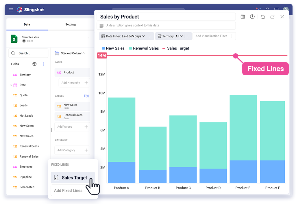
You can now add fixed lines to your charts to highlight key values, like targets, thresholds, or goals. These lines remain in place regardless of how your data changes, helping you effectively showcase key benchmarks.

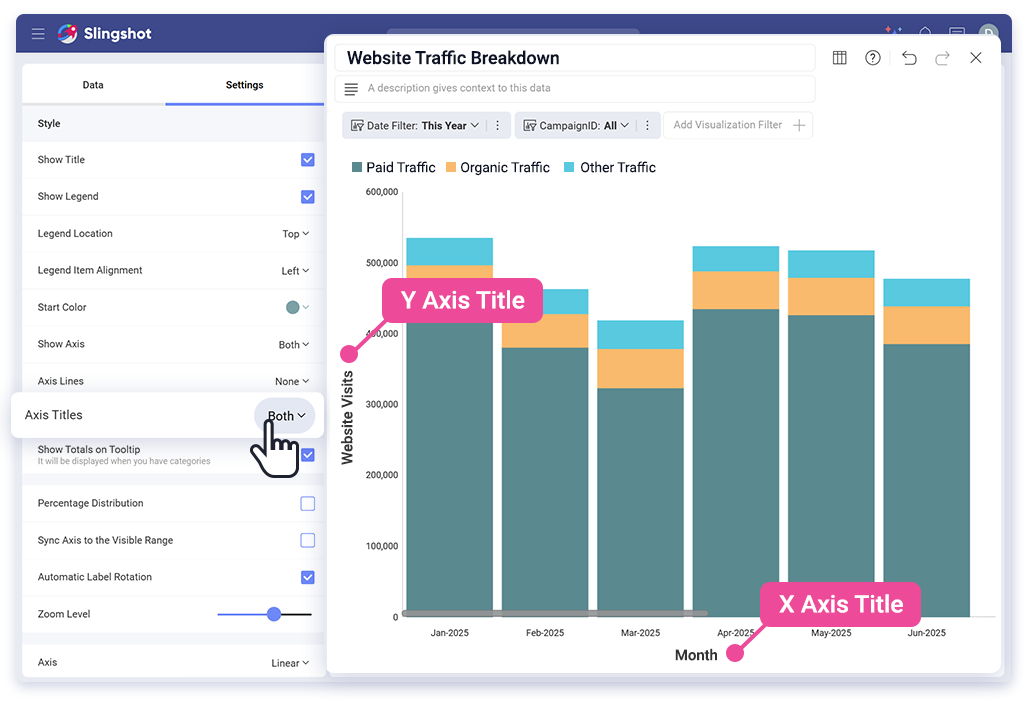
Easily add and customize labels for your chart’s X and Y axes. This makes your data easier to understand when shared with anyone.

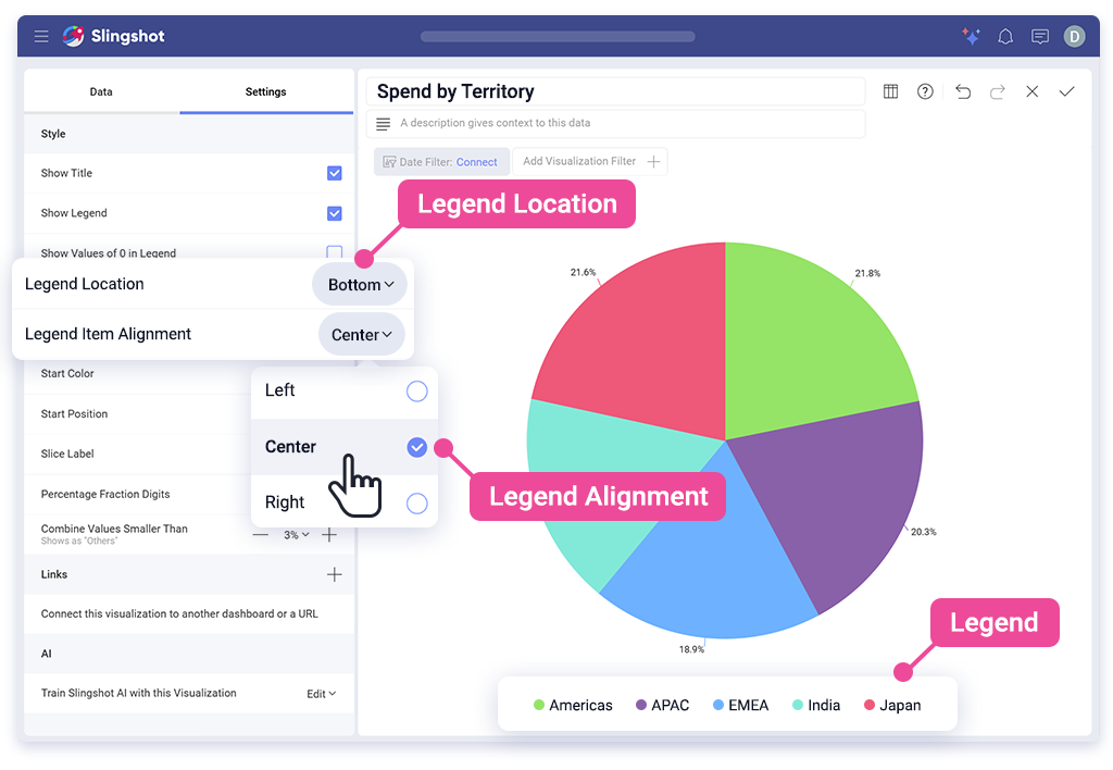
Choose where your chart legends appear: top, bottom, left, or right. You can align them any way you need to, creating layouts that look cleaner, work better for your audience, and make sense for your data story.

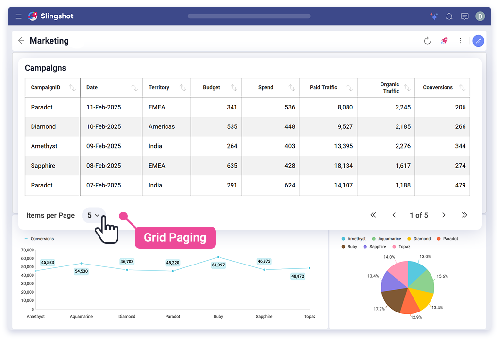
Enable paging for data grids to boost loading performance and improve the readability of large datasets. View thousands of data points without slowing down your dashboards.
Supported data sources include SQL Server, MySQL, BigQuery, PostgreSQL, Sybase, and Oracle.
Every update in this release helps you display data with greater clarity and less clutter. Whether you’re building reports for your team or presenting results to execs, you now have the tools to do it faster and with greater clarity.
Log in to Slingshot today and start building clearer, faster dashboards.
Need guidance? Our team is here to help. Request a demo and see these features in action.
SHARE THIS POST