How Stephen Gould Scaled Its Capacity by 30% without Making a Single Hire

Using R as a data analytics platform lets developers and data scientists create various types of visualizations to represent complex, raw data with minimum coding.
Executive Summary:
Using R as a data analytics platform lets developers and data scientists create various types of visualizations to represent complex, raw data with minimum coding.
Data is everywhere around us and it becomes fundamental that we understand it. Data visualization is a powerful tool that lets us turn raw data into visual representation so that data is easier and faster to understand by the human brain.
Today, there are many online programs, applications, and software that allow us to easily create beautiful data visualizations with a few clicks. They all come with different capabilities and functionalities and require a different skill set to use them. In this article, we’ll be focusing on R data visualization. R is a programming language and environment for statistical computing, graphical data analysis, and scientific research.
Using R as a data analytics platform lets developers and data scientists create various types of visualizations to represent complex, raw data with minimum coding.
In this article, we will walk you through the basics of using R for data visualization, list down the differences between data visualization in R vs Python and show examples, so you can better understand what data visualization in R is and how it works.
Creating data visualizations in R is a technique of gaining data insights with the help of a visual medium. By using R’s diverse functionalities, you can create appealing data visualizations writing only a few lines of code. To create data visualizations, R provides several visualization libraries including ggplot2 which is one of the most widely used packages. Ggplot2 allows you to build almost any type of chart and improves the quality and aesthetics of your graphics.
The best thing in the process of creating data visualizations with R is that you don’t need to be an R programmer or data analysis expert. There are many datasets available in R that you can work on, so you don’t even need to prepare your own dataset.
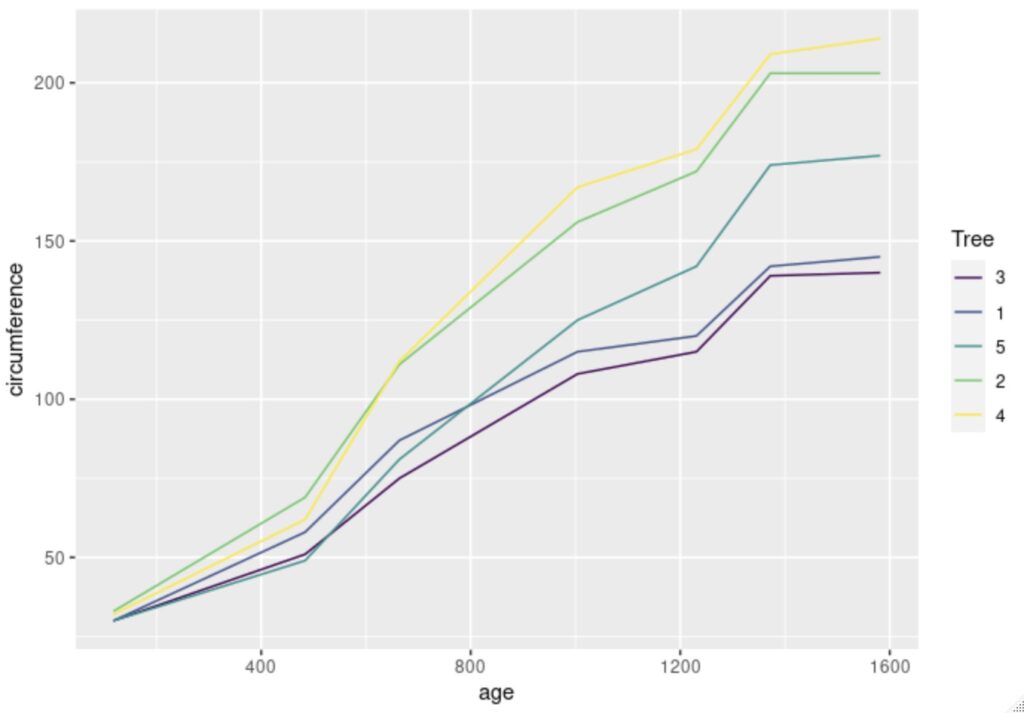
This R visualization example uses the built-in Orange data set to plot tree age and tree circumference.
ggplot(Orange) + geom_line(aes(x = age, y = circumference, color = Tree)) Resulting in this visualization:

The provided visualization libraries and built-in data sets are complete and feature everything you need to experiment with R to create your data visualizations and see instant results.
R timeline visualizations are visual tools that display a succession of events in chronological order. Timeline visualizations are great for case reports and presentations, and they can also be very useful in the healthcare industry displaying the clinical course of a patient and in project management where a project timeline can be created with milestones.
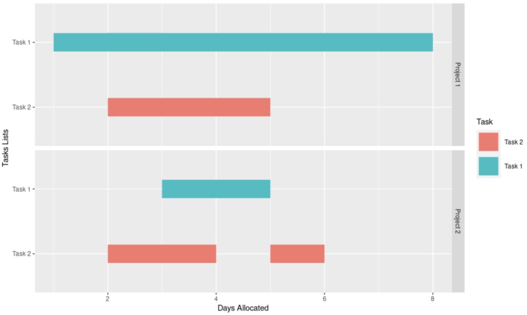
This example in R shows how to create a data frame with Projects and Tasks, and plot the Task objects in an R Timeline Visualization.
df <- structure(list(Project = structure(c(1L, 1L, 1L, 2L, 2L, 2L), .Label = c("Project 1", "Project 2"), class = "factor"), + Task = structure(c(1L, 2L, 1L, 2L, 1L, 2L), .Label = c("Task 1", +                                                                             "Task 2"), class = "factor"), StartDay = c(1L, 2L, 2L, 2L, 3L, 5L), StopDay = c(3L, 5L, 8L, 4L, +                                                                                                                                                           5L, 6L)), .Names = c("Project", "Task", "StartDay", +                                                                                                                                                                                 "StopDay"), class = "data.frame", row.names = c(NA, -6L))

df$Task <- factor(df$Task, levels(df$Task)[c(2,1)])


ggplot(data=df, aes(color=Task))+ geom_segment(aes(x=StartDay, xend=StopDay, y=Task, yend=Task),lwd=12)+ facet_grid(Project~.)+xlab("Days Allocated")+ylab("Tasks Lists")
Resulting in this Timeline visualization:

The R timeline visualizations are often created with the ggplot2 library in R studio where layers of detail can be added to these visualizations using colors, shapes, and other visual elements to make them more appealing and easily understandable.
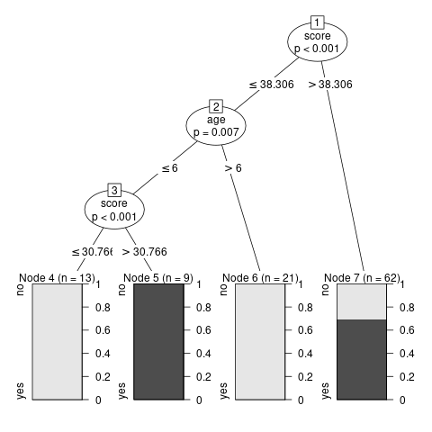
The R package ggtree provides programmable visualization of tree-like structures and associated data. ggtree was originally designed to work with phylogenetic trees but later has been expanded to support other tree-like structures, which extends the application of ggtree to present tree data in other disciplines too. The R library party is another popular library that includes the ctree() function to render decision tree visualizations. In this example, a decision tree is rendered using the built-in readingSkills dataset.
library(party)


input.dat <- readingSkills[c(1:105),]


png(file = "decision_tree.png")


  output.tree <- ctree(nativeSpeaker ~ age + shoeSize + score,

  data = input.dat)


plot(output.tree)
This example code will render this decision tree R visualization:

Decision trees, for example, are widely used for predicting an outcome from a set of features and can provide predictions at desirable accuracy while still being easy to understand and interpret.
Decision tree models comprise a set of machine learning algorithms, getting used to the simplicity of these models is an important building block in the creation of more complex tree-based structures such as gradient-boosted trees.
Tools for visualizations are available in both R and Python. They both provide us with the ability to create complex and appealing statistical graphics so that we can gain insights and learn more about the data that we possess. However, there are some key differences between the two, so if you’re wondering which language is the best choice for your data visualizations, check the pros and cons that we’ve gathered to help you take the best decision for your data.
Like R, Python also offers multiple visualization libraries that come packed with lots of different features. The most popular among them include Matplotlib, Seaborn, and ggplot that’s based on R’s ggplot2.
The differences:
R is a language that is primarily used for data analysis, while Python is a general-purpose programming language that can also be used for data analysis, but this isn’t its primary purpose. Both are well-equipped for data visualization but customizing graphics in R is generally easier and more intuitive. R was built to demonstrate the results of statistical analysis with the base graphics module allowing you to create charts and plots with ease, and you can also use ggplot2 for more advanced plots.
As businesses continue to rely on data to make better and fact-based decisions, the importance of data visualization will grow even more. And since visualization techniques like charts and graphs are more efficient in terms of understanding data in comparison to traditional spreadsheets and outdated data reports, tools like R data visualization are a necessity for every cross-functional team.
However, even with the importance of data and insights, just having them is not enough anymore. To unlock data’s full potential, you need to turn that data into actions that fit into your daily operations workflow. You can seamlessly transition from insights to action with Slingshot.
With Slingshot, you can analyze data, create beautiful data visualizations, collaborate with everyone within your organization, and manage all of your projects with ease, all from the same platform.
Interested in learning more? Try Slingshot for free and see how it can help you leverage actionable insights all while making it easier for your team to utilize data, cultivate a data-driven culture and improve productivity.
SHARE THIS POST