
How Stephen Gould Scaled Its Capacity by 30% without Making a Single Hire
Data visualization is the translation of your data in a language you can understand very quickly. And being able to grasp it fast makes decision-making much more efficient, while aligning our team around data.
Executive Summary:
Data visualization is the translation of your data in a language you can understand very quickly. And being able to grasp it fast makes decision-making much more efficient, while aligning our team around data.
Everyone out there is talking about data visualization.
Why? Because raw figures can’t bring you the satisfaction of understanding data with only one glance.
And since the human brain processes images 60 000 times faster than text, you want to use all the opportunities data visualization brings for your business.
Data visualization is the process of displaying data through charts, maps, graphs, and other types of visuals. With them, data is represented clearly and all the information and facts are presented in an easy-to-grasp manner.
Businesses often rely on data visualization to analyze and plan their next steps by relying on logic. Marketers and project managers rely on those visuals to discover patterns that are useful for their overall performance and strategy.
Data tells a story – and visualizations are there to help us understand it.
Through visualization we also get many ideas that wouldn’t have popped up otherwise – it’s a tactic that brings alignment, quality control, and efficiency to the decision-making process.
One of the most common types of data visualization is infographics, usually used to convey big loads of information quickly and efficiently. Nevertheless, companies are depending more and more on dashboards – a customizable visualization that can be displayed in a variety of ways. So, let’s take a look at some of the data visualization types you might want to use and their specific purposes.
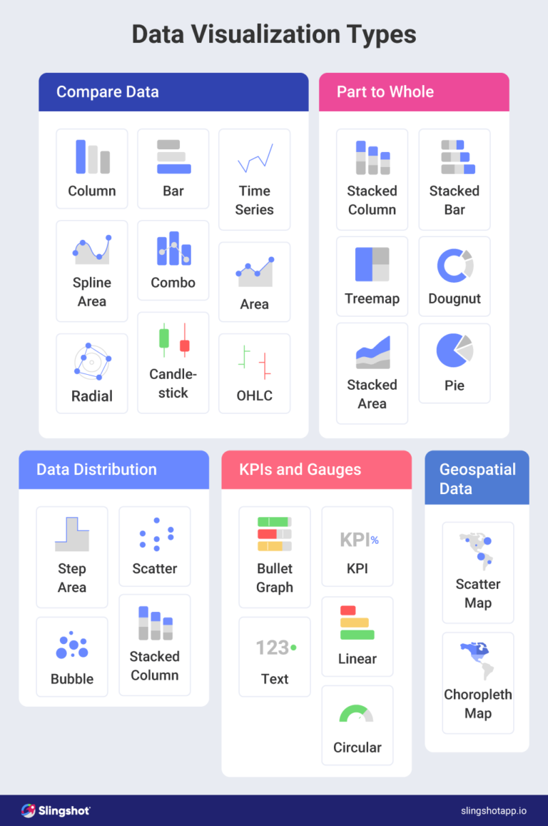
Through charts and graphs, the overall story of data trends is told in a much faster way. They provide swift comparisons and relationships between events, show distribution, and give a better way of conducting data analysis in the long term.
With this type of visualization, you can quickly see whether outliers are dragging a process up or down. They’re also valuable when comparing averages, and standard deviations, and answering questions such as “Are these two processes statistically the same?”
. It can help you quickly discover how a certain project, campaign, or numbers are performing versus how they are expected to perform.
Histograms show the distribution of your data and help in coming up with probability outcomes. They can quickly prove whether a process is hovering around the right mean or whether outliers are skewing results for data or outcomes.
You can use a number of pie chart variations if you need to see whether each part of the whole is pulling its weight, or if you want to see what factors are most important in a process or outcome.
With treemap charts, hierarchical data is shown through nested nodes (rectangles) of varying sizes and colors, making it easy to spot data patterns or to compare data quantities.
With dashboards, we have the advantage of built-in analysis tools that may help your team dive deeper into the metrics and never lose sight of what’s most important.
Data visualizations can be as useful as they are creative – and there is a wide range of examples we can point out that highlight those two things. Below we list the most popular and contemporary usages of visualizations with examples.
Marketing specialists generate a lot of data through digital marketing campaigns and those metrics are the standing ground of marketing performance data visualization. Through them, we can check out the ROI and effectiveness of a project/campaign, level of performance, SEO, PPC, email, social media performance, and goal accomplishment. In marketing (and the very popular ABM marketing), dashboards are mostly used to check out things like interactions and conversions, visits, landing page performance, website traffic, and others. Usage of charts, graphs, pie charts, and tables is most frequent here.
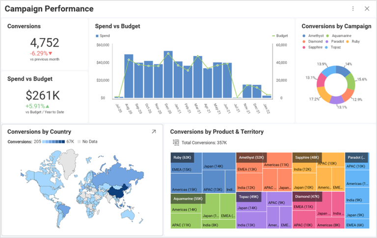
The volume of data generated in finance can be overwhelming for someone who is not used to dealing with that kind of evaluation. Finance data visualizations can be useful for providing other members of the team useful insights through data without them having to be tech-savvy to understand it. The financial visualizations usually track payroll, budgets, cash flow, liquidity, expenses, and other financial metrics. CFOs can involve many more people in their financial analysis without depending solely on Excel files, set financial goals easily, analyze KPIs and stay intuitive with the data.
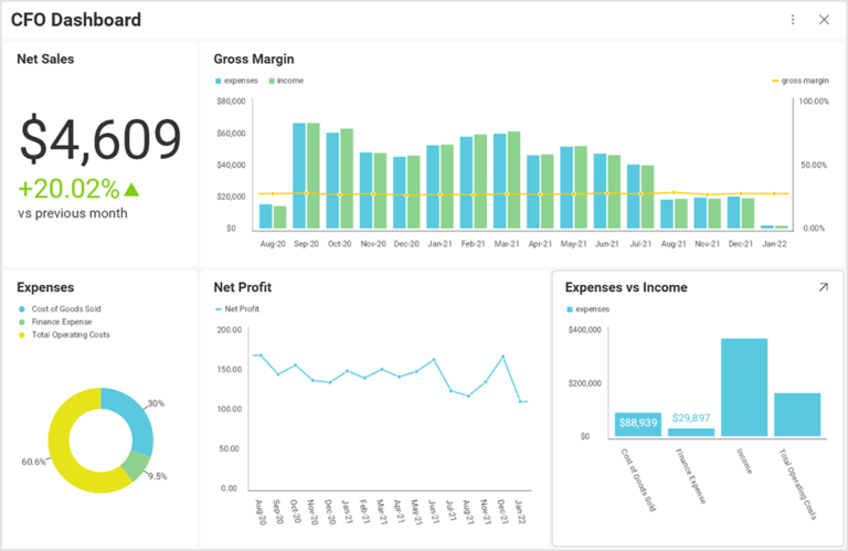
Everything needs to be tracked in sales and the performance and targets achieved hugely depend on data, so the business keeps growing and the right decisions are made. Sales data visualization usually includes:
Gaining insight into the sales KPI through visualization is essential for taking the necessary actions in each yearly quarter.
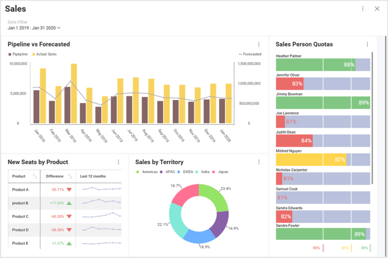
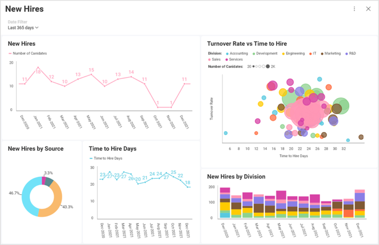
With data visualizations, HR can tell stories like never before. As it is a structured narrative that gets straight to the point, it can be incredibly beneficial to showcase employee retention, or turnover, in a graph. That way a particular audience, like the CEO or senior managers, can be persuaded much more easily to take a particular step or be informed of a current situation fast and efficiently.
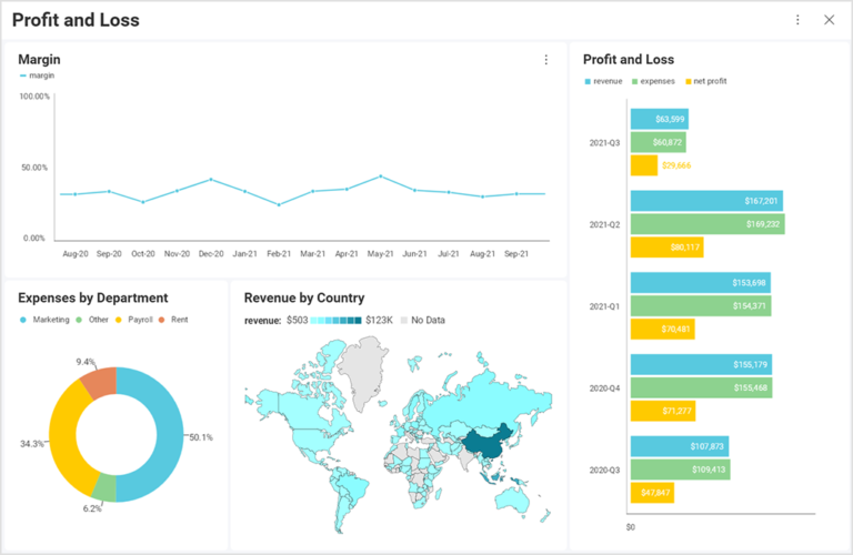
Accounting can use data visualizations to quickly compare different metrics, identify patterns and stay on record with events. It can also identify trends to come and forecast new patterns through historical data. Auditors can then quickly assess and choose a course of action to achieve results with minimal risk, understand the client better, and communicate not only through spreadsheets but connect with data in an illuminating way.
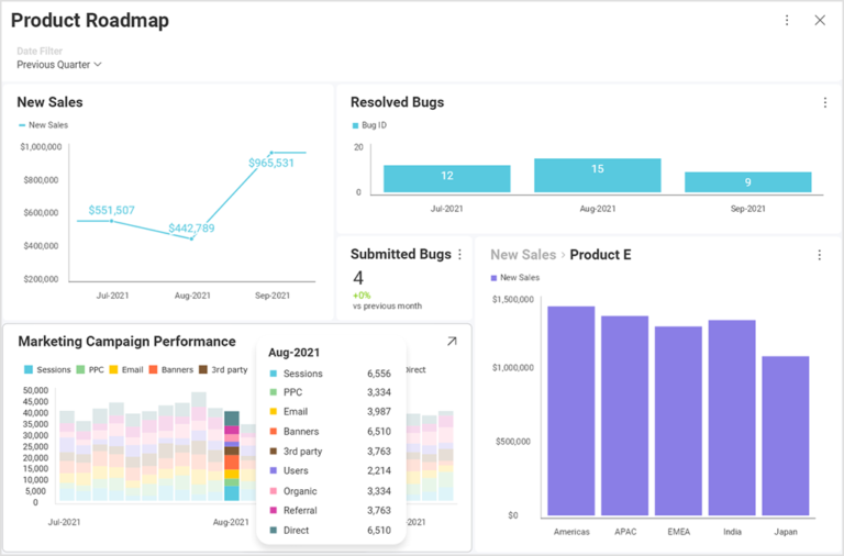
For a product roadmap, you will need to measure different points of the project: milestones, and campaigns that are executed. Data visualization here provides the assets for quick assessment through visuals of the stage you’re in and how you are advancing on your targets.
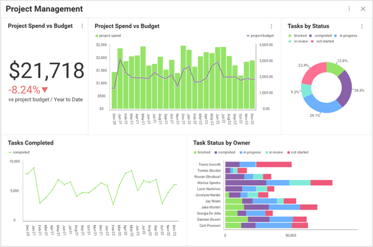
Complex data thrives in visualizations and your project manager will thrive with the insights from them. Variables like team performance, budget, and target progress can be translated into a visual language that gives a clear purpose and reveals details that will help in the long run.
Good visualizations can tell a great story when it comes to reporting on SEO and marketing campaigns. If you work with in-house SEO specialists or an external agency, team leaders need to know how the website performs in organic search. But that’s not an easy task as most SEO data comes from multiple sources – Google Analytics, Google Search Console, and rank trackers.
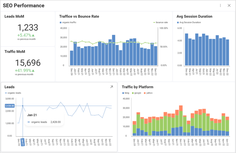
In the SEO dashboard example below, we show the most important KPIs for organic channels ( Leads/Sales) vs. the previous month and in a timeline. Sales data, in a combination of engagement metrics like bounce rate and Avg. Session duration can give an excellent overview of how users consume the content on the site and can identify issues or areas for improvement. Depending on the type of the business and particularly businesses impacted by seasonality, MoM comparisons might not be the best choice. For such, Year on Year comparison (YoY) might be the better choice. Annotations highlighting specific events can add clarity to the dashboards ( holidays, Google Algorithm updates, Technical fixes).
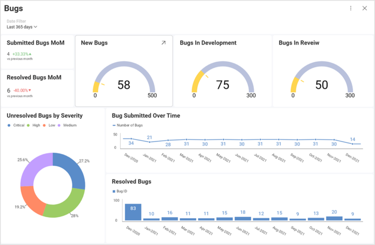
Visualizations used by developers really close the gap in the understanding between them and other departments. Visualizing data for developers means presenting a project, bug tracking in real time, examples, progress, and results, to really start making data-driven decisions faster.
Manage and follow up on your SEO projects with this dashboard and project template.
Use Template →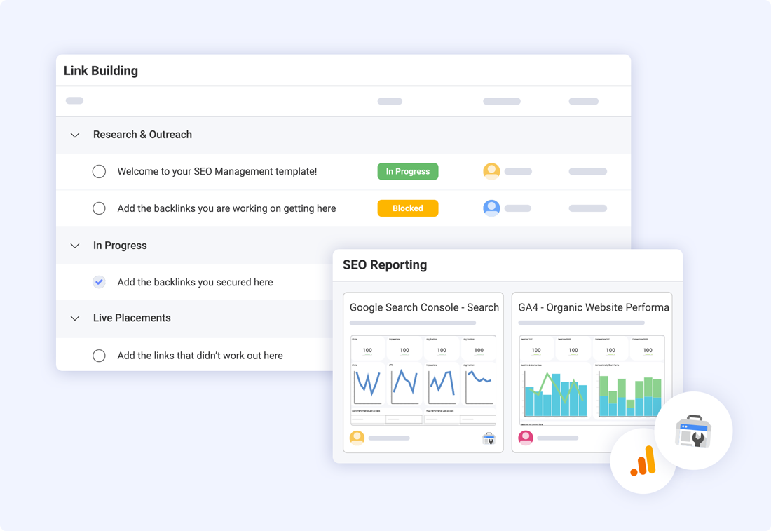
Data visualizations written in languages like Python help identify trends, patterns, and correlations that you might have otherwise never discovered. Python scripting opens the door for a number of options to visualize data and gain insights that raw data alone cannot provide them with.
Using Python to create your data visualizations will assist with:
As businesses continue to rely on data to make better and fact-based decisions, the importance of data visualization will grow even more. And since visualization techniques like charts and graphs are more efficient in terms of understanding data in comparison to traditional spreadsheets and outdated data reports, using tools like Python to create data visualizations is a necessity for every cross-functional team. To dive more deeply into the topic, check out our article on data visualization with Python.
Using R scripts lets developers and data scientists create various types of visualizations to represent complex, raw data with minimal coding. To create data visualizations, R provides several visualization libraries including ggplot2 which is one of the most widely used packages.
If we want to compare R to Python, we can point out a few differences – like the fact that R is a language that is primarily used for data analysis, while Python is a general-purpose programming language that can also be used for data analysis, but this isn’t its primary purpose.
Both are well-equipped for data visualization but customizing graphics in R is generally easier and more intuitive. R was built to demonstrate the results of statistical analysis with the base graphics module allowing you to create charts and plots with ease, and you can also use ggplot2 for more advanced pilots.
To learn more, go to our article on Data Visualization in R.
To achieve full-blown data visualization magic, you need the right software to connect to all the data you have in different systems and build a dashboard visual of your choosing.
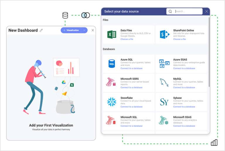
This is exactly what Slingshot can do for you – it’s an all-in-one digital workspace and a tool that is able to aggregate data analytics, project and information management, chat, and goals-based strategy benchmarking – all in one, intuitive app.
Furthermore:
Want to try? Go here to see how to create your first dashboard in Slingshot in four easy steps.
SHARE THIS POST